|
The economic impact of COVID-19 is undeniable. Businesses all across the globe are learning how to adapt to these new circumstances and we're all learning how to operate in a "new normal" that's constantly changing. That's why we'll be publishing week-over-week trend data for core business metrics like website traffic, email send and open rates, sales engagements, close rates and more. We hope to establish useful benchmarks to measure your business against, and serve as an early indicator of when short- or long-term adjustments may be needed in your strategy. While this post focuses on the highlights of last week, you can explore all the data we're publishing here.
About the Data
*The spread of COVID-19 has had a different timeline in different regions, so we are using the World Health Organization's declaration of a global pandemic on March 11, 2020 as our "official" start date. NOTE: Because the data is aggregated from HubSpot customers' businesses, please keep in mind that individual businesses, including HubSpot's, may differ based on their own markets, customer base, industry, geography, stage, and/or other factors. What We're SeeingAfter several weeks of concerning declines in deals created and deals closed, we are cautiously optimistic about this week's data. While it's certainly too early to call these trends a "rebound," the numbers suggest that companies that had paused "business as usual" in the last seven weeks are beginning to move forward in a new normal. Last week saw the highest volume of deals closed since the start of the pandemic, even though deals created and closed are still trending below pre-COVID levels. Deal creation increased 8% the week of April 20, compared to the prior week, with increases in every region. Deals closed saw an upward trend as well with a 9% increase the week of April 20. Buyer engagement reached historic highs last week. Marketing email open rates continue setting new records despite volume of email sends trending far above pre-COVID averages, and the data shows that salespeople are booking more meetings. We saw increases in average contacts added to customer portals as well. But there's still a major disconnect in how salespeople are prospecting. Thus far, sales teams have struggled to convert buyer interest via email -- send volume is a staggering 67% above pre-COVID averages, and hasn't been accompanied by an equivalent increase in response rates or meetings booked. However, our deep dive on sales activity suggests that salespeople are starting to book more meetings. With some adjustments to prospecting strategy, we're hopeful that there's opportunity for sales performance to improve. This week, we're adding two new cuts of data:
There's still work to be done, but last week's movement on these trends is a bright spot. After several weeks of steady declines in these metrics, recent data suggests that buyers are entering a new normal. There's gold in the hills, if sales teams just have the patience to find it -- salespeople would do well to take a breath and rethink their prospecting and outreach now, to ensure they're able to connect with the right buyers at the right time. How Metrics Changed Last WeekDespite remaining below pre-COVID levels, the volume of created and closed deals is trending in the right direction.We can't call it a rebound yet, but sales pipeline data from last week revealed the second straight week of growth after sharp declines across all regions and company sizes in March and early April. Last week, sales teams created 8% more deals than the week of April 13. This is still trending 15% below pre-COVID levels, but last week was the highest volume of deals created since the start of the pandemic.
This increase was seen across all regions with EMEA seeing the largest increase week-over-week (18%) and NORTHAM following suit at 7%. APAC and LATAM each saw a small 2% gain.
All company sizes followed the same trend. Companies with 201 or more employees are leading the pack with the biggest improvement in performance compared to the start of the pandemic.
Deals closed improved 9% week-over-week. While the volume of deals closed is still 22% lower than pre-COVID averages, we're encouraged that this metric has improved two weeks in a row.
APAC, EMEA, and NORTHAM followed the global trend. LATAM was the exception to the rule but largely held steady, closing 32% fewer deals than pre-COVID averages the week of April 20, compared to 31% below pre-COVID benchmarks the week of April 13.
Engagement with marketing content reached record levelsBuyers continue engaging with marketing content at levels equal to or higher than pre-COVID averages. Marketing teams that have invested in providing helpful, relevant content, deserve credit for reaching buyers in an incredibly noisy time. Consumers are still researching and connecting with businesses at high levels. Website traffic increased last week to 24% higher than pre-COVID averages, the highest volume we've seen all year.
Marketing email volume held steady again, by less than 1% week-over-week, and remains 25% higher than pre-COVID averages. This increase is accompanied by a staggeringly high open rate that is 25% higher than pre-COVID levels, a record for the year.
Engagement with sales outreach is no longer in free fall, but reveals opportunities for improvement.Sales engagement metrics show slight improvement over the past weeks though they have not recovered to pre-COVID levels. In the coming weeks, sales teams' success will depend on whether they are able to identify and connect with the pool of engaged buyers who have expressed interest in a business' offerings. The data suggests that there's still a significant disconnect between where sales teams are focusing their time, and where buyer interest exists. Total sales emails increased by 6% the week of April 20, and are trending at 67% above pre-COVID averages -- the highest level this metric has reached all year. However, after five straight weeks of decline, sales open rates increased marginally, an indication that more total buyers are responding to sales teams this week.
Things get really interesting when we zoom in on two additional parts of the sales process -- call prospecting and meetings booked. Weekly average call volume has maintained a 20% decrease compared to pre-COVID benchmarks. Sales teams are reallocating time they'd ordinarily use to call prospects toward emailing them in order to reach more buyers, a tactic that will not be sustainable as companies attempt to return to pre-COVID performance. Encouragingly, another metric appears to be genuinely rebounding. The number of meetings booked was trending at around 7% below pre-COVID averages, but last week increased to 10% above pre-COVID averages. Companies that may have frozen new investments while assessing their financial outlook seem to be reentering the market and restarting stalled deals -- a promising sign. We hope to see this increase reflected in the volume of deals created and booked in the coming weeks. Countries that have begun to reopen are generally seeing positive movement in the core dataset.Germany has begun a phased reopening of the economy, starting with allowing some small businesses to reopen on April 20. Australia has been widely praised for containing the spread of the virus, and states have begun relaxing isolation rules for some public spaces and social visit. Both these countries may provide a hint of what the early signs of economic recovery look like.
In Germany, marketing email volume kept with global trends, while open rates dipped slightly last week, though both metrics surpass pre-COVID levels. On the sales side, Germany saw a 14% increase in response rate, a 39% increase in deals created, and an 11% increase in closed-won deals the week of April 20. Germany is creating and closing more deals than the global average, with a higher response rate to sales emails as well. In Australia, marketing engagement held with global trends as well. Sales email response rates increased 28%, deals created increased 15%, and closed-won deals increased 20% the week of April 20. Australia is creating slightly more deals than the global average, holding with global trends for deals closed, and is also seeing a better open rate than the global average. We'll be watching these countries (and adding additional cuts) closely to track what economic recovery looks like in countries where the impacts of COVID-19 are starting to lessen. We're hopeful we will see continued improvement in these metrics, and are particularly interested in whether they will settle above or below pre-COVID levels in the coming weeks. What This Means for BusinessesTransition from outside sales to inside sales.The last few weeks have doubtless been a time of tremendous change for companies that employ an outside sales model. Temporarily adjusting to an inside sales model is virtually a requirement for businesses hoping to maintain or grow. In times like these, knowing how to build strong relationships remotely is key. Invest in videoconferencing software to have "face-to-face" conversations online, and build trust by starting conversations with educational content instead of a generic pitch. Ensure the quality of your sales conversations don't suffer by taking essential parts of the sales process online. If you don't already have a CRMWhether it's training your sales teams on cloud communications so they're able call prospects without physical phones, working with your marketing team to digitize educational content that prospects use to research your products, or learning how to conduct demos online, you'll need to create online equivalents for formerly offline processes. And of course, you'll need the right tools to keep your sales team running -- see below for a dedicated analysis of the technology your team needs. The last piece of the puzzle is integrating sales enablement with your inside sales engine. Build workflows that ensure the right information is reaching your sales team and that they can easily access it, whether it's through a project management platform, team wiki, etc. Resources to Help
Improve prospecting with targeted, creative outreach.Our data shows that historic numbers of buyers are visiting and engaging with businesses. Yet we haven't seen a corresponding increase in sales volume. Why? Part of this decline was inevitable. Companies across the world are tightening their belts and cutting down on nonessential investments. But that can't fully explain historic lows in sales engagement. The answer lies in prospecting -- the root of most good and bad sales outcomes. The huge increase in email prospecting accompanied by decrease in call volume is both troubling and revealing. Instead of maintaining their standard balance of activities, sales professionals are prioritizing the technique that allows them to touch the largest number of prospects in the least amount of time. Not only has this change had the opposite intended effect, it may also hamstring salespeople who find they've burned through their database by blasting irritating emails to prospects who may have been a good fit down the line. It's time to get back to basics. Buyer interest is at historic highs, and sales teams that take the time to target buyers who have expressed interest in their products will be better at capturing their interest than teams who are merely emailing as many people as possible. Encourage your sales team to add a human touch to outreach. For example, recording personalized videos to attach to email messages is a way to stand out in crowded inboxes. Leading with relevance and empathy is more important than ever, and incorporating personalization into your outreach process will drive sales teams to slow down and focus on good-fit prospects. Resources to Help
Remove friction from your sales process with the right technology.Friction is never good. But in an economic downturn, friction can be deadly. Our data shows that record numbers of buyers are turning to company websites and chat to conduct research. There are a number of ways you can remove friction from your sales process to form more connections between these prospects and your sales team. Automate and digitize interactions that formerly took place in person. Many steps of the sales process that used to happen face-to-face will need to move online. Chatbots are a useful way to automate parts of the qualification process. Invest in self-service resources like prerecorded demos, and ensure your sales team has the right technology to add a human touch to email outreach, and run sales calls online. Invest in conversational marketing. Conversational marketing offers a real-time way to answer customer questions and automates the lead routing process so your business can serve prospective and existing customers even when your team is out of the office. Additionally, chatbots can help your company meet the increase in inquiries by providing customers with lightning-fast answers, automating lead qualification, and booking meetings on behalf of your sales and service teams. Enable self-service. Whether it's through chatbots, online meeting booking, eSigning, or self-service meetings links, implementing technology that allows prospects to engage with your business on their schedule will make the process easier on your prospects and more efficient for your team. Resources to Help
Free Software to Get Started
[Read More ...] from https://blog.hubspot.com/marketing/covid-19-benchmark-data-edition4
0 Comments
In 2020, there's no question of whether or not blogs generate leads. In fact, marketers who prioritize blogging as a marketing strategy report 13-times the ROI of companies that don't. However, many marketers still worry that blogging's effectiveness could be losing steam. Fears that "blogging is dead" haven't been eased by research. Recently, when we polled over 300 people to ask them how often they read blogs, roughly 40% said "never." This followed HubSpot's 2020 State of Marketing Report, which revealed that blogging fell from the first to third-most-common content strategy between 2018 and 2020. But, before you get wrapped up in all the negative data, it's important to remember that blogging is still incredibly valuable to marketers -- but the way you approach blogging matters more than ever. And, while our past survey found that 40% of people never read blogs, it conversely revealed that 60% of consumers read this content regularly. The truth is, blogging is alive and well. You'll just need to work a tiny bit harder to persuade people to read your content in 2020. So, what's one way to get into a consumer's head and figure out how to motivate them to read your blog? Performing another survey. Rather than asking more than 300 people, "Do you read blogs?", I launched a second Lucid survey that more deeply asked, "Why do you most commonly read blog posts?" In the survey, which asked participants to select the most common reason that they consume blog content, answer options included, "To learn how to do something new," "To be entertained," "To learn more about products or brands," and "To learn about news and trends in my job industry." With the number of leads that business blogs are known to generate, you might assume that a large chunk of people read blogs to learn about brands or products. But, actually, you might be surprised -- and a little concerned -- by the highest and lowest-ranking reasons for blog readership: In fact, only four percent of consumers say they read blogs to learn about brands or products. According to the results of the survey, more people are actually driven to read blogs that teach them how to do something new. While 34% selected this reasoning, 20% said they read blogs to be entertained, while 12% read blogs to learn about news or trends in their job industry. Additionally, 9% said they're driven to read blogs for all of the reasons given. 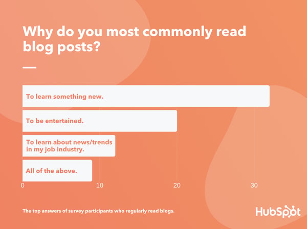 Data Source: Luc.id What exactly do the results above mean? To win over blog readers, you'll need to create content that provides some type of informative value or entertainment, rather than purely using your blog to discuss your brand or product. In this blog post, I'll walk you through the top three reasons why the general consumer population is driven to read blogs. I'll also show you how to create blog content that fulfills your reader's needs while still subtly spreading brand awareness. 3 Reasons People Read Blogs1. People read blogs to learn something new.By far, the most common reason that people will read a blog post is to learn something new. This result doesn't surprise me at all. Why? Posts that include guides, step-by-step processes, tutorial videos, or fast-facts often gain a large amount of search traffic. This is because people are looking up instructions for how to do things on Google every day. Even when posts aren't informing people of how to do something on a granular level, blogs that discuss complex topics such as studies, trends, or topics people are less familiar with can pique a person's curiosity. Psychologically, people crave new information similarly to how they crave food. As a blogger, you can harness this to create content that both piques curiosity, while discussing topics related to your brand, service, or products. For example, on the Marketing Blog, we might show our readers how to publish an Instagram Story. By doing this, marketers or social media users who want to learn how to do this could find our content in search or on social media and read it to learn how to create this content. On a broader scope, our blog might create multiple pieces of content that discuss a trend from multiple angles. For example, when the app TikTok emerged, we wrote a few blog posts to answer common marketer questions like, "What is TikTok?", "How do brands market themselves on TikTok?", or "How do you leverage influencer marketing on TikTok?" Aside from helping our readers, guide or trend-related blogs allow us to highlight the level of research and knowledge we've gained as marketers. This could also demonstrate to a prospect that HubSpot is a credible company that sells quality products within the marketing industry. 2. People read blogs to be entertained.While people crave knowledge, they also like to be entertained. Each day, people might read blogs that tell interesting stories, make them laugh, or intrigue them in some other way. But, as a business blogger, You might be asking yourself, "How can I entertain my readers while still keeping my blog professional?" The truth is, when you think creatively, there are a number of ways you can entertain your audience while still staying on brand. For example, you could create a fun infographic or photo post about a viral trend in your industry, While your readers might not be willing to invest in this viral trend, the imagery and information about the trend might entertain them. In one of our posts, we highlighted funny memes that marketers used in their actual campaigns. Alternatively, you could also create a fun, but informative, video or podcast to go with your blog post. With this added layer of content, you could dive deeper into discussing a viral marketing trend, or interview an industry expert that people in your field follow. While this might not be "entertaining" for people outside of your industry, it might be more interesting than the average blogs people in your field might be reading. Here's an example of a blog post that combines text and video for a better reader experience:  3. People read blogs to learn about trends related to their job industry.While people might not be interested in reading blogs that specifically discuss your product or brand, they could be more intrigued by a blog that discusses an industry your product is affiliated with. While the poll result noted in the introduction came from general consumers with mixed professional backgrounds, it's likely that those in the workforce will read a blog if it educates them or provides them with valuable information about their industry. One example of a brand that discovered how industry experts read its industry-themed blog is American Scientist. Recently, the science blog conducted a study to learn about what motivated its blog readers to visit its site. They found that the average reader was either highly educated in science and technology or was actively working in STEM fields. American Scientist also discovered that these readers, who already had some expertise on the topic, weren't interested in general science news. They were actually interested in reading the American Scientist blog for specific "nuggets" of new scientific information, studies, or findings. From the above study, and what we've learned when developing HubSpot's Marketing, Sales, and Service blogs, industry experts or professionals will read blogs to learn something more specific about their industry. Here's an example of one of our own high-performing blog posts where an industry thought leader discusses the ins and outs of organic growth. 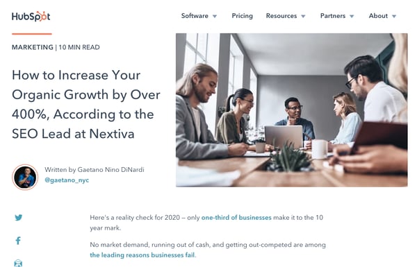 To zone in on your particular industry, experiment with tactics like thought leadership, similarly to the post noted above. You can additionally write about news or trends related to your field. For example, here's a post where we discussed how a third-party cookie phaseout could impact marketers. Creating Content That Fulfills Multiple Reader NeedsSo, how do you create engaging content that pulls in audiences with all different reading motivations while still spreading brand awareness about your product or service? Consider publishing blog posts that combine industry trends, how-tos, and entertainment. After all, nine percent of the survey recipients polled above said they read blogs for all of the reasons on the list I gave. Here are two examples of how you can create content that fulfills the interests of multiple groups of blog readers. Teach your readers how to do something in your industry.At the HubSpot Blog, each of our posts teaches readers about something specific. For example, the post you're currently reading highlights the research we've done about how people read blogs and shows you how to leverage these results. In other posts, we'll also inform marketers by giving them a step-by-step guide to a marketing tactic or examples of how brands leverage promotional trends. Regardless of what we write about, we're always trying to teach readers something valuable. When you create content that educates people about strategies related to your industry, it's also easier to subtly discuss your product in a way that doesn't seem shameless of over promotional. For example, when we're discussing a strategy that HubSpot can help with, we might subtly link readers to a tool or resource we offer that can help them. Here's an example of a HubSpot mention in a post about form building tools: 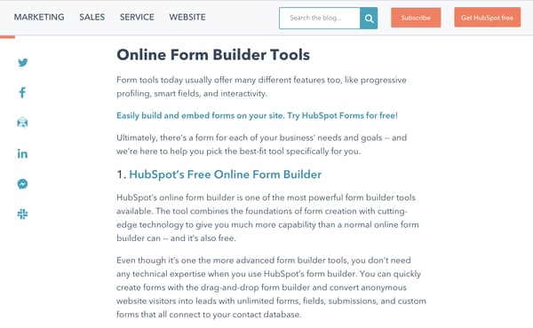 We also like to include free offers related to our content at the end of each blog post. When we do this, a reader can learn more about the topic we've just taught them about. And, when they fill out a simple form requesting the free resource, they can choose whether or not they'd like to be contacted about one of our products. This allows the reader to feel like they are receiving valuable information without being forced to learn about our products.  Even when you don't specifically acknowledge a product, an industry blog focused on informing readers can show off your company's level of expertise. When your brand is seen as highly knowledgeable about your industry, readers might think that your products were also created by your staff of industry experts. Entertain industry readers while still informing them.Even though an industry blog will likely target company employees or leaders, this doesn't mean your content can't be informative and entertaining. For example, you can use videos, GIFs, imagery, or interactive blog assets to add to your content while keeping it interesting for the reader. For example, you could consider embedding a trivia or personality quiz related to your industry, as we did in this blog post:  On occasion, you could also create a fun, suitable for work posts that your industry readers can relate to. For example, here's a Service Blog post where we highlight GIFs related to working on a customer service floor: 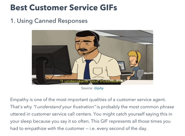 Entertaining blog content on an industry blog can similarly show off your expertise. But, importantly, this content also allows your reader to relate to your brand on a more human level. Building an Effective Blog StrategyWhile it can be great to run with one successful content type, the blogs with the most credibility and quickest growth often have a mix of content that entertains or informs readers, makes them aware of brands or products, or teaches them something new. And, with 9% of consumers in the poll above saying that they'll read blogs for "all" reasons listed, there's a good chance that a mix will intrigue and fulfill the reading needs of multiple different groups. To learn more about how to drive internet users to your blog, check out this post. For tips on how to be a blogger, check out this post with advice from our own blog team. [Read More ...] from https://blog.hubspot.com/marketing/why-do-people-read-blogs As your business grows and evolves, you'll inevitably find yourself adding more applications to your growth stack. If those applications run on different platforms and can't communicate effectively, you're going to run into issues with data loss, duplication of efforts, and bottlenecks that slow your team down. iPaaS -- which stands for Integration Platform as a Service -- helps you connect the tools and systems that power your business in one place, so information can be shared without high-maintenance, one-off integrations or manual data entry. We wrote a deep dive on iPaaS here if you'd like to learn more about the basics, view a complete glossary of iPaaS terms, and better understand what iPaaS can potentially offer your business. If you've decided you want to invest in iPaaS but aren't sure where to start, you're in the right place. In this article, we'll go over some of the best iPaaS vendors, so you can discover one that fits your company's unique needs and budget. Let's dive in. 1. Dell BoomiAcquired by Dell in 2010, Boomi offers a cloud-based integration and API management solution with all the bells and whistles you could ask for: workflows, API design, application deployment, B2B/EDI management, and much more. Within Boomi, you can design end-to-end workflows and process data across multiple applications. Suitable for enterprise and small businesses from many different industries, Boomi has been considered a leader in the iPaaS space for the last six years by Gartner. Price: Starting at $549/month 2. Oracle Integration CloudIf you're looking for a straightforward iPaaS solutions with industry best practices and premade integration flows baked into the product, Oracle Integration Cloud might be an option to take a deeper look at. Oracle serves up an extensive library of out-of-the-box adapters to different SaaS and on-premises applications, making the initial set-up less time consuming for your team. Price: Choose from several different pricing structures, including a pay-as-you-go plan starting at $1.2097/message, and a monthly flex plan starting at $0.8065/message. 3. WorkatoThis iPaaS solution was designed to enable better connection between business users and IT, allowing both groups to plan, create, and easily maintain integrations between different systems. Workato provides pre-built integration flows between 300 of the most popular SaaS products, and the ability to design custom integrations in a simple, drag-and-drop interface. Price: Choose from a Business Plan ($1499/month) Business Plus Plan ($2999/month) and Enterprise Plan (Custom pricing based on your specific needs) 4. TIBCO CloudTIBCO Cloud prides itself on providing an easy-to-use iPaaS solution that simplifies the creation and management of integration flows in your business. They consider themselves to be an "application neutral" technology partner for their clients -- meaning, they won't try to push you towards using a particular application or ecosystem, they'll work with you to build a solution that connects your on-premises and cloud-based applications your business already prefers to use. Price: Starting at $400/month for a Basic Plan, $1500/month for a Standard Plan, and custom pricing for Hybrid plans based on your unique needs. 5. Elastic.ioElastic.io promises to remove the laborious product management component of custom integrations and reduce the amount of time spent on integrations at your company by up to 80%. This iPaaS vendor also takes an as-a-service mentality to how they work with customers, helping you support feature roll-outs and upgrades, bug fixes, and connector updates. Price: For system integrators, the monthly plans start at €199/month, for enterprise customers, the yearly plans start at €1,499/month, and for software vendors, they offer the platform as OEM with customizable pricing (i.e. on request). 6. Modulus DataThis iPaaS vendor specializes in integrations for the Human Resources industry, offering a comprehensive library of pre-built connectors aimed at helping your HR department align their applications and tools in one seamless, secure hub. Modulus Data has out-of-the-box connectors with most popular HR applications and softwares, including Workday, Greenhouse, Monster, and Oracle HCM. Price: Contact [email protected] 7. InformaticaInformatica has been around since 1993, and still continues to be an industry leader in helping businesses manage their data effectively and securely. Specializing in enterprise level iPaaS solutions, Informatica lists big companies like GE, Unilever, and L'Oreal among their clients. If you're a large company looking for hands-on support on your custom iPaaS journey, Informatica might be a good fit for your needs. Price: Prices for an integration base begin at $2,000/month 8. IBM AppConnectIBM's iPaaS solution markets itself as an easy way to connect apps, build APIs, integrate data, and act on events. AppConnect comes equipped with a series of templates made up of common patterns you can use to quickly set-up integration flows for your business, and start getting value immediately. SMBs looking to get started with iPaaS and explore the possibilities of new applications might benefit from using AppConnect. Price: AppConnect offers a free lite package. Professional packages start at $500/month, and customizable Enterprise packages begin at $2,370/month. 9. SnapLogicFor companies seeking at enterprise-level iPaaS solution that can handle a lot of data quickly, SnapLogic offers up a way to automate integrations across on-premises and cloud-based applications on a large scale. But don't let the hefty capabilities of SnapLogic mislead you into thinking the product itself is for the extremely tech-savvy only -- this iPaaS solution is designed with user accessibility in mind, so even teams with less technology experience can build, manage, and scale custom integrations and workflows. Price: Annual pricing starts at $48k/year 10. ZapierOne of the more user and wallet-friendly options in the iPaaS space, Zapier gives businesses of any size the ability to design and manage custom integration solutions that fit their exact needs. Zapier adds new integrations (called "zaps") to their massive integrations library each week, so chances are, there's already an out-of-the-box solution available for you to start using today. Price: Zapier offers a free basic package. Starter packages start at $20/month, and Professional packages begin at $50/month. 11. JitterbitAccording to G2 ratings, Jitterbit is one of the more user-friendly and cost-effective iPaaS options out there. This iPaaS vendor offers support for a wide breadth of connectors, advanced workflow capabilities, real-time integrations, and a range of data security features. Additionally, Jitterbit has an easy-to-use visual designer to help make the setup and monitoring processes run smoothly -- even for teams without a dedicated developer on staff. Price: Pricing varies based on your needs, so you'll need to contact Jitterbit to get a quote. 12. Amazon API GatewayBuilt with developers in mind, Amazon's iPaaS solution enables teams to create and manage APIs that act as a "front door" for applications to access data and share information. Amazon API Gateway is unique because you only pay for the API calls you use, rather than most other iPaaS vendors which rely on monthly or annual pricing models. This iPaaS vendor is one to consider if you have a developer on staff and want more direct control over the API calls your company uses. Pricing: No upfront costs. Pricing is determined by the quantity and type of API calls used. 13. Celigo Intergrator.ioIf you aren't sure how an iPaaS solution will work for your company and are wary of hefty fees, Celigo offers a free version of their iPaaS product. Their Integration Marketplace is stocked with plenty of prebuilt, supported integrations with common applications, and their "flow" subscription model means you can start off with the free version and only start paying if you increase your usage and add new integrations into the mix. Pricing: The basic package is free, and they offer additional packages starting at $600/month. 14. Tray.ioThis iPaaS vendor was designed with the intention to better connect the tools and workflows used by your marketing, sales, product, and services teams. They offer out-of-the-box integration solutions developed with these specific teams in mind, and aim to empower your teams to manage and create the integrations they need without the need for developer assistance every step of the way. Price: Standard packages start at $595/month, Professional starts at $2,450/month, and Enterprise packages are available with custom pricing based on your needs. 15. XplentyIf you're seeking a straightforward way to visualize your workflows, integrations, and data flows, Xplenty might be a good option to consider. Their simplified dashboard enables you to manage how your tools and data are working together in one central place, and your developers will love that they can connect Xplenty with their existing monitoring systems using service hooks. Price: Contact Xpenty for a quote. 16. MulesoftUsed by tech giants like Netflix and Airbnb, Mulesoft offers a wide range of customized iPaaS solutions for different industries and tech setups. Their selection of out-of-the-box connectivity options means your team will spend less time initially building out new integrations, since prebuilt integrations are easier to get up and running fast. Price: Contact Mulesoft for a quote. 17. PieSyncPieSync wants to make it easier for your team to provide excellent service for your customers, and that starts with ensuring customer data doesn't get lost in the spaces between your team's tools and databases. This iPaaS vendor advertises a "no coding" approach that's ideal for teams who want to get started with iPaaS but might not have the tech resources on staff. They offer prebuilt integrations between many popular applications, like HubSpot, MailChimp, and Office 365. PieSync is also one of the more affordable options on the list -- so it could be a good choice for startups and teams on the smaller side. Price: Starter is $9/month, Pro is $19/month, and Enterprise is $99/month. 18. The CrosscutDeveloped by Moskitos, The Crosscut® is an iPaaS solution for hybrid information systems -- it can connect both cloud-to-cloud applications and cloud-to-on-premise applications, which makes it a great pick if your team isn't looking to go full cloud just yet. You can develop and launch integrations in a central Control Center, and set up role-based monitoring using their Corporate Portal. Price: Contact Moskitos for a quote. 19. Blendr.ioBlendr.io offers a low-code visual builder to create complex enterprise-grade or standardized self-service integrations. They also provide a set of features to embed integrations in the the UI of your platform (including HubSpot) into the UI of other SaaS platforms. Price: Contact Blendr.io for a quote. 20. BlendoBlendo is a self-service iPaaS solution that can connect applications from your sales, marketing, and financial teams and flow directly into a number of popular data warehousing options. Blendo was designed to make reporting across multiple applications more straightforward, so they ensure you can access your data in your preferred reporting platform. Price: Contact Blendo for a quote. 21. SkyviaLast but certainly not least, we have Skyvia, a no-coding cloud data integration platform that offers both ELT and ETL approaches. It has both visual tools for simple integration cases and powerful mapping and transformation settings for more complex scenarios. The platform also offers no-coding OData and SQL web API layer and has ADO.NET provider and ODBC driver for accessing your data via these API over the web. Skyvia supports all major data sources - from SaaS apps like Salesforce and BigCommerce, to databases like MySQL and SQL Server. Price: Choose from a Data Integration Free plan (free), a Data Basic Integration plan ($19/month), and a Data Integration Standard plan ($99/month). [Read More ...] from https://blog.hubspot.com/marketing/ipaas-vendors At the end of every year, we like to read through some of the major reports on inbound marketing, content marketing, social media, and online behavior. It's amazing how fast things can change in just one or two years, and this year has a breadth of surprising statistics to reflect on. This year, we've seen the continued importance of visual content emphasized by the changes that occurred across almost every major social network, including Facebook, Instagram, and Twitter. At the same time, videos continued to grow as powerful tools for brands looking to communicate more easily with their readers, and virtual reality (VR) is finding its place as a marketing tool in numerous businesses. To help you keep pace with these trends, let's take a look at some visual content marketing statistics that demonstrate the impact visual content has on reach, engagement, and sales. You can jump to the following categories to see statistics related to that category:
50 Visual Content Marketing Statistics You Should KnowGeneral Visual Content Statistics
Source: HubSpot
Video Marketing Statistics
Emerging Visual Marketing Trends
Source: Perkins Coie LLC Infographic Stats for Visual Content Marketers
Social Media Stats for Visual Content Marketers
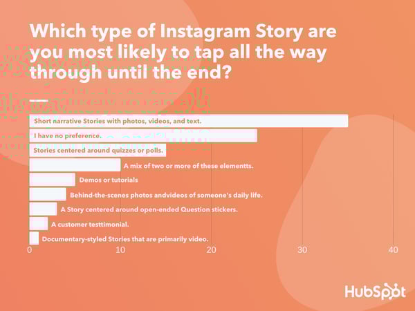
Data Source: Lucid Software
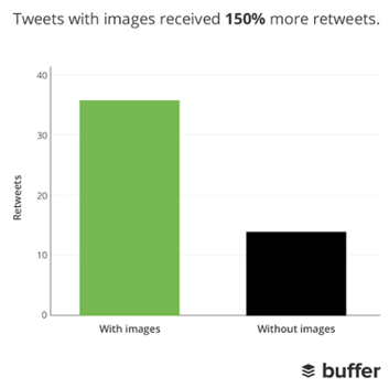
Source: Buffer
Source: Buzzsumo

Source: Jeff Bullas
[Read More ...] from https://blog.hubspot.com/marketing/visual-content-marketing-strategy On any given day, most of our email inboxes are flooded with a barrage of automated email newsletters that do little else besides giving us another task to do on our commutes to work -- namely, marking them all as unread without reading, or unsubscribing altogether. But every now and then, we get a newsletter that's so good, not only do we read it, but we click it, share it, and recommend it to our friends. How to Create an Effective Email Marketing CampaignEffective email marketing campaigns need to be cleverly written to attract attention in busy inboxes. Here are four steps you should follow to create an effective email campaign. 1. Use a comprehensive email builder.The first step to creating an effective email marketing campaign is to use the best email builder. There are several options depending on your needs, including HubSpot, MailChimp, and Constant Contact. With a comprehensive email builder, you can create, optimize, and personalize your own email campaigns without needing any technical or graphic design experience. 2. Include personalization elements in the copy and excellent imagery.Marketing emails need to be personalized to the reader and filled with interesting graphics. Few people want to read emails that are addressed "Dear Sir/Madam" -- as opposed to their first or last name -- and even fewer people want to read an email that simply gives them a wall of text. Visuals help your recipients quickly understand the point of the email. 3. Add an appropriate call-to-action.Once you've included personalization elements and added your copy and images, it's time to add a call-to-action. Above all, exceptional marketing emails must contain a meaningful CTA. After all, if brands are taking up subscribers' time -- and inbox space -- with another email, every message must have a point to it. Internet users get multiple emails per day -- why should they care about yours? 4. Make sure it's designed for all devices.Effective email marketing campaigns are designed for all devices on which users can read their emails -- desktop, tablet, and mobile. Email campaigns that are designed for mobile devices are especially important -- a quality known as "responsive design." In fact, 73% of companies today prioritize mobile device optimization when creating email marketing campaigns. You probably receive enough emails as it is, and it's tough to know which newsletters are worth subscribing to, so we've curated a list of some of our favorite examples. Read on to discover some great email campaign examples and what makes them great -- or just skip ahead to the brands you already know and love. But first, download the planning template you'll need to craft your own lovable email marketing campaign, and check out our new Out-of-Office Email Generator to make your email address even more delightful to your contacts. 1. charity: waterMarketing Campaign: Donation Progress UpdateWhen people talk about email marketing, lots of them forget to mention transactional emails. These are the automated emails you get in your inbox after taking a certain action on a website. This could be anything from filling out a form, to purchasing a product, to updating you on the progress of your order. Often, these are plain text emails that marketers set and forget. Well, charity: water took an alternate route. Once someone donates to a charity: water project, her money takes a long journey. Most charities don't tell you about that journey at all -- charity: water uses automated emails to show donors how their money is making an impact over time. With the project timeline and accompanying table, you don't even really need to read the email -- you know immediately where you are in the whole process so you can move onto other things in your inbox.
2. Brooks SportsMarketing Campaign: Desiree Linden's Boston Marathon VictoryWhen Desiree Linden won the 2018 Boston Marathon, she became the first American woman to win the race in more than 30 years. To her shoe and apparel sponsor, Brooks Sports, it was an opportunity to celebrate their long partnership together. The resulting email campaign focuses almost entirely on the Olympic marathoner's amazing accomplishment. Email campaigns like this one allow companies to demonstrate their loyalties and add value to the products their best users have chosen. The blue CTA button at the bottom of the email reads, "See Desiree's go-to gear." What better products to call attention to than the stuff worn by America's latest legend? After Desiree's victory, everyone knew her name. Brooks Sports struck while the iron was hot with a proud email that was sure to be opened and forwarded.
3. BuzzFeedMarketing Campaign: 'BuzzFeed Today' NewsletterI already have a soft spot for BuzzFeed content ("21 Puppies so Cute You Will Literally Gasp and Then Probably Cry," anyone?), but that isn't the only reason I fell in love with its emails. First of all, BuzzFeed has awesome subject lines and preview text. They are always short and punchy -- which fits in perfectly with the rest of BuzzFeed's content. I especially love how the preview text will accompany the subject line. For example, if the subject line is a question, the preview text is the answer. Or if the subject line is a command (like the one below), the preview text seems like the next logical thought right after it:
Once you open up an email from BuzzFeed, the copy is equally awesome. Just take a look at that glorious alt text action happening where the images should be. The email still conveys what it is supposed to convey -- and looks great -- whether you use an image or not. That's definitely something to admire. Without images:
With images:
4. UberMarketing Campaign: Calendar IntegrationThe beauty of Uber's emails is in their simplicity. Email subscribers are alerted to deals and promotions with emails like the one you see below. We love how brief the initial description is, paired with a very clear CTA -- perfect for subscribers who are quickly skimming the email. For the people who want to learn more, these are followed by a more detailed (but still pleasingly simple), step-by-step explanation of how the deal works. We also love how consistent the design of Uber's emails is with its brand. Like its app, website, social media photos, and other parts of the visual branding, the emails are represented by bright colors and geometric patterns. All of its communications and marketing assets tell the brand's story -- and brand consistency is one tactic Uber's nailed in order to gain brand loyalty. Check out the clever copywriting and email design at work in this example:
5. TheSkimmMarketing Campaign: Subscription AnniversaryWe love TheSkimm's daily newsletter -- especially its clean design and its short, punchy paragraphs. But newsletters aren't TheSkimm's only strength when it comes to email. Check out its subscriber engagement email below, which rewarded fellow marketer Ginny Mineo for being subscribed for two years. Emails triggered by milestones, like anniversaries and birthdays, are fun to get -- who doesn't like to celebrate a special occasion? The beauty of anniversary emails, in particular, is that they don't require subscribers to input any extra data, and they can work for a variety of senders. Plus, the timeframe can be modified based on the business model. Here, the folks at TheSkimm took it a step further by asking Mineo if she'd like to earn the title of brand ambassador as a loyal subscriber -- which would require her to share the link with ten friends, of course.
6. Mom and Dad MoneyMarketing Campaign: Get to Know Your SubscribersThink you know all about the people who are reading your marketing emails? How much of what you "know" about them is based on assumptions? The strongest buyer personas are based on insights you gather from your actual readership, through surveys, interviews, and so on -- in addition to the market research. That's exactly what Matt Becker of Mom and Dad Money does -- and he does it very, very well. Here's an example of an email I once received from this brand. Design-wise, it's nothing special -- but that's the point. It reads just like an email from a friend or colleague asking for a quick favor. Not only was this initial email great, but his response to my answers was even better: Within a few days of responding to the questionnaire, I received a long and detailed personal email from Matt thanking me for filling out the questionnaire and offering a ton of helpful advice and links to resources specifically catered to my answers. I was very impressed by his business acumen, communication skills, and obvious dedication to his readers.
7. PonchoMarketing Campaign: Custom Weather ForecastSome of the best emails out there pair super simple design with brief, clever copy. When it comes down to it, daily emails I get from Poncho -- which sends me customizable weather forecasts each morning -- takes the cake. Poncho's emails are colorful, use delightful images and GIFs, and are very easy to scan. The copy is brief but clever with some great puns, and it aligns perfectly with the brand. Check out the copy near the bottom asking to "hang out outside of email." Hats off to Poncho for using design to better communicate its message.
8. BirchboxMarketing Campaign: Co-marketing PromotionThe subject line of this email from beauty product subscription service Birchbox got my colleague Pam Vaughan clicking. It read: "We Forgot Something in Your February Box!" Of course, if you read the email copy below, Birchbox didn't actually forget to put that discount code in her box -- but it was certainly a clever way to get her attention. As it turned out, the discount code was actually a bonus promo for Rent the Runway, a dress rental company that likely fits the interest profile of most Birchbox customers -- which certainly didn't disappoint. That's a great co-marketing partnership right there.
9. PostmatesMarketing Campaign: New ProductI have to say, I'm a sucker for GIFs. They're easy to consume, they catch your eye, and they have an emotional impact -- like the fun GIF in one of Postmates' emails that's not only delightful to watch, but also makes you crave some delicious Chipotle. You, too, can use animated GIFs in your marketing to show a fun header, draw people's eyes to a certain part of the email, or display your products and services in action.
10. DropboxMarketing Campaign: User ReengagementYou might think it'd be hard to love an email from a company whose product you haven't been using. But Dropbox found a way to make its "come back to us!" email cute and funny, thanks to a pair of whimsical cartoons and an emoticon. Plus, the email was kept short and sweet, to emphasize the message that Dropox didn't want to intrude -- it just wants to remind the recipient that the brand exists, and why it could be helpful. When sending these types of email, you might include an incentive for recipients to come back to using your service, like a limited-time coupon.
11. InVision AppMarketing Campaign: Weekly Blog NewsletterEvery week, the folks at InVision send a roundup of their best blog content, their favorite design links from the week, and a new opportunity to win a free t-shirt. (Seriously. They give away a new design every week.) They also sometimes have fun survey questions where they crowdsource for their blog. This week's, for example, asked subscribers what they would do if the internet didn't exist. Not only is InVision's newsletter a great mix of content, but I also love the nice balance between images and text, making it really easy to read and mobile-friendly -- which is especially important, because its newsletters are so long. (Below is just an excerpt, but you can read through the full email here.) We like the clever copy on the call-to-action (CTA) buttons, too.
12. Warby ParkerMarketing Campaign: Product RenewalWhat goes better with a new prescription than a new pair of glasses? The folks at Warby Parker made that connection very clear in their email to a friend of mine back in 2014. It's an older email, but it's such a good example of personalized email marketing that I had to include it in here. The subject line was: "Uh-oh, your prescription is expiring." What a clever email trigger. And you've gotta love the reminder that your prescription needs updating. Speaking of which, check out the clever co-marketing at the bottom of the email: If you don't know where to go to renew your subscription, the information for an optometrist is right in the email. Now there's no excuse not to shop for new glasses!
13. Cook SmartsMarketing Campaign: Weekly Product NewsletterI've been a huge fan of Cook Smarts' "Weekly Eats" newsletter for a while. The company sends yummy recipes in the form of a meal plan to my inbox every week. But I didn't just include it because of its delicious recipes -- I'm truly a fan of its emails. I especially love the layout of Cook Smarts' emails: Each message features three distinct sections: one for the menu, one for kitchen how-to's, and one for the tips. That means you don't have to go hunting to find the most interesting part of its blog posts -- you know exactly where to look after an email or two. I also love Cook Smarts' "Forward to a Friend" CTA in the top-right of the email. Emails are super shareable over -- you guessed it -- email, so you should also think about reminding your subscribers to forward your emails to friends, family, or coworkers.
14. HireVueMarketing Campaign: Customer Retention"Saying goodbye is never easy to do… So, we thought we’d give you a chance to rethink things." That was the subject of this automated unsubscribe email from HireVue. We love the simple, guilt-free messaging here, from the funny header images to the great CTA button copy. Not only are the design and copy here top-notch, but we applaud the folks at HireVue for sending automated unsubscribe emails in the first place. It's smart to purge your subscriber lists of folks who aren't opening your email lists, because low open rates can seriously hurt email deliverability.
15. Paperless PostMarketing Campaign: Mother's Day PromotionWhen you think of "holiday email marketing," your mind might jump straight to Christmas, but there are other holidays sprinkled throughout the rest of the year that you can create campaigns around. (Download these email marketing planning templates to keep yourself organized throughout the year.) Take the email below from Paperless Post, for example. I love the header of this email: It provides a clear CTA that includes a sense of urgency. Then, the subheader asks a question that forces recipients to think to themselves, "Wait, when is Mother's Day again? Did I buy Mom a card?" Below this copy, the simple grid design is both easy to scan and quite visually appealing. Each card picture is a CTA in and of itself -- click on any one of them, and you'll be taken to a purchase page.
16. StitcherMarketing Campaign: Recommended for YouAs humans, we tend to crave personalized experiences. So when emails appear to be created especially for you, you feel special -- you’re not just getting what everyone else is getting. You might even feel like the company sending you the email knows you in some way, and that it cares about your preferences and making you happy. That's why I love on-demand podcast/radio show app Stitcher's "Recommended For You" emails. I tend to listen to episodes from the same podcast instead of branching out to new ones. But Stitcher wants me to discover (and subscribe to) all the other awesome content it has -- and I probably wouldn't without this encouragement. I think this email also makes quite a brilliant use of responsive design. The colors are bright, and it's not too hard to scroll and click -- notice the CTAs are large enough for me to hit with my thumbs. Also, the mobile email actually has features that make sense for recipients who are on their mobile device. Check out the CTA at the bottom of the email, for example: The "Open Stitcher Radio" button prompts the app to open on your phone.
17. RCNMarketing Campaign: Storm UpdateInternet providers and bad weather are natural enemies. You'd think telecommunications companies wouldn't want to call attention to storm-induced power outages -- the one thing that sets off customers' impatience. Then, there's RCN. RCN, a cable and wireless internet service, turned this email marketing campaign into a weather forecast just for its customers. This "storm update" got the company out ahead of an event that threatened its service, while allowing its users to get the weather updates they need right from the company they count on for Wi-Fi. As you can see below, the email even advises personal safety -- a nice touch of care to go with the promise of responsive service. At the bottom of the email, RCN also took the opportunity to highlight its social media channels, which the company appropriately uses to keep users informed of network outages.
18. TruliaMarketing Campaign: Moving TrendsI'm a huge advocate of thought leadership. To me, some of the best companies gain customer loyalty by becoming the go-to source for expertise on a given topic. Trulia -- a property search engine for buyers, sellers, and renters -- is that expert in the real estate biz. How do I know? Just read their emails, much like the one below. "Why aren't millennials moving?" The subject line of this email campaign reads before citing interesting data about relocation trends in the U.S. Trulia doesn't benefit from people who choose not to move, but the company does benefit from having its fingers on the pulse of the industry -- and showing it cares which way the real estate winds are blowing.
19. RedBubbleMarketing Campaign: Featured ArtistThis email marketing campaign crushes it, and for so many reasons. Not only is the design below super eye-catching -- without looking cluttered -- but the artwork is user-made. RedBubble sells merchandise featuring designs from artists all over the world. This presents a golden opportunity to feature popular submissions across the RedBubble community. The example below showcases artwork from "Letter Shoppe," and when that artist sees RedBubble featuring her content, she's more likely to forward it to friends and colleagues. In addition to linking to Letter Shoppe's designs (available on merchandise that is ultimately sold by RedBubble), the email campaign includes an endearing quote by the Featured Artist: "Never compromise on your values, and only do work you want to get more of." RedBubble's customers are likely to agree -- and open other emails in this campaign for more inspiring quotes.
These are just some of our favorite emails. Don't just follow best practice when it comes to your marketing emails. Every email you send from your work email address also can be optimized to convert. Try out our free email signature generator now, and check out some more of our favorite HubSpot marketing email examples. Editor's note: This post was originally published in October 2013 and has been updated for comprehensiveness. [Read More ...] from https://blog.hubspot.com/marketing/email-marketing-examples-list You probably already know how integral the process of blogging is to the success of your marketing efforts. Which is why it goes without saying it's exceptionally important to learn how to effectively start and manage a blog in a way that supports your business. Without a blog, you'll find yourself experiencing a number of problems such as poor search engine optimization (SEO), lack of promotional content for social, little clout with your leads and customers, and fewer pages to share your lead-generating calls-to-action (CTAs) on. So why, oh why, do so many marketers I talk to still have a laundry list of excuses for why they can't maintain a blog? Maybe because, unless you enjoy writing, business blogging might seem uninteresting, time consuming, and difficult. Well, the time for excuses is over and this guide is here to help you understand why. We'll cover how to write and manage your business's blog as well as provide helpful templates to simplify your blogging efforts. Let's get started with an important question. Today, people and organizations of all walks of life manage blogs to share analyses, instruction, criticisms, product information, industry findings, and more. There are many popular blog formats but, here are six of the most common:
Save time and download six blog templates for free. So, how do you ensure your blog post catches the eyes of your target audience, buyer personas, and customers? What makes a good blog post?Before you write a blog, make sure you know the answers to questions like, "Why would someone keep reading this entire blog post?" and "What makes our audience come back for more?" To start, a good blog post is interesting and educational. Blogs should answer questions and help readers resolve a challenge they're experiencing — and you have to do so in an interesting way. It's not enough just to answer someone's questions — you also have to provide actionable steps while being engaging. For instance, your introduction should hook the reader and make them want to continue reading your post. Then, use examples to keep your readers interested in what you have to say. Remember, a good blog post is interesting to read and provides educational content to audience members. (Want to learn how to apply blogging and other forms of content marketing to your business? Check out HubSpot Academy's free content marketing training resource page.) So, how do you actually go about writing one of these engaging and informational pieces? How to Write a Blog PostHere are the steps you'll want to follow while writing a blog post. 1. Understand your audience.Before you start writing your blog post, make sure you have a clear understanding of your target audience. Ask questions like: What do they want to know about? And, what will resonate with them? This is where creating your buyer personas comes in handy. Consider what you know about your buyer personas and their interests while you're coming up with a topic for your blog post. For instance, if your readers are millennials looking to start a business, you probably don't need to provide them with information about getting started in social media — most of them already have that down. You might, however, want to give them information about how to adjust their social media approach (for example — from what may be a casual, personal approach to a more business-savvy, networking-focused approach). That kind of tweak is what helps you publish content about the topics your audience really wants (and needs). Don't have buyer personas in place for your business? Here are a few resources to help you get started:
2. Create your blog domain.Next, you'll need a place to host this and every other blog post you write. This requires choosing a content management system (CMS) and a website domain hosting service. Choose a CMS.A CMS helps you create a website domain where you'll actually publish your blog. CMS platforms can manage domains (where you create your website) and subdomains (where you create a webpage that connects to an existing website). HubSpot customers host web content via CMS Hub. Another popular option is a self-hosted WordPress website on WP Engine. Whether you create a domain or a subdomain to start your blog, you'll need to choose a web hosting service after you pick a CMS. Register a domain or subdomain with a website host.Your blog's domain will look like this: www.yourblog.com. The name between the two periods is up to you, as long as this domain name doesn't yet exist on the internet. Want to create a subdomain for your blog? If you already own a cooking business at www.yourcompany.com, you might create a blog that looks like this: blog.yourcompany.com. In other words, your blog's subdomain will live in its own section of yourcompany.com. Some CMSs offer subdomains as a free service, where your blog lives on the CMS, rather than your business's website. For example, it might look like this: yourblog.contentmanagementsystem.com. However, to create a subdomain that belongs to a company website, register the subdomain with a website host. Most website hosting services charge very little to host an original domain — in fact, website costs can be as inexpensive as $3 per month. Here are five popular web hosting services to choose from: 3. Customize your blog's theme.Once you have your domain name set up, customize the appearance of your blog to reflect the theme of the content you plan on creating and your brand. For example, if you're writing about sustainability and the environment, green might be a color to keep in mind while designing. If you already manage a website and are writing the first post for that existing website, ensure the article is consistent with the website in appearance and subject matter. Two ways to do this are including your:
4. Identify your first blog post's topic.Before you write anything, pick a topic for your blog post. The topic can be pretty general to start. For example, if you're a company that sells a CRM for small-to-enterprise businesses, your post might be about the importance of using a single software to keep Marketing, Sales, and Service aligned. Pro tip: You may not want to jump into a "how-to" article for your first blog post. For instance, if you're a plumber writing your first post, perhaps you'd write about modern faucet setups, or tell a particular success story you had rescuing a faucet before it flooded a customer's house. Here are four other types of blog posts you could start with:
If you're having trouble coming up with topic ideas, check out this blog post by my colleague. In the post, she walks through a helpful process for turning one idea into many. Similar to the "leaky faucet" examples above, she suggests you "iterate off old topics to come up with unique and compelling new topics." This can be done by:
5. Come up with a working title.You might come up with a few different working titles — in other words, iterations of approaching that topic to help you focus your writing. For example, you may decide to narrow your topic to "Tools for Fixing Leaky Faucets" or "Common Causes of Leaky Faucets." A working title is specific and will guide your post so you can start writing. Let's take a real post as an example: "How to Choose a Solid Topic for Your Next Blog Post." Appropriate, right? The topic, in this case, was probably "blogging." Then the working title may have been something like, "The Process for Selecting a Blog Post Topic." And the final title ended up being "How to Choose a Solid Topic for Your Next Blog Post." See that evolution from topic, to working title, to final title? Even though the working title may not end up being the final title (more on that in a moment), it still provides enough information so you can focus your blog post on something more specific than a generic, overwhelming topic. 6. Write an intro (and make it captivating).We've written more specifically about writing captivating introductions in the post, "How to Write an Introduction," but let's review, shall we? First, grab the reader's attention. If you lose the reader in the first few paragraphs — or even sentences — of the introduction, they'll stop reading (even before they've given your post a fair shake). You can do this in a number of ways: tell a story or a joke, be empathetic, or grip the reader with an interesting fact or statistic. Then, describe the purpose of your post and explain how it will address a problem the reader may be experiencing. This will give the reader a reason to continue reading and offer a connection to how it will help them improve their work/lives. Here's an example of a post we think does a good job of attracting a reader's attention right away:
7. Organize your content in an outline.Sometimes, blog posts can have an overwhelming amount of information — for the reader and the writer. The trick is to organize the info in a way so readers aren't intimidated by length or amount of content. This organization can take multiple forms — sections, lists, tips — whatever's most appropriate. But it must be organized! Let's take a look at the post, "How to Use Snapchat: A Detailed Look Into HubSpot’s Snapchat Strategy." There's a lot of content in the piece, so it's broken up into a few sections using descriptive headers. The major sections are separated into sub-sections that go into more detail, making the content easier to read. To complete this step, all you really need to do is outline your post. This way, before you start writing, you'll know which points you want to cover and the best order to do so in. And to make things even easier, you can download and use our free blog post templates, which are pre-organized for six of the most common blogs. Just fill in the blanks! 8. Write your blog post!The next step — but not the last — is actually writing the content. We can't forget about that, of course. Now that you have your outline/template, you're ready to fill in the blanks. Use your outline as a guide and expand on all points as needed. Write about what you already know, and if necessary, conduct additional research to gather more information, examples, and data to back up your points, while providing proper attribution when incorporating external sources. (Need help finding accurate and compelling data to use in your post? Check out this roundup of sources for inspiration.) If you're having trouble stringing sentences together, you're not alone. Finding your "flow" can be challenging for a lot of folks. Luckily, there are a ton of tools you can lean on to help you improve your writing. Here are a few to get you started:
For a complete list of tools for improving your writing skills, check out this post. And if you're looking for more direction, the following resources are chock-full of valuable writing advice:
9. Proofread and edit your post.You're not quite done yet, but you're close! The editing process is an important part of blogging — don't overlook it. Ask a grammar-conscious co-worker to copyedit and proofread your post. You may also consider enlisting the help of The Ultimate Editing Checklist or using a free grammar checker like Grammarly. If you're looking to brush up on your self-editing skills, turn to these helpful posts for some tips and tricks to get you started:
When you're ready to check your formatting, keep the blog elements in mind ... Featured ImageChoose a visually appealing and relevant image for your post. As social networks treat content with images more prominently, visuals are more responsible than ever for the success of your blog content.
In fact, it's been shown that content with relevant images receives 94% more views than content without relevant images. For help selecting an image for your post, read "How to Select the Perfect Image for Your Next Blog Post" and pay close attention to the section about copyright law. Visual AppearanceNo one likes an unattractive blog post. And it's not just pictures that make a post visually appealing — it's the formatting and organization of the post, too. In a well-formatted and visually-appealing blog post, you'll notice that header and sub-headers are used to break up large blocks of text — and those headers are styled consistently. Here's an example of what that looks like:
Screenshots should always have a similar, defined border so they don't appear as if they're floating in space — that style should stay consistent from post to post. Maintaining this consistency makes your content look more professional and easier on the eyes. Topics and TagsTags are specific, public-facing keywords that describe a post. They also allow readers to browse for more content in the same category on your blog. Refrain from adding a laundry list of tags to each post. Instead, put some thought into a blog tagging strategy. Think of tags as "topics" or "categories," and choose 10-20 tags that represent all the main topics you want to cover on your blog. Then stick to those. 10. Insert a CTA.At the end of every blog post, insert a CTA that indicates what you want the reader to do next — subscribe to your blog, download an ebook, register for a webinar or event, read a related article, etc. Your visitors read your blog post, they click on the CTA, and eventually you generate a lead. But the CTA is also a valuable resource for the person reading your content — use your CTAs to offer more content similar to the subject of the post they just finished reading. In the blog post, "What to Post on Instagram: 18 Photo & Video Ideas to Spark Inspiration," for instance, readers are given actionable ideas for creating valuable Instagram content. At the end of the post is a CTA referring readers to download a comprehensive guide on how to use Instagram for business:
See how that's a win-win for everyone? Readers who want to learn more have the opportunity to do so, and the business receives a lead they can nurture ... who may even become a customer! 11. Optimize for on-page SEO.After you finish writing, go back and search engine optimize your post. Don't obsess over how many keywords to include. If there are opportunities to incorporate keywords you're targeting, and it won't impact reader experience, do it. If you can make your URL shorter and more keyword-friendly, go for it. But don't cram keywords or shoot for some arbitrary keyword density — Google's smarter than that! Here's a little blog SEO reminder about what you should review and optimize: Meta DescriptionMeta descriptions are the descriptions below the post's page title on Google's search results pages. They provide searchers with a short summary of the post before clicking into it. They are ideally between 150-160 characters and start with a verb, such as "Learn," "Read," or "Discover." While meta descriptions no longer factor into Google's keyword ranking algorithm, they give searchers a snapshot of what they'll get from reading the post and help improve your clickthrough rate from search. Page Title and HeadersMost blogging software uses your post title as your page title, which is the most important on-page SEO element at your disposal. But if you've followed our formula so far, you should already have a working title that will naturally include keywords and/ or phrases your target audience is interested in. Don't over-complicate your title by trying to fit in keywords where they don't naturally belong. With that said, if there are clear opportunities to add keywords you're targeting to your post title and headers, feel free to take them. Also, try to keep your headlines short — ideally, under 65 characters — so they don't get truncated in the search engine results. Anchor TextAnchor text is the word or words that link to another page — either on your website or on another website. Carefully select which keywords you want to link to other pages on your site because search engines take that into consideration when ranking your page for certain keywords. It's also important to consider which pages you link to. Consider linking pages that you want to rank for a specific keyword. You could end up getting it to rank on Google's first page of results instead of its second page — and that ain't small potatoes. Mobile OptimizationWith mobile devices accounting for nearly two-of-three minutes spent online, having a website with a responsive design is critical. In addition to making sure your website's visitors (including your blog's visitors) have the best experience possible, optimizing for mobile will score your website some SEO points. To make sure your site is getting the maximum SEO benefit possible, check out this free guide: How to Make a Mobile-Friendly Website: SEO Tips for a Post-"Mobilegeddon" World. 12. Pick a catchy title.Last but not least, it's time to spruce up that working title of yours. Luckily, we have a simple formula for writing catchy titles that will grab the attention of your reader. Here's what to consider:
If you've mastered the steps above, learn about some ways to take your blog posts to the next level. Want some real examples of blog posts? See what your first blog post can look like, below, based on the topic you choose and the audience you're targeting. 1. List-Based Blog PostList-Based Post Example: 10 Fresh Ways to Get Better Results From Your Blog Posts
List-based posts are sometimes called "listicles," a mix of the words "list" and "article." These are articles that deliver information in the form of a list. A listicle uses sub-headers to break down the blog post into individual pieces, helping readers skim and digest your content more easily. According to ClearVoice, listicles are among the most shared types of content on social media across 14 industries. As you can see in the example from our blog, above, listicles can offer various tips and methods for solving a problem. 2. Thought Leadership PostExample: What I Wish I Had Known Before Writing My First Book
Thought leadership posts allow you to indulge in your expertise on a particular subject matter and share firsthand knowledge with your readers. These pieces — which can be written in the first person, like the post by Joanna Penn, shown above — help you build trust with your audience so people take your blog seriously as you continue to write for it. 3. Curated Collection PostExample: 8 Examples of Evolution in Action
Curated collections are a special type of listicle blog post. Rather than sharing tips or methods for doing something, this type of blog post shares a list of real examples that all have something in common in order to prove a larger point. In the example post above, Listverse shares eight real examples of evolution in action among eight different animals — starting with the peppered moth. 4. Slideshare PresentationExample: The HubSpot Culture Code
Slideshare is a presentation tool owned by the social network, LinkedIn, that helps publishers package a lot of information into easily shareable slides. Think of it like a PowerPoint, but for the web. With this in mind, Slideshare blog posts help you promote your Slideshare so that it can generate a steady stream of visitors. Unlike blogs, Slideshare decks don't often rank well on search engines, so they need a platform for getting their message out there to the people who are looking for it. By embedding and summarizing your Slideshare on a blog post, you can share a great deal of information and give it a chance to rank on Google at the same time. Need some Slideshare ideas? In the example above, we turned our company's "Culture Code" into a Slideshare presentation that anyone can look through and take lessons from, and then promoted it in a blog post. 5. Newsjacking PostExample: Ivy Goes Mobile With New App for Designers
"Newsjacking" is a nickname for "hijacking" your blog to break important news related to your industry. Therefore, the newsjack post is a type of article whose sole purpose is to garner consumers' attention and, while offering them timeless professional advice, also prove your blog to be a trusted resource for learning about the big things that happen in your industry. The newsjack example above was published by Houzz, a home decor merchant and interior design resource, about a new mobile app that launched just for interior designers. Houzz didn't launch the app, but the news of its launching is no less important to Houzz's audience. 6. Infographic PostExample: The Key Benefits of Studying Online [Infographic]
The infographic post serves a similar purpose as the Slideshare post — the fourth example, explained above — in that it conveys information for which plain blog copy might not be the best format. For example, when you're looking to share a lot of statistical information (without boring or confusing your readers), building this data into a well-designed, even fun-looking infographic can help keep your readers engaged with your content. It also helps readers remember the information long after they leave your website. 7. How-to PostExample: How to Write a Blog Post: A Step-by-Step GuideFor this example, you need not look any further than the blog post you're reading right now! How-to guides like this one help solve a problem for your readers. They're like a cookbook for your industry, walking your audience through a project step by step to improve their literacy on the subject. The more posts like this you create, the more equipped your readers will be to work with you and invest in the services you offer. 8. Guest PostExample: Your Bookmarkable Guide to Social Media Image Sizes in 2020 [Infographic]
Guest posts are a type of blog post that you can use to include other voices on your blog. For example, if you want to get an outside expert's opinion on a topic, a guest post is perfect for that. Additionally, these posts give your blog variety in topic and viewpoint. If your customer has a problem you can't solve, a guest post is a great way to solve that problem. If you begin accepting guest posts, set up editorial guidelines to ensure they're up to the same standards as your posts. Ready to blog?Blogging can help you build brand awareness, become a thought-leader and expert in your industry, attract qualified leads, and boost conversions. Follow the steps and tips we covered above to begin publishing and enhancing your blog today. Editor's note: This post was originally published in October 2013 and has been updated for comprehensiveness. [Read More ...] from https://blog.hubspot.com/marketing/how-to-start-a-blog Today, most marketing teams are focused on driving traffic toward websites in hopes that this traffic then converts into qualified leads for sale reps to close. The cycle continues and business grows. Although this is an oversimplified look at the standard marketing playbook, it's relevant to most businesses and marketing teams. But there's something missing — a tactic that few marketing teams focus on, yet one that propels the companies that do toward long-term, sustainable success and growth: Getting more out of existing traffic and leads (versus entirely new traffic). That's where conversion rate optimization (CRO) comes in. In this guide, you'll learn about the power of CRO, why your business should focus on improving your conversion rate, and how to get get started. What is a conversion rate?A conversion rate is the percentage of visitors who complete a desired action (in other words, convert). For instance, a desired action may be completing a web form, signing up for a service, or purchasing a product. Conversion rate is calculated by dividing your number of conversions by your number of visitors and multiplying that number by 100 to get the percentage. Conversion rate optimization, or CRO, is the process of enhancing your website and content to boost conversions. A high conversion rate means your website is well-designed, formatted effectively, and appealing to your target audience. The process of optimizing for conversions allows you to boost your number of highly-qualified leads, increase revenue, lower acquisition costs, obtain greater value from your current leads and customers, and, simply, grow better. Conversions can happen all over your website (e.g. homepage, pricing page, blog, landing pages, etc.). As a business, you want your website to be designed in a way that converts website visitors into paying customers. With so much potential throughout these areas of your website, you must optimize each location to allow for conversions. How Websites Benefit From CROHere are four areas of your website that have the potential to largely benefit from conversion rate optimization. 1. HomepageHomepages are prime candidates for CRO. In addition to making a first impression on visitors, the homepage is also an opportunity to retain those visitors and guide them further into your website. You can do this by emphasizing links to product information, offering a free signup button, or even incorporating a chatbot that solicits questions from visitors at any point during their browsing experience. 2. Pricing PageA website's pricing page can be the make-or-break point for many website visitors. CRO can help a pricing page convert visitors into customers by modifying the pricing intervals (e.g. price-per-year vs. price-per-month), describing the product features associated with each price, and including a phone number for visitors to call for a price quote. 3. BlogA blog is a massive conversion opportunity for a website. In addition to publishing thoughtful and helpful content about your industry, a blog can use CRO to convert readers into leads. This process often includes adding calls-to-action (CTA) throughout an article or inviting readers to learn more about a topic by submitting their email address in exchange for an ebook or industry report. 4. Landing PagesLanding pages are inherently designed for people to take an action. An event landing page, for example, can be optimized with a video of last year's event to encourage visitors to register this year. And if a landing page is being used to share a free resource with visitors, it can be optimized with preview content from that resource to encourage visitors to download it. Now that you know where you can optimize for conversions, you may be wondering how you know when your business is ready to start the process. When is CRO right for your business?Simply, if your business is attracting website visitors, then you should take CRO into consideration. That's because, no matter how established or large your company is, you want to convert your visitors into qualified leads, customers, and brand advocates — and you want to do so in the most effective, impactful, and reliable way. With the process of conversion rate optimization, you'll get more out of your existing website traffic while ensuring you're targeting qualified leads. Although this is a straightforward concept, setting a conversion goal isn't as easy as saying, "This page converted 50 people this month, so we want to convert 100 people next month." You don't just want 50 more conversions from a webpage. Instead, you want 50 more conversions for every X amount of people who visit it. (This is your conversion rate — the percentage of people who convert on your website based on how many people have touched it). To provide a better understanding of where you stand at any point in time in regards to conversion rate, here are three commonly-used formulas your business can use to understand, analyze, and improve. CRO Calculation 1: Conversion RateAs we mentioned earlier, to calculate conversion rate, you must divide your number of conversions (or leads generated) by your number of visitors (or web traffic), and then multiply that number by 100 to get the percentage. Leads Generated ÷ Website Traffic x 100 = Conversion Rate % CRO Calculation 2: Number of Net New CustomersTo calculate your number of net new customers, you'll want to divide your net revenue goal by your average sales price. New Revenue Goal ÷ Average Sales Price = Number of New Customers CRO Calculation 3: Lead GoalAnd lastly, to calculate your lead goal, take your number of new customers and divide it by your lead-to-customer close rate (which is your total number of leads divided by total number of customers) percentage. Number of New Customers ÷ Lead-to-Customer Close Rate % = Lead Goal Here's an example of these formulas in action: If your website has 10,000 visitors per month that generate 100 leads — and subsequently, 10 customers each month — the website visitor-to-lead conversion rate would be 1%. What if you wanted to generate 20 customers each month? You could try to get 20,000 visitors to your website and hope that the quality of your traffic doesn't decrease — although, that's a risk you'll likely want to avoid. Rather, you could obtain more leads from your existing traffic by optimizing your conversion rate. This is less risky and is more likely to produce better results for your bottom line. For instance, if you increase your conversion rate from 1% to 2%, you'd double your leads and your customers. The following table is proof of this — you can see the positive impact that results from increasing your website's conversion rate:
Notice the drastic increases in number of leads generated and net new customers when you boost your conversion rate. Not only that, but it's clear that generating more website traffic isn't necessarily the right approach when trying to improve your conversion rate — in fact, this chart shows you that you can grow your business substantially without increasing traffic at all. Hard to believe? Think about this way: Pretend you were trying to fill up a leaky bucket. If you pour more water into the bucket, you won't fix the root cause of the issue — instead, you'll end up with a lot of water that's wasted (not to mention, a bucket that will never fill up all the way). Are you ready to take the first steps toward CRO at your company? Review the strategies below and start experimenting. CRO Marketing Strategies to TryHere are some applicable conversion rate optimization marketing strategies to test and implement at your company. 1. Create text-based CTAs within blog posts.While it's good practice to include a CTA in s blog post, they sometimes fail to entice visitors to take your desired course of action. Banner blindness is a real phenomenon related to people becoming accustomed to ignoring banner-like information on websites. This lack of attention coupled with the fact site visitors don't always read all the way to the bottom of a blog post (rather, they "snack” on content), means a different approach is required. That's where the text-based CTA comes in handy. Here at HubSpot, we ran a test with text-based CTAs — a standalone line of text linked to a landing page and styled as an H3 or an H4 — to see if they would convert more traffic into leads than regular CTAs located at the bottom of a web page. In HubSpot's limited test of 10 blog posts, regular end-of-post banner CTAs contributed an average of just 6% of leads that the blog posts generated, whereas up to 93% of a post's leads came from the anchor-text CTA alone. 2. Add lead flows on your blog.A lead flow is another conversion rate optimization element you can include on your site. Lead flows are high-converting pop-ups designed to attract attention and offer value. You can select from a slide-in box, drop-down banner, or pop-up box, depending on your offer. We experimented with the slide-in box on the HubSpot Blog and it achieved a 192% higher clickthrough rate and 27% more submissions than a regular CTA at the bottom of a blog post. 3. Run tests on your landing pages.Landing pages are an important part of the modern marketer's toolkit and, as mentioned earlier, integral to conversion rate optimization. That's because a landing page is where a website visitor becomes a lead or an existing lead engages more deeply with your brand. To optimize a landing page, run A/B tests to identify your best design and content features for audience members. For instance, with A/B testing you can quickly and easily test different versions of your website copy, content offers, images, form questions, and web pages to determine what your target audience and leads respond to best. Get everything you need to start effectively A/B Testing your website today. 4. Help leads to immediately become a marketing-qualified lead.Sometimes visitors want to get right down to business, skip parts of the typical buyer's journey, and immediately speak with a sales rep (rather than be nurtured). There are specific actions you should encourage these high-intent visitors to complete so they can easily become marketing qualified leads (MQLs) — and they can take action through a combination of thoughtfully designed web pages, compelling and clear copy, and smart CTAs. For instance, at HubSpot, we discovered that visitors who sign up for product demos convert at higher rates than visitors who sign up for free product trials. So, we optimized our website and conversion paths for people booking demos or meetings with a sales rep. Admittedly, this depends on your product and sales process, but our best advice is to run a series of tests to find out what generates the most customers. Then, optimize for that process. The key here is to look for ways to remove friction from your sales process. 5. Build workflows to enable your team.There are a number of automated workflows you can create to enable your team with the help of marketing automation software. For example, with marketing automation, it's possible to send automatic emails with workflows. Then, leads can book meetings with reps in one click. Meanwhile, reps receive notifications when leads take high-intent actions such as view the pricing page on your website. Or, if you work in ecommerce, you can send an email to people who abandon their shopping cart as a reminder. 6. Add messages to high-converting web pages.Use live chat software to chat with your website visitors in real-time and offer support and guidance as needed. To increase conversions, add these messaging features to your high-performing web pages — such as your pricing and product pages — so leads get the information they want in real-time. You can also make your messaging and chat bots action-based. For example, if someone has spent more than a minute on the page, you may want to automatically offer to help and answer any questions they may have (again, a live chat tool, like HubSpot, makes this easy). 7. Optimize high-performing blog posts.Again, publishing blog articles opens the door to a big opportunity for conversions. Even more so if you already have existing blog content on your site — in fact, at HubSpot, the majority of our monthly blog views and leads come from posts published over a month ago. To get started optimizing your blog content, identify your posts with the highest levels of web traffic but low conversion rates. (Possible causes of this issue may be related to SEO, the content offer you are promoting, or your CTA.) In one instance, we at HubSpot added an inbound press release template offer to a blog post about press releases — as a result, we saw conversions for that post increase by 240%. Additionally, look at your blog posts with high conversion rates. You want to drive more qualified website traffic to those posts and you can do so by optimizing the content for the search engine results page (SERP) or updating it as needed to ensure it's fresh and relevant. 8. Leverage retargeting to re-engage website visitors.It doesn't matter what your key conversion metric is: The cold, hard truth is that most people on your website don't take the action you want them to. By leveraging retargeting, you can re-engage people who left your website. Retargeting works by tracking visitors to your website and serving them online ads as they visit other sites around the web. This is particularly impactful when you retarget people who visited your highest-converting web pages. The normal inbound rules still apply here — you need well-crafted copy, engaging visuals, and a compelling offer for retargeting to work. (If you're a HubSpot customer, take a look at how the AdRoll integration can improve your conversion efforts.) Now, let's talk about how you can get started with CRO at your company. How to Get Started with Conversion Rate Optimization (CRO)Maybe you're wondering, "Where do I start with CRO?” Enter: PIE framework. Before starting a CRO project, prioritize your efforts by ranking each element on Potential, Importance, and Ease. Use the PIE framework to answer the following questions for every strategy outlined in the previous section. Then, assign a score between one and 10 (one being the lowest and 10 being the highest) to each strategy.
Once you've assigned a score for each strategy, add up the numbers and divide the total by three — this gives a score that shows what project will have the greatest impact. Then, work on the projects with the highest scores first. The PIE framework isn't perfect, but it's easy to understand, systematic, and offers a starting point for CRO collaboration and communication among colleagues. Begin Using CROThere are many "best practices" out there when it comes to CRO but, ultimately, you need to find out what your customers respond to, and what drives results for your business. Keep these three follow-up actions in mind when getting started with CRO today:
Editor's note: This post was originally published in January, 2019 and has been updated for comprehensiveness. [Read More ...] from https://blog.hubspot.com/marketing/conversion-rate-optimization-guide What is a Content Map?A content map is a plan to deliver the right content, to the right people, at the right time. Content mapping takes into account the characteristics of the person who will be consuming the content and their lifecycle stage. Marketers hear it all the time: The content you create needs to be personalized. It needs to be aligned with the wants and needs of your customers (and prospective customers). It needs to resonate with them. It needs to feel like it was created just for them. On its surface, this sounds like great advice. Personalization, giving people content that they're actually interested in ... it makes perfect sense. But coming up with the actual topics that make for a highly targeted content strategy isn't that easy. To help you brainstorm and map out content ideas for targeting specific segments of your audience, we've created a new free template resource: Content Mapping Template: Using Buyer Personas & Lifecycle Stages to Create Targeted Content. I'll talk more about how you can use this template in a bit. But first, let’s take a look at how this whole "content mapping" business works. And when think you've got this concept down, you'll want to check out HubSpot Academy's free content marketing training resource page to learn how to map a content strategy for your business. What Is Content Mapping?When it comes to content, one size rarely fits all. To ensure that your company's content is effective at generating and nurturing leads, you need to deliver the right content, to the right people, at the right time. Content mapping is the process of doing just that. With content mapping, the goal is to target content according to:
Buyer PersonasBuyer personas are fictional, generalized representations of your ideal customers. They help you understand your customers (and prospective customers) better, and make it easier for you to tailor content to the specific needs, behaviors, and concerns of different groups. The strongest buyer personas are based on market research as well as on insights you gather from your actual customer base (through surveys, interviews, etc.). Depending on your business, you could have as few as one or two personas, or dozens. If you’re just getting started with personas, don’t go crazy! You can always develop more personas later if needed. Lifecycle StagesThe buyer persona you target with your content i s just one half of the content mapping equation. In addition to knowing who someone is, you need to know where they are in the buying cycle (i.e. how close they are to making a purchase). This location in the buying cycle is known as a lifecycle stage. For the purposes of our Content Mapping Template, we’re divvying up the buying cycle into three lifecycle stages: Awareness, Consideration, & Decision.
By combining buyer personas with lifecycle stages, you can really hone in on specific segments of your audience and tailor content to resonate with each of those segments. How to Use a Content Mapping TemplateTo help you create a content map for your own team, we've created a downloadable content mapping template. The template includes an introduction to content mapping, a crash course on buyer personas and lifecycle stages, a content mapping template (plus examples), and bonus buyer persona templates. With the template, you'll learn how to understand buyer personas and lifecycle stages, identify problems and opportunities that your audience needs help with, and brainstorm highly targeted content ideas that incorporate personas and lifecycle stages. This template is available in both Google Docs and Microsoft Word. Whether you want to download our content mapping template or create your own, let's dive into the structure of a content mapping template. In our Content Mapping Template, we created a simple grid system, putting buyer persona (and a key problem or opportunity that persona is struggling with) along the y-axis and lifecycle stage along the x-axis. As you move from left to right, you're effectively moving down the funnel.
Your awareness stage content should target the top of the funnel (TOFU). People in this segment are just becoming aware that they have a problem. At this stage, don't try to beat them over the head with product-focused content. Instead, think of how your content can help people become more informed about the problem in general, and you'll (hopefully) find that they continue moving down your funnel as they search for solutions. Your consideration stage content, in comparison, can more explicitly mention how your product or service could potentially solve a problem. Keep in mind, however, that at this point in the buying cycle, people are still evaluating their options. So while case studies and demo videos are fine, save your more sales-focused content (estimates, free trials, etc.) for the next stage. At the decision stage of the game, you can really lean into marketing your products or services. If someone has reached this stage, they've already identified a problem and a solution, and are now getting ready to pull the proverbial trigger. Not quite convinced that content mapping is worth it? Let's hear from some marketers who are actually doing this stuff ... Content Mapping Tips From the Pros
"The best part about inbound is that you can give your prospects the information they are asking for before they even ask for it. Buyer personas and lifecycle stages allow you to be one step ahead of the game by mapping out what your prospect's next steps are and delivering them the content from numerous different avenues. We create buyer personas as part of our onboarding process and everything we do from content offer to daily tweets is centered around that document. We also always ask ourselves, 'Would business owner Bob open this email, click this tweet, download this offer, etc.?'" - Laura Hogan ( Marketing Manager, OverGo Studio)
"When mapping out content for your site's visitors, it's important to remember that when it comes to purchasing decisions (BOFU conversions, especially for B2B and high-priced items), there are some personas out there who would rather speak to someone on their terms rather than fill out a form for a consultation. Understanding how they are most comfortable when it comes to making decisions can help you understand what points of conversion will be the most relevant and successful for that persona. Optimizing your site pages (landing and thank you pages, as well), TOFU & MOFU offers, and workflows with direct contact information (phone #, email, etc.) is a great way to ensure that visitors, prospects and leads who may shy away from form submissions still have readily available, alternate means of converting." - Marc Herschberger ( Inbound Coordinator, Revenue River Marketing) 
"Mapping out buyer personas and lifecycle stages is extremely important when creating content. In terms of buyer personas, it's easy to see that a Marketing Director will have different questions, information needs, and interests compared to a CEO. Both of these personas may be searching for your product or service, but they'll be looking for different topics. By creating content that appeals to each audience, you can be more effective in attracting that specific audience. By the same token, each persona of yours may be in a different stage of the buying process, so it's important to think through and create content that appeals to someone looking for basic, high-level information such as an ebook, as well as specific information like a pricing guide or case study. One tip I'd suggest for anyone with pretty different personas would be to dedicate an entire section of your site to each audience. That way, when you pull in your audience, all the content is directed toward them. We actually took this concept and went a step further by creating unique brands for each one of our vertical markets. Each brand has its own section of the website, its own blog content, and its own premium content (downloadable offers). It's really helped us attract and convert visitors at a higher rate because all the content is more relevant to that persona." - Spencer Powell ( Inbound Marketing Director, Inbound Educators) 
"By taking the buyer and buying stage into account when creating content, you can be sure that you're designing content to help move them through the buying process. - Diona Kidd (Cofounder,Knowmad) Editor's Note: This post was originally published in March 2014 and has been updated for accuracy and comprehensiveness. [Read More ...] from https://blog.hubspot.com/marketing/content-mapping-template-personalize-marketing Think about all the times you've signed up for things in your life. Did you once download Evernote? Dropbox? Spotify? Maybe you've even taken a class on General Assembly. Each one of these signups is likely a result of an effective call-to-action (CTA). Think about it: If you hadn't been drawn in by the copy or design of the CTA, or been guided so eloquently through your sign-up process, you would probably use a lot fewer apps and websites than you do now. It's really important to guide your visitors through the buying journey using strategic CTAs. What a CTA Means in MarketingAs a marketer, CTAs are relevant because they encourage your audience to take action on a marketing campaign. Ultimately, the goal of any marketing campaign is to guide your audience in the buyer's journey so they eventually make a purchase. However, each marketing campaign might have a different action for the audience to carry out because there are several tactics you can use to guide your audience in their journey. Below are a few examples of the types of CTAs you might use in marketing: Sign up.In this type of CTA, the audience might be invited to sign up for a free trial, an online course, a future event, or even a software product. It all depends on the CTAs context on an ad or website. Subscribe.This CTA doesn't commit a person to a purchase. Rather, it invites them to receive updates from the company. "Subscribe" CTAs are common to company blogs, for which the business wants to develop a readership. Try for free.Nearly every company website has a free trial offer today. Each of them are CTAs of this variety, and they allow people to demo a product before deciding if it's worth the cost to them. Get started.This CTA can drive a variety of behaviors for a company, from a free trial to virtual reality experience. Learn more.Sometimes, all you want is to give your potential customers a little more information so they're prepared to buy something. That's what this CTA is for. Join us.Do you manage an online community. Is your product built on collaboration between users? You might find yourself placing "join us" CTA somewhere on your website. Learn more about the purposes CTAs can serve in this blog post. The above types of CTA all serve a designated purpose, but keep in mind the language they use can vary. And today, marketers everywhere have put some creative spins on their calls to action to generate the leads their businesses depend on. To help you identify what's effective and what's not, we've listed out 31 examples of CTAs that totally rock. These call-to-action examples are broken out into three categories:
1. EvernoteCTA: Sign Up"Remember Everything." Visitors can immediately understand that message the moment they land on this page. The design on Evernote's website makes it super simple for users to see quick benefits of using the app and how to actually sign up to use it. Plus, the green color of the main and secondary CTA buttons is the same green as the headline and the Evernote logo, all of which jump off the page.
2. DropboxCTA: Sign up for freeDropbox has always embraced simple design with a lot of negative space. Even the graphics on their homepage are subtle and simple. Thanks to that simple design and negative space, the blue "Sign up for free" call-to-action button stands out from everything else on the page. Since the CTA and the Dropbox logo are the same color, it's easy for the visitor to interpret this CTA as "Sign up for Dropbox." That's one effective call-to-action.
3. OfficeVibeCTA: SubscribeHere's a slide-in call-to-action that caught my attention from OfficeVibe. While scrolling through a post on their blog, a banner slid in from the bottom of the page with a call-to-action to subscribe to their blog. The best part? The copy on the slide-in told me I'd be getting tips about how to become a better manager -- and the post it appeared on was a post about how to become a better manager. In other words, the offer was something I was already interested in.
Plus, I like how unobtrusive slide-in CTAs are -- as opposed to what my colleague Rachel Sprung calls the "stop-everything-and-click-here-pop-up-CTA." I find these CTAs offer a more lovable experience because they provide more information while still allowing me to continue reading the blog post. 4. NetflixCTA: Join Free for a MonthOne big fear users have before committing to sign up for something? That it'll be a pain to cancel their subscription if they end up not liking it. Netflix nips that fear in the bud with the "Cancel anytime" copy right above the "Join Free for a Month" CTA. I'd venture a guess that reassurance alone has boosted signups. Also, you'll notice again that the red color of the primary and secondary CTAs here match Netflix's logo color.
5. SquareCTA: Get StartedTo achieve effective CTA design, you need to consider more than just the button itself. It's also super important to consider elements like background color, surrounding images, and surrounding text. Mindful of these additional design components, the folks at Square used a single image to showcase the simplicity of using their product, where the hovering "Get Started" CTA awaits your click. If you look closely, the color of the credit card in the image and the color of the CTA button match, which helps the viewer connect the dots of what to expect if/when they click.
6. PreziCTA: Give Prezi a tryThe folks at Prezi are also into the minimalist design look on their website. Other than the green dinosaur and the dark brown coffee, the only other color accompanying the predominantly black-and-white design is a bright blue -- the same blue from their main logo. That bright blue is strategically placed on the homepage: the main "Give Prezi a try" CTA, and the secondary "Get Started" CTA, both of which take users to the same pricing page.
7. Full BundleCTA: Our WorkFull Bundle is another company that uses negative space to make their primary CTA pop. The white "Our Work" call-to-action stands out against the dark greys of the background. Their choice of CTA is strategic, too. Given that they primarily exist to build out clients' online presences, it's important for them to showcase their work -- and that's what most folks are going to their website for.
8. PantheraCTA: JoinThe folks at Panthera are looking for users who really care about wild cats around the world and want to join a group of people who feel the same way. To target those people in particular, we love how they use language that would speak to big cat-lovers: "Join the pride today." The page itself is super simple: an on-page form with two, simple fields, and a button asking folks to (again) "Join."
9. EPICCTA: Let's start a new project togetherThe folks at the agency EPIC use their homepage primarily to showcase their work. When you arrive on the page, you're greeted with animated videos showing some of the work they've done for clients, which rotate on a carousel. While there are plenty of other places users might click on their site -- including their clients' websites -- the main call-to-action stands out and always contrasts with the video that's playing in the background. I love that it features friendly, inclusive language -- "Let's start a new project together" -- which gives a hint to users looking for a creative partner that they're an especially great team to work for.
10. AquaspressoCTA: Send Me Specials Now!The whole point of a call-to-action is to direct your site visitors to a desired course of action -- and the best CTAs do so in a way that's helpful to their visitors. The folks at coffee company Aquaspresso really nailed that balance here with the pop-up CTA on their main blog page. Here, the desired course of action is for their blog readers to check out what they're actually selling (and hopefully buy from them). There are many ways they could have done this, including putting out a CTA that urges people to "Check out our most popular products!" or something very direct. But we love what they've done instead: Their CTA offers blog readers something much more helpful and subtle -- an offer for "today's specials" in exchange for the reader's email address. Adding that the specials are for today only is a great example of a psychological tactic called scarcity, which causes us to assign more value to things we think are scarce. The fear that today's specials are better than tomorrow's might make people want to fill it out and claim their offer while they can.
(The call-to-action above was created using HubSpot's free conversion tool, Leadin. Click here to learn how to easily create CTAs like this one using Leadin.) 11. QuickSproutCTA: Are you doing your SEO wrong? Enter your URL to find outNo one wants to be wrong. That's why a call-to-action button like QuickSprout's slide-in CTA on their blog is so clickworthy. It asks the reader, "Are you doing your SEO wrong?" Well, am I? All I have to do is enter my URL to find out -- seems easy enough. It's language like that that can really entice visitors to click through. Plus, having the CTA slide in mid-blog post is a great tactic for catching readers before they bounce off the page. Traditionally, many blogs have CTAs at the very bottom of each blog post, but research shows most readers only get 60% of the way through an article. (Click here to learn how to add slide-in CTAs to your blog posts.)
12. Grey GooseCTA: Discover a cocktail tailored to your tasteHere's a fun, unique call-to-action that can get people clicking. Whereas site visitors might have expected to be directed to product pages or press releases from the homepage, a CTA to "Discover a Cocktail Tailored to Your Taste" is a pleasantly surprising ask. People love personalization, and this CTA kind of feels like an enticing game. The play button icon next to the copy gives a hint that visitors will be taken to a video so they have a better idea of what to expect when they click.
13. TreehouseCTA: Claim Your Free TrialA lot of company websites out there offer users the opportunity to start a free trial. But the CTA on Treehouse's website doesn't just say "Start a Free Trial"; it says "Claim Your Free Trial." The difference in wording may seem subtle, but think about how much more personal "Claim Your Free Trial" is. Plus, the word "claim" suggests it may not be available for long, giving users a sense of urgency to get that free trial while they can.
14. OKCupidCTA: ContinueOKCupid's CTA doesn't seem that impressive at first glance, but its brilliance is in the small details. The call-to-action button, which is bright green and stands out well on a dark blue background, says, "Continue." The simplicity of this term gives hope that the signup process is short and casual. To me, this CTA feels more like I'm playing a fun game than filling out a boring form or committing to something that might make me nervous. And it's all due to the copy.
15. Blogging.orgCTA: Countdown ClockNothing like a ticking timer to make someone want to take action. After spending a short amount of time on blogging.org's homepage, new visitors are greeted with a pop-up CTA with a "limited time offer," accompanied by a timer that counts down from two minutes. As with Aquaspresso's example in #10, this is a classic use of the psychological tactic called scarcity, which causes us to assign more value to things we think are scarce. Limiting the time someone has to fill out a form makes people want to fill it out and claim their offer while they can. Curious, what happens when time runs out? So was I. Hilariously, nothing happens. The pop-up CTA remains on the page when the timer gets to zero.
16. IMPACT Branding & DesignCTA: What We DoCTAs can feel really pushy and salesy (yes, that's a word...) if the wrong language is used. I like IMPACT's educational approach, where they challenge visitors to learn what the company does before pushing them to take any further action. This call-to-action is especially intriguing to me because they don't even use an action verb, yet they still manage to entice people to click.
17. HuemorCTA: Launch (Do Not Press)If you went to a website and saw a "Launch" CTA accompanied by the copy "Do Not Press" ... what would you do? Let's be honest: You'd be dying to press it. The use of harmless reverse psychology here is playful, which is very much in keeping with Huemor's brand voice.
18. Brooks RunningCTA: Find out when we have moreHow many times have you hotly pursued a product you love, only to discover it's sold out? Well, as you might know, it's no picnic for the seller either. But just because you've run out of an item doesn't mean you should stop promoting it. Brooks Running uses a clever call to action to ensure their customers don't bounce from their website just because their favorite shoe is out of stock. In the screenshot below, you can see Brooks touting an awesome-looking shoe with the CTA, "Find out when we have more." I love how this button turns bad news into an opportunity to retain customers. Without it, Brooks' customers would likely forget about the shoe and look elsewhere. When you click on the blue CTA button depicted below, Brooks directs you to a page with a simple code you can text the company. This code prompts Brooks to automatically alert the visitor when the shoe they want is available again.
19. Humboldt CountyCTA: Follow the MagicHumboldt County's website is gorgeous on its own: It greets you with a full-screen video of shockingly beautiful footage. But what I really love is the unconventional call-to-action button placed in the bottom center, which features a bunny icon and the words "Follow the Magic." It enhances the sort of fantastical feel of the footage, making you feel like you're about to step into a fairytale.
What's more, once you click into that CTA, the website turns into a sort of choose-your-own-adventure game, which is a fun call-to-action path for users and encourages them to spend more time on the site.
20. UberCTA: Sign up to drive | Start riding with UberUber's looking for two, very distinct types of people to sign up on their website: riders and drivers. Both personas are looking for totally different things, and yet, the website ties them together really well with the large video playing in the background showing Uber riders and drivers having a good time in locations all over the world. I love the copy of the driver CTA at the top, too: It doesn't get much more straightforward than, "Make money driving your car." Now that's speaking people's language.
21. SpotifyCTA: Go Premium | Play FreeAs soon as you reach Spotify's homepage, it's pretty clear that their main goal is to attract customers who are willing to pay for a premium account, while the CTA for users to sign up for free is very much secondary. It's not just the headline that gives this away; it's also the coloring of their CTA buttons. The "Go Premium" CTA is lime green, making it pop off the page, while the "Play Free" CTA is plain white and blends in with the rest of the copy on the page. This contrast ensures that visitors are drawn to the premium CTA.
22. UgmonkCTA: Send me the coupons | I'm not interestedExit CTAs, also known as exit intent pop-ups, are different than normal pop-ups. They detect your users' behavior and only appear when it seems as though they're about to leave your site. By intervening in a timely way, these pop-ups serve as a fantastic way of getting your reader’s attention while offering them a reason to stay. Ugmonk has a great exit CTA, offering two options for users as a final plea before they leave the site. First, they offer a 15% discount on their products, followed by two options: "Yes Please: Send me the coupon" and "No Thanks: I'm not interested." It's super helpful that each CTA clarifies what "Yes" and "No" actually mean, and I also like that they didn't use guilt-tripping language like "No Thanks: I hate nature" like I've seen on other websites. Finally, notice that the "Yes Please" button is much brighter and inviting in color than the other option.
23. PinterestCTA: Continue with Facebook | Sign UpWant to sign up for Pinterest? You have a couple of options: sign up via Facebook or via email. If you have a Facebook account, Pinterest wants you to do that first. How do I know? Aesthetically, I know because the blue Facebook CTA comes first and is much more prominent, colorful, and recognizable due to the branded logo and color. Logically, I know because if you log in through Facebook, Pinterest can pull in Facebook's API data and get more information about you than if you log in through your email address. Although this homepage is optimized to bring in new members, you'll notice a very subtle CTA for folks with Pinterest accounts to log in on the top right.
24. MadewellCTA: Take me there | What's next?Madewell (owned by J.Crew) has always had standout website design, taking what could be a typical ecommerce website to the next level. Their use of CTAs on their homepage is no exception. When you first arrive on the page, you're greeted with the headline "I'm Looking For ..." followed by a category, like "Clothes That'll Travel Anywhere." Below this copy are two options: "Yes, Take Me There" or "Hmm... What's Next?" The user can choose between the two CTAs to either browse clothes that are good for travel, or be taken to the next type of clothing, where they can play again. This gamification is a great way to make your site more interesting for users who come across it without having a specific idea of where they want to look.
25. InstagramCTA: Download on the App Store | Get it on Google PlaySince Instagram is a mainly mobile app, you'll see two black CTAs of equal size: one to download Instagram in Apple's App Store, and another to download it on Google Play. The reason these CTAs are of equal caliber is because it doesn't matter if someone downloads the app in the App Store or on Google Play ... a download is a download, which is exactly what Instagram is optimizing for. If you already have Instagram, you can also click the CTA to "Log In" if you'd prefer that option, too.
26. BarkboxCTA: Get Started | Give a GiftThe two CTAs on Barkbox's homepage show that the team there knows their customers: While many people visiting their site are signing up for themselves, there are a lot of people out there who want to give Barkbox as a gift. To give those people an easy path to purchase, there are two, equally sized CTAs on the page: "Get Started" and "Give a Gift." As an added bonus, there's an adorable, pop-up call-to-action on the right-hand side of the screen prompting users to leave a message if they'd like. Click into it, and a small dialogue box pops up that reads, "Woof! I'm afraid our pack is not online. Please leave us a message and we'll bark at you as soon as pawsible." Talk about delightful copy.
27. t.c. pharmaCTA: Find out more | View productsTurns out Red Bull isn't its own parent company: It's owned by Thailand-based t.c. pharma, a company that makes popular energy drinks, electrolyte beverages, and functional drinks and snacks. Its homepage features two call-to-action buttons of equal size: "Find out more" and "View products" -- but it's clear by the bright yellow color of the first button that they'd rather direct folks to "Find out more."
28. General AssemblyCTA: View Full-Time Courses | SubscribeAs you scroll through the General Assembly website, you'll see CTAs for various courses you may or may not want to sign up for. I'd like to point your attention to the CTA that slides in from the bottom of the page as you're scrolling, though, which suggests that you subscribe to email updates. Although this feels like a secondary CTA due to its location and manner, I actually think they try to sneak this in to become more of a primary CTA because it's so much more colorful and noticeable than the CTAs for individual classes. When you create your own CTAs, try using bolder colors -- even ones that clash with your regular stylings -- to see if it's effective at getting people's attention. (Click here for a tutorial on how to add slide-in CTAs to your webpages.)
29. charity: waterCTA: Give by Credit Card | Give by PayPalCharity: water's main goal is to get people to donate money for clean water -- but they can't assume that everyone wants to pay the same way. The CTAs featured on their homepage take a really unique approach to offering up different payment methods by pre-filling $60 into a single line form and including two equally important CTAs to pay via credit card or PayPal. Notice how both CTAs are the same size and design -- this is because charity: water likely doesn't care how you donate, as long as you're donating.
30. HipmunkCTA: Flights | Hotels | Cars | PackagesWhen you land on the Hipmunk site, your main option is to search flights. But notice there are four tabs you can flip through: flights, hotels, cars, and packages. When you click into one of these options, the form changes so you can fill out more information. To be 100% sure you know what you're searching for, Hipmunk placed a bright orange CTA at the far right-hand side of the form. On this CTA, you'll see a recognizable icon of a plane next to the word "Search," so you know for sure that you're searching for flights, not hotels. When you're on the hotels tab, that icon changes to a hotel icon. Same goes with cars and packages.
31. MakeMyPersonaCTA: Grab the template! | No thanksHere's another example of a great pop-up with multiple calls-to-action -- except in this case, you'll notice the size, color, and design of the users' two options are very different from one another. In this case, the folks at MakeMyPersona are making the "Grab the template!" CTA much more attractive and clickable than the "No, I'm OK for now, thanks" CTA -- which doesn't even look like a clickable button. I also like how the "no" option uses polite language. I find brands that don't guilt-trip users who don't want to take action to be much, much more lovable.
32. TeuxDeuxCTA: Get Started for Free | Try for FreeAnother example of simplistic design, TeuxDeux's main website features one phrase and two CTA buttons. That's it. Using the company's colors, the background is just a splash of red and some black. The CTA buttons stand out against the color and emphasize that you can try the product for free. I like these CTAs because they show that the company understands its audience. Whenever I'm researching to-do list apps, I always want to try it before I buy it. It's something that people are very particular about and want to test-drive. TeuxDeux's CTAs shows that they understand this about their audience.
33. BetabrandCTA: Get involvedBetabrand is a clothing company that sells yoga/dress pants for women. Usually, clothing brands tend to use similar CTAs such as "Shop Now." However, Betabrand's homepage CTA is unique in that it involves the audience. Here, users can vote and impact the design of new products. This is a fun way to get the audience involved and do something different.
34. FableticsCTA: Limited EditionThis Fabletics CTA uses several marketing tactics: scarcity and a holiday. On the homepage, the brand announces a limited edition collection that's tied to a holiday (Mother's Day). Additionally, the CTA uses a bright color so the CTA stands out on the simple homepage.
35. Ashley StewartCTA: Shop the LookbookAshley Stewart is a clothing brand catered to plus-sized women. In this CTA, the company uses a fun design to entice website visitors. The entire collage of images looks like a behind-the-scenes camera roll, which is interesting to look at. Additionally, the CTA copy is straight to the point, which is helpful for visitors who are looking to browse.
36. Amazon MusicCTA: 3 months freeThis is a great example of several of the elements we've talked about in one CTA. Amazon uses two strategically placed CTAs, colorful, yet simple design, and offers the product for free. With this CTA, Amazon is promoting one of its own products and services on its homepage instead of other products listed for sale on the site. The only message they want to get across? That you can try their product, Amazon Music, for free for three whole months. This CTA accomplishes that goal with a simple design.
37. Barnes and NobleCTA: Shop NowBarnes and Noble uses a simple CTA to entice visitors to shop a limited collection during the Mother's Day holiday. I like this CTA because the landing page design is so cohesive with the branding of the overall company. Additionally, the graphics and the fonts are all interesting and match the brand's messaging.
38. SlackCTA: Learn More | Contact UsSlack uses beautiful, simple design on its homepage to entice visitors to click on one of the two CTA buttons. I like this example because Slack has two CTA buttons for two different audiences. If you're just getting started in your research, you can click "Learn More." However, if you're a repeat visitor and know that you want to talk to a sales person, you can click "Contact Us." This is a great example of serving two audiences with your CTAs on your homepage.
39. NintendoCTA: Compare FeaturesOn Nintendo's website, the company is focused on answering any questions a visitor might have. In fact, one of the main CTAs is "Compare Features." With this CTA, Nintendo answers one of their most popular questions because they understand that many visitors are still doing their research before purchasing a product.
There you have it. By now, we hope you can see just how important little CTA tweaks can be. Full Disclosure: We don't have data to know if these are all scientifically successful, but these examples all follow our best practices. If you decide to recreate these CTAs on your site, please remember to test to see if they work for your audience. Want more CTA design inspiration? Check out some of our favorite HubSpot call-to-action examples. Editor's note: This post was originally published in June 2014 and has been updated for comprehensiveness. [Read More ...] from https://blog.hubspot.com/marketing/call-to-action-examples In light of the evolving situation around the COVID-19 pandemic, the Australian Government has released a number of economic responses to support individuals, households and businesses and improve stability in this particularly volatile environment. With so much information being circulated, updated and changed so frequently, we wanted to provide a summary of the government’s response in a more easily digestible format. Below is a guide to the Australian government support that is currently available for:
You’ll also find a summary of timings at the end of this page, where the implementation dates of each initiative are listed in accordance with government guidelines at the time of writing. This blog post is meant as a basic resource and not a comprehensive guide. For the most up-to-date information visit the official Australian government website, which outlines in detail the official economic response to the Coronavirus. Support for Individuals and Households1. Income support for individuals.The Government is providing an income support payment of $550 to individuals every two weeks. This is limited for six months as a temporary Coronavirus supplement and is applicable to new and existing recipients of existing support payments such as JobSeeker Payment, Parenting Payment etc. You can apply for this by creating and/or signing into your myGov account online and registering your intention to claim a Centrelink payment. 2. Payments to support households.This is the provision of two $750 payments for specific groups such as veterans, concession card holders and other income support recipients. The second of those two payments won’t be made available to those that qualify for the aforementioned Coronavirus supplement for individuals. You can apply for this by creating and/or signing into your myGov account online and registering your intention to claim a Centrelink payment. 3. Temporary early release of superannuation.This release entitles individuals and those operating as sole traders that have been impacted to an early, tax-free withdrawal of up to $10,000 of their superannuation in 2019-2020 financial year and another $10,000 in the 2020-2021 financial year. You can apply for this by creating and/or signing into your myGov account online and registering your interest in accessing your super early. 4. Temporarily reducing superannuation minimum drawdown rates.Superannuation minimum drawdown rates have been reduced by 50% from 2019-2020 and 2020-2021 income years to reduce the need to sell assets in order to fund these requirements. You do not need to apply for this. 5. Reducing social security deeming rates.Social security deeming rates were reduced by 0.5% on March 12th and have since been reduced by another 0.25%, meaning that income from savings will be lessened. This will benefit many income support recipients and also Age Pensioners who will get $324 more of their Age Pension over the first full year of these new rates. You do not need to apply for this. Support for Businesses1. JobKeeper payment.As of March 30th, 2020, the JobKeeper Payment provides businesses with $1,500 every two weeks per eligible employee to supplement their wages, for a maximum of six months. This isn’t available for businesses subject to the Major Bank Levy, but can include sole traders. You may qualify for this if:
Businesses can register their interest here and below are some additional assets for this: 2. Boosting cash flow for employers.Small-to-medium businesses and not for profit bodies that employ staff during the current climate will receive temporary, tax-free cashflow support from the government from 28th April, ranging from $20,000 to $100,000. This will be done through two credit boosts in the activity statement system as and when eligible businesses submit their activity statements. Initial payments will be made from March to July, 2020, and will be 100% of employees’ salary and wages that have been withheld. Minimum initial payment will be $10,000 and maximum will be $50,000. A second payment will be made to those who received the initial boost and will be for the same amount as the first payment. You may qualify for this if:
You don’t need to apply for the cash flow boost. All you need to do is lodge your upcoming activity statements. You must lodge your March and Q3 activity statements on their due date and no earlier to ensure you receive the maximum refund available. If your business is eligible, the credit will be automatically applied on or after 28th April 2020. 3. Temporary relief for financially distressed businesses.The limit at which creditors and other bodies can issue statutory demands or start bankruptcy proceedings against a business is being temporarily increased from $2,000 to $20,000, as is the response time that a business has to reply to these proceedings and demands, extending from 21 days to six months. This initiative also temporarily relieves directors from personal liability for trading during insolvency as a result of the Coronavirus. With this, the ATO will aid in creating solutions for businesses that are suffering and this includes reducing payments or stopping enforcement actions. You do not need to apply for this. 4. Backing business investment.From now until 30th June, 2021, businesses with a turnover of under $500m can deduct 50% of the cost of eligible business assets on installation. However, the remaining cost of the asset will be subject to existing depreciation rules. You do not need to apply for this. 5. Supporting apprentices and trainees.If a small business doesn’t have the means to retain an apprentice or trainee, they can apply for a wage subsidy equal to 50% of the apprentice’s wages until 30th September, 2020. This is subject to a maximum of $21,000 per eligible apprentice and $7,000 per quarter. Visit this page to learn more or apply for support. Support for Coronavirus-affected regions and communities:There’s now a fund of $1bn available to support communities and areas that have most heavily been impacted by Coronavirus and include industries like tourism, agriculture and education. At the time of writing, the Deputy Prime Minister will work with affected industries and communities to develop recovery plans and measures. You do not need to apply for this. Supporting the Flow of Credit1. Support for immediate cash flow needs for SMEs.The government will now support short-term unsecured small-to-medium enterprise loans by providing 50% to lenders, guaranteeing up to $40bn in the process. Through this, businesses will get the funding they need to keep cash flowing by enabling lending institutions to extend their credit lines. Advice from this official government website says if you're interested in the Coronavirus SME Guarantee Scheme you should approach your financial institution for more information. 2. Quick and efficient access to credit for small business.Lending institutions now have leeway as the government provides temporary exemption for certain lending obligations in terms of providing credit to small businesses. This means lenders can extend their line of credit to small businesses much quicker and more efficiently than before. Advice from this official government website says if you're interested in the Coronavirus SME Guarantee Scheme you should approach your financial institution for more information. 3. Reserve Bank of Australia — Supporting the flow and reducing the cost of credit.Banks now have access to $90bn+ in funding at a fixed interest rate of 0.25%, reducing their funding costs and in turn reducing the interest rates imposed on businesses borrowing from these banks. This is being implemented with a view to encouraging business lending and reducing the cost of borrowing for banks and businesses. Advice from this official government website says if you're interested in the Coronavirus SME Guarantee Scheme you should approach your financial institution for more information. 4. Australian Prudential Regulatory Authority — Ensuring banks are well placed to lend.The Australian Prudential Regulatory Authority has made significant changes in terms of the expectations they have on bank capital ratios. Like the above, this measure is designed to ensure that lending can take place and that banks are in a solid position to do so. Advice from this official government website says if you're interested in the Coronavirus SME Guarantee Scheme you should approach your financial institution for more information. Timing of Assistance
We hope that this has added some clarity to what is a very uncertain time for everyone, and that some of the initiatives being rolled out can help you and your business get through this hugely difficult environment. [Read More ...] from https://blog.hubspot.com/marketing/australia-stimulus-package |

Joseph Ashley
Juice is a drink made from the extraction or pressing of the natural liquid contained in fruit and vegetables. It can also refer to liquids that are flavored with concentrate or other biological food sources, such as meat or seafood, such as clam juice. Archives
February 2021
Categories |

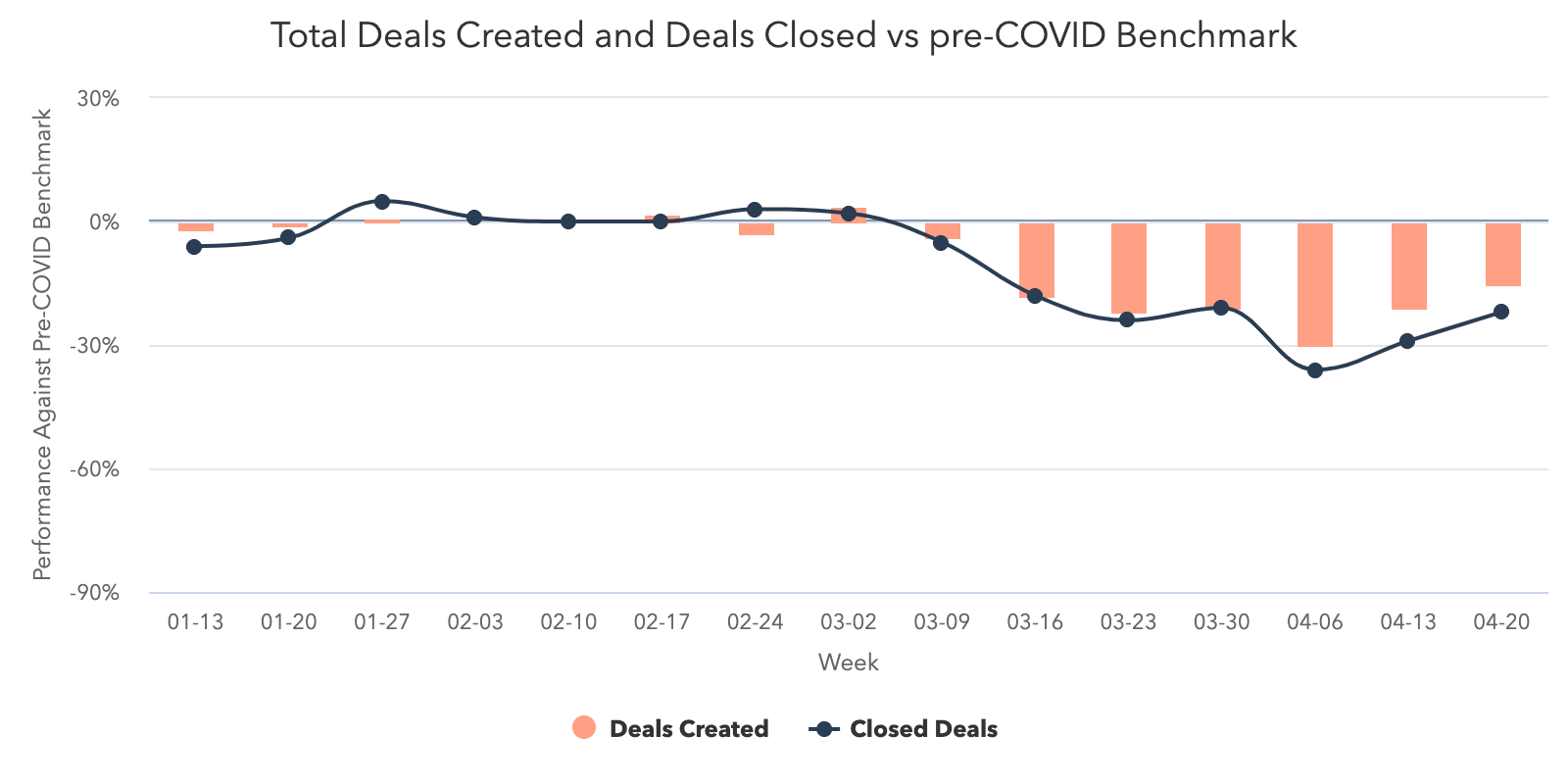
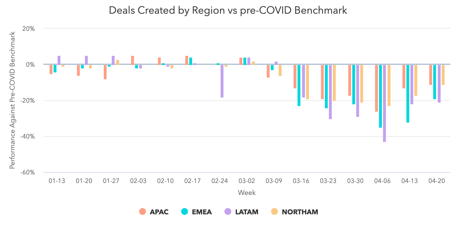
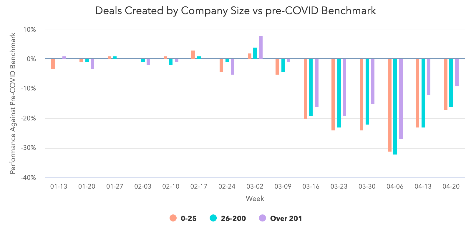
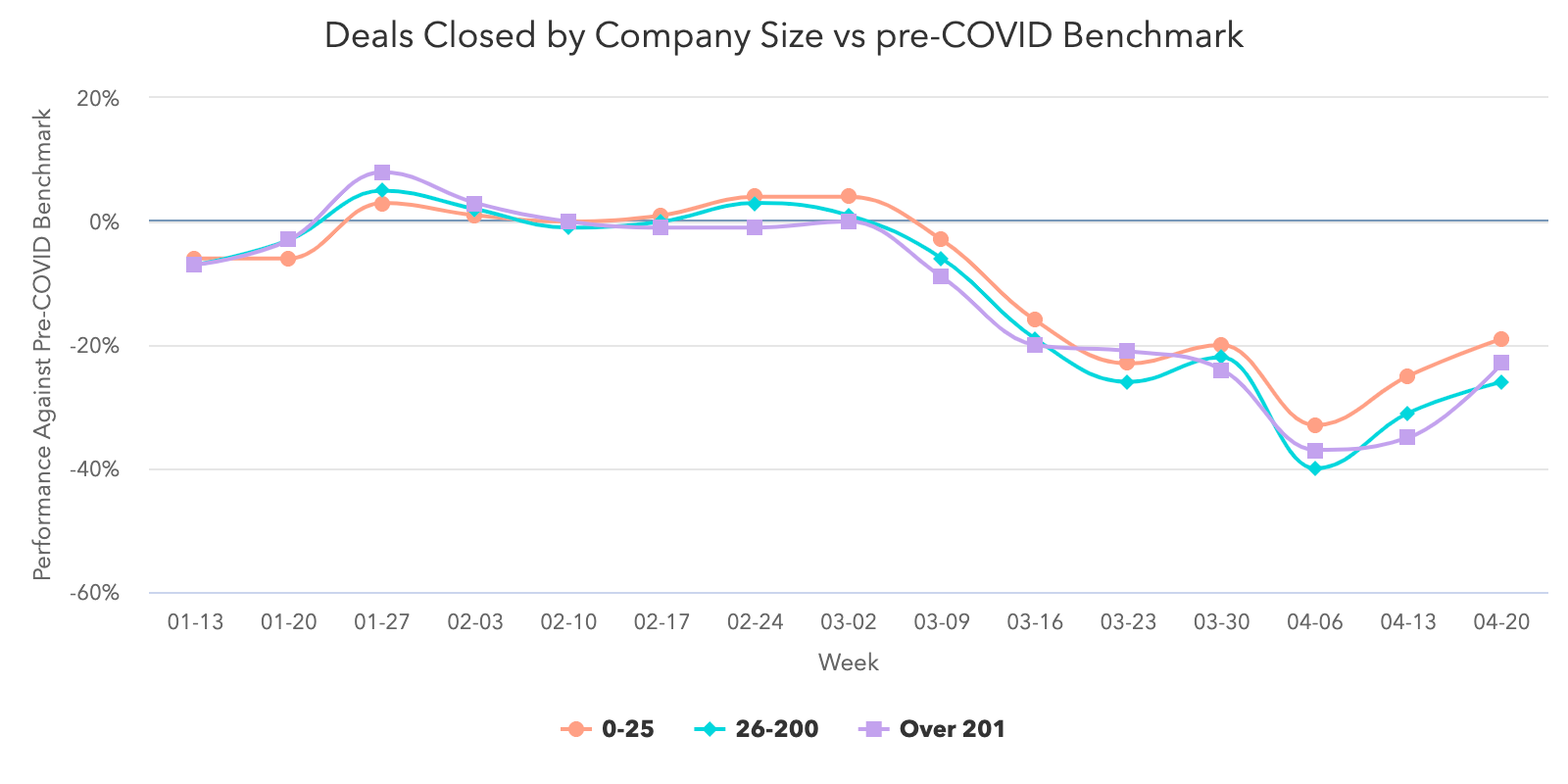
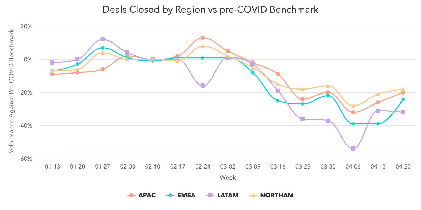
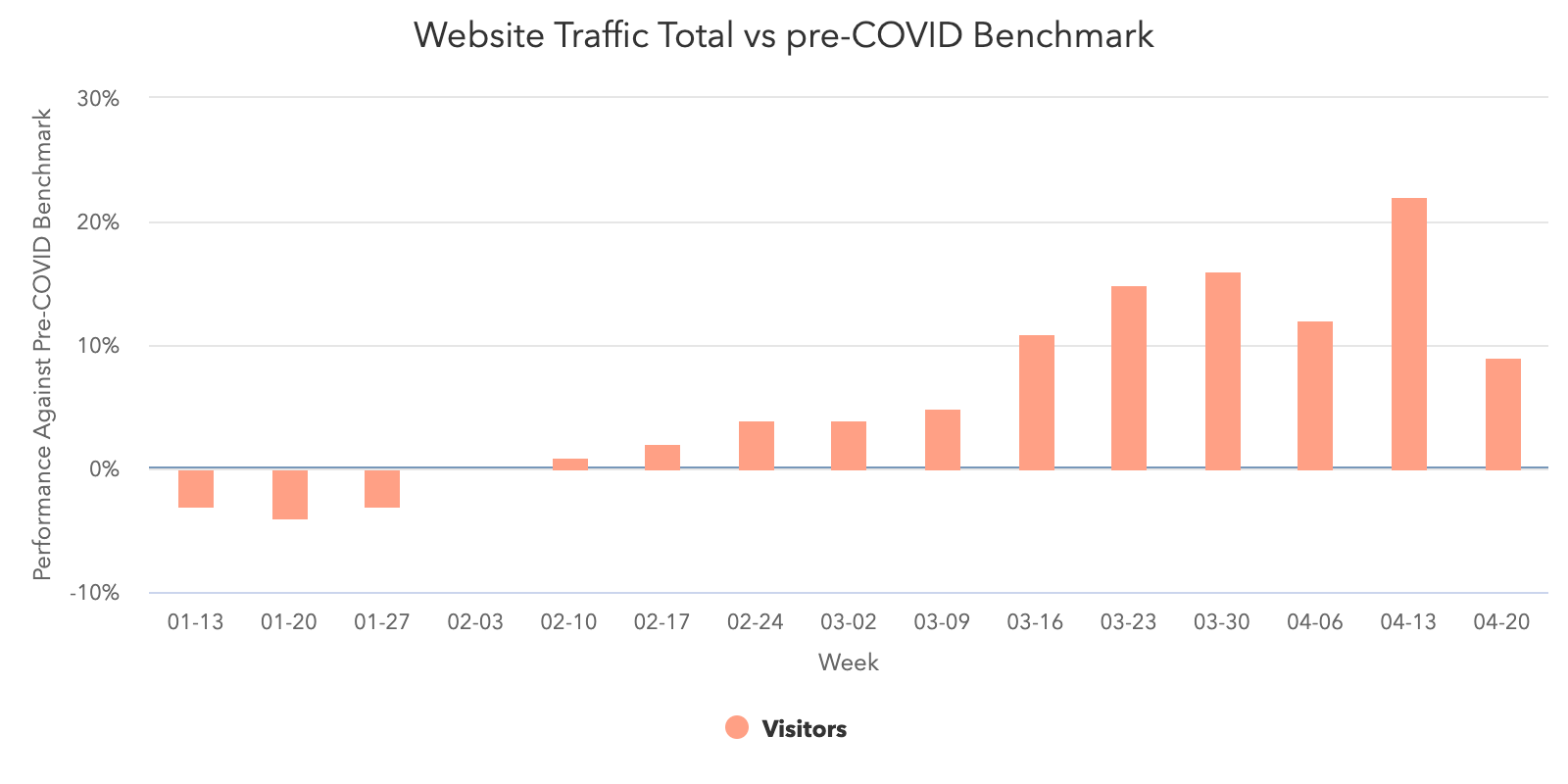
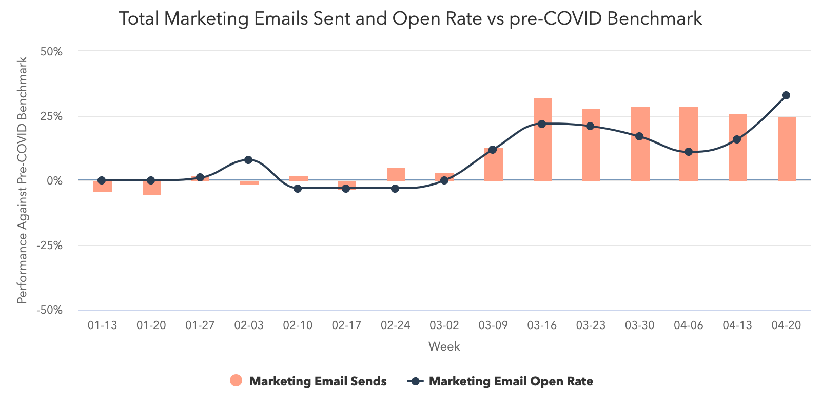
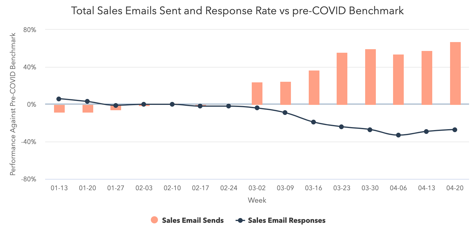
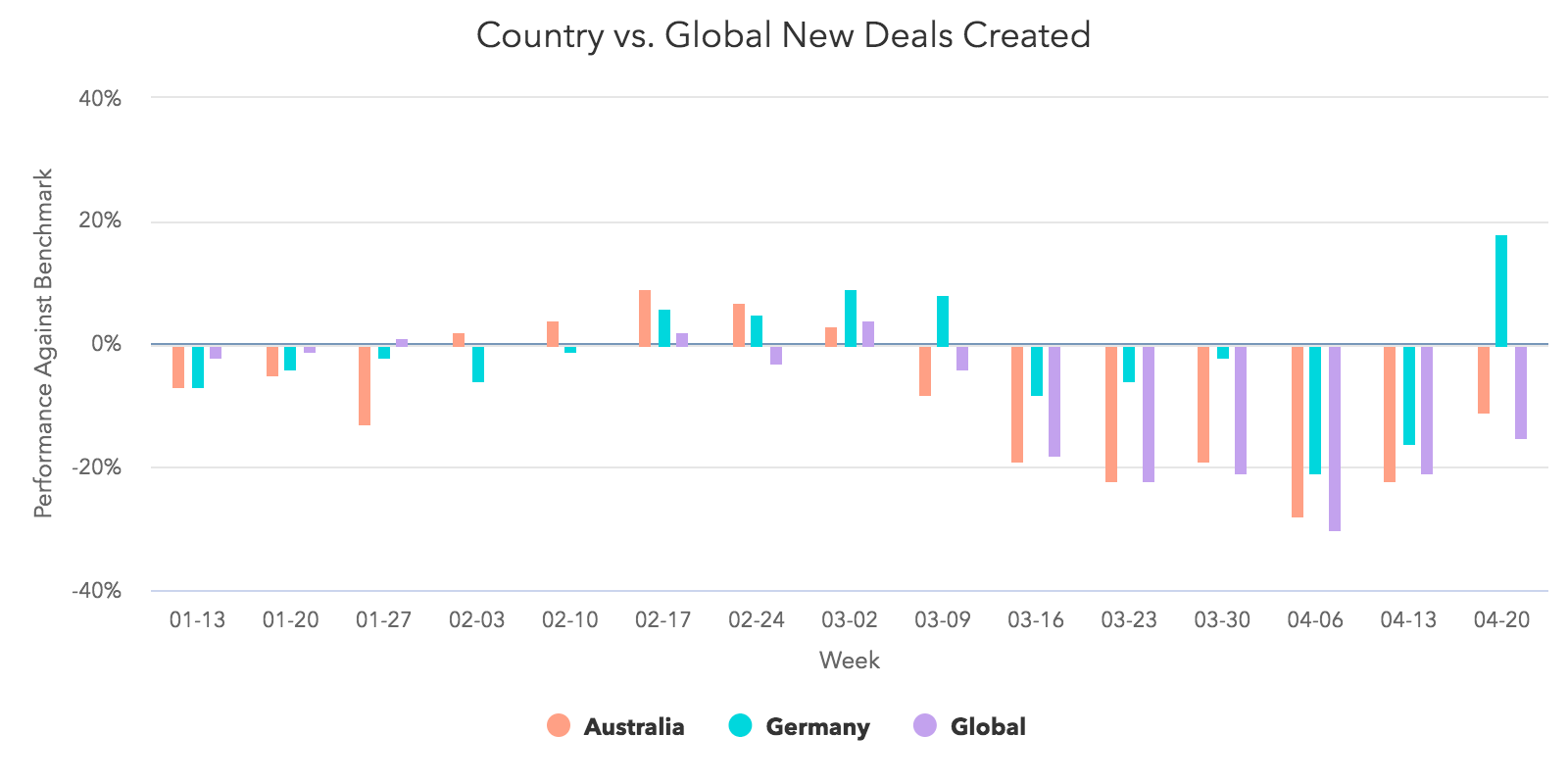
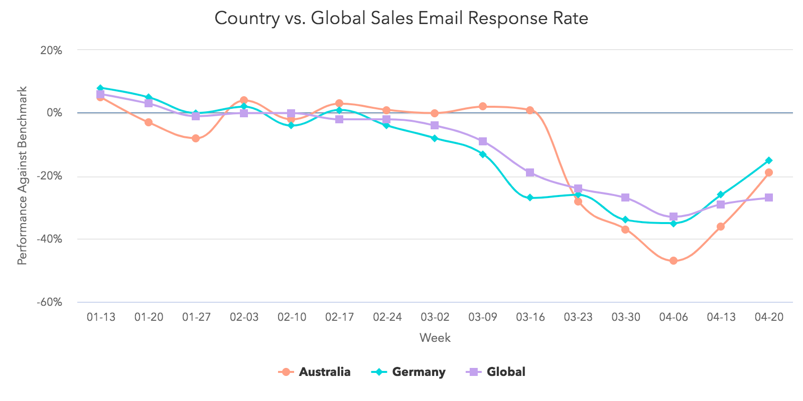

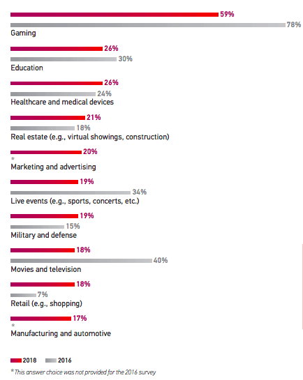

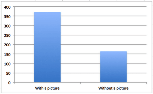
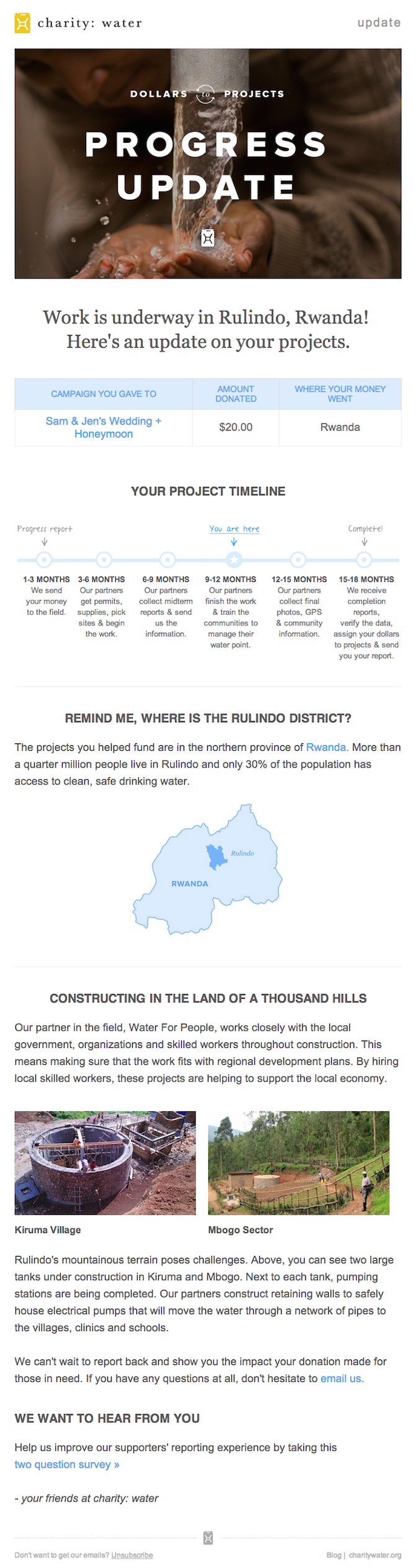


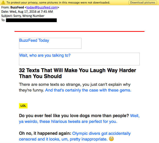
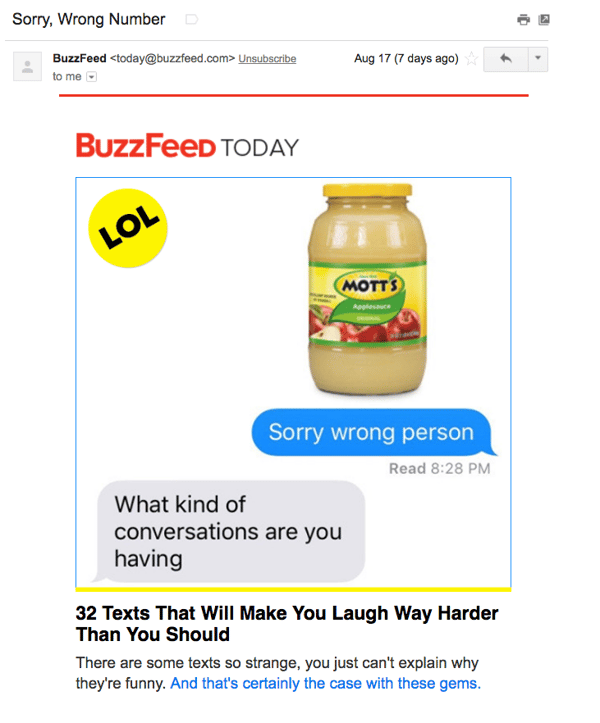

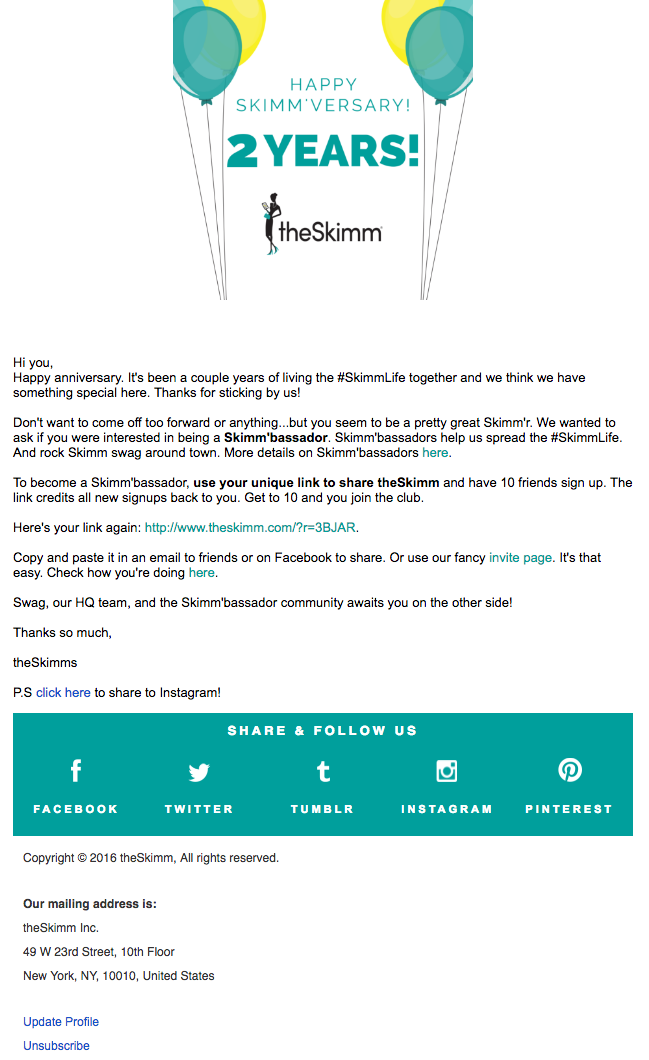
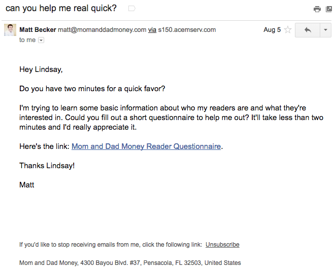
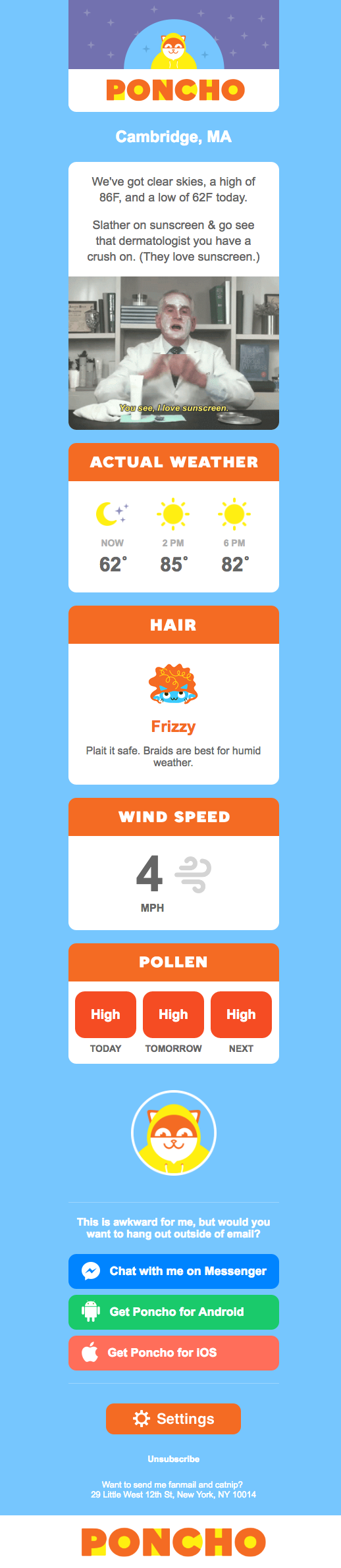
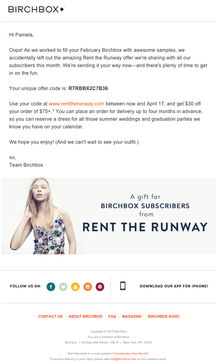

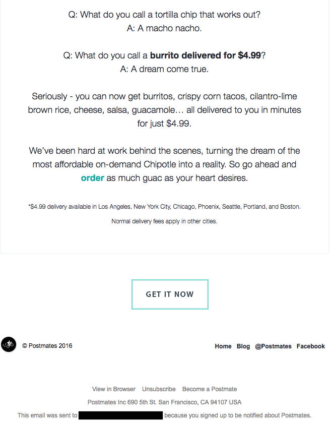
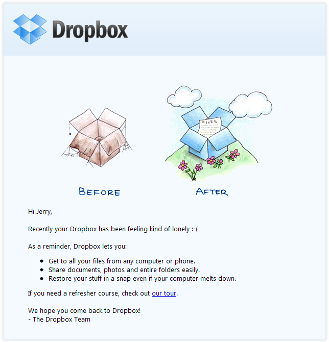

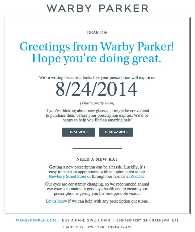
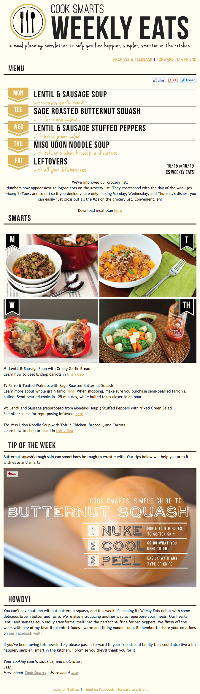
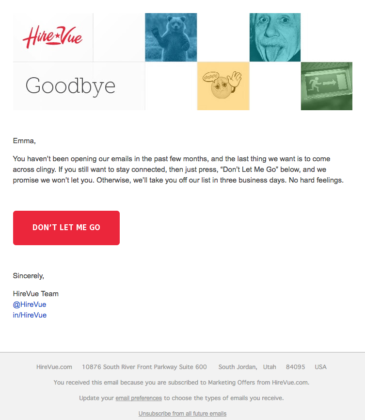
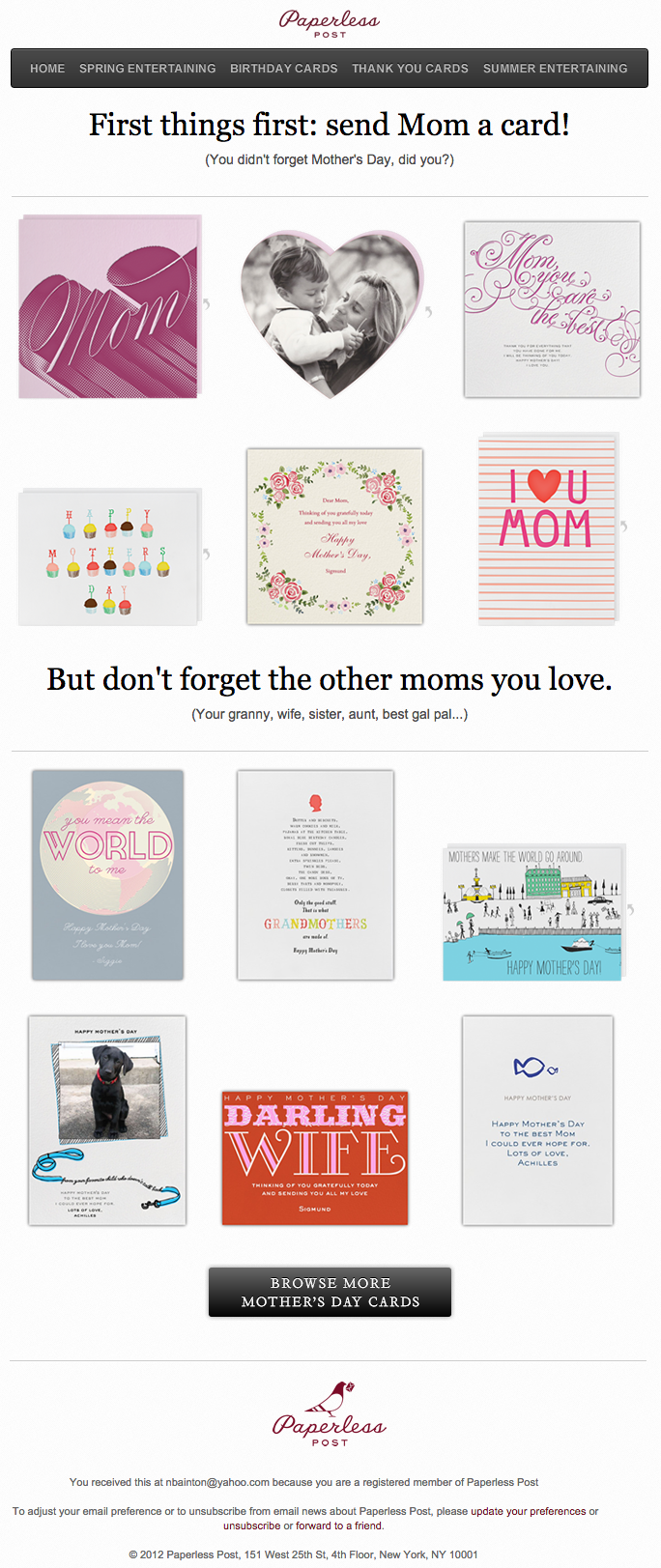
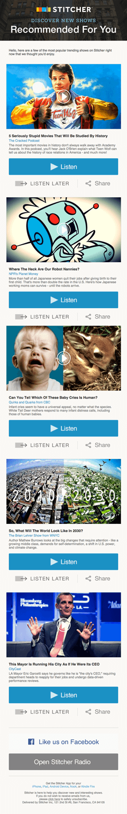
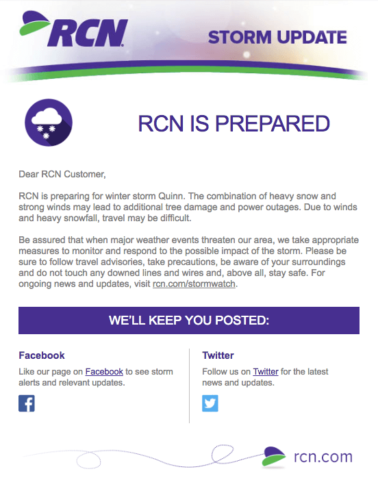
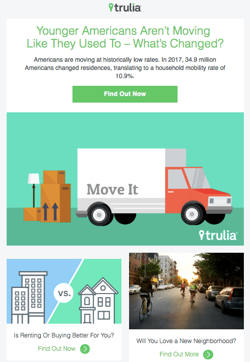
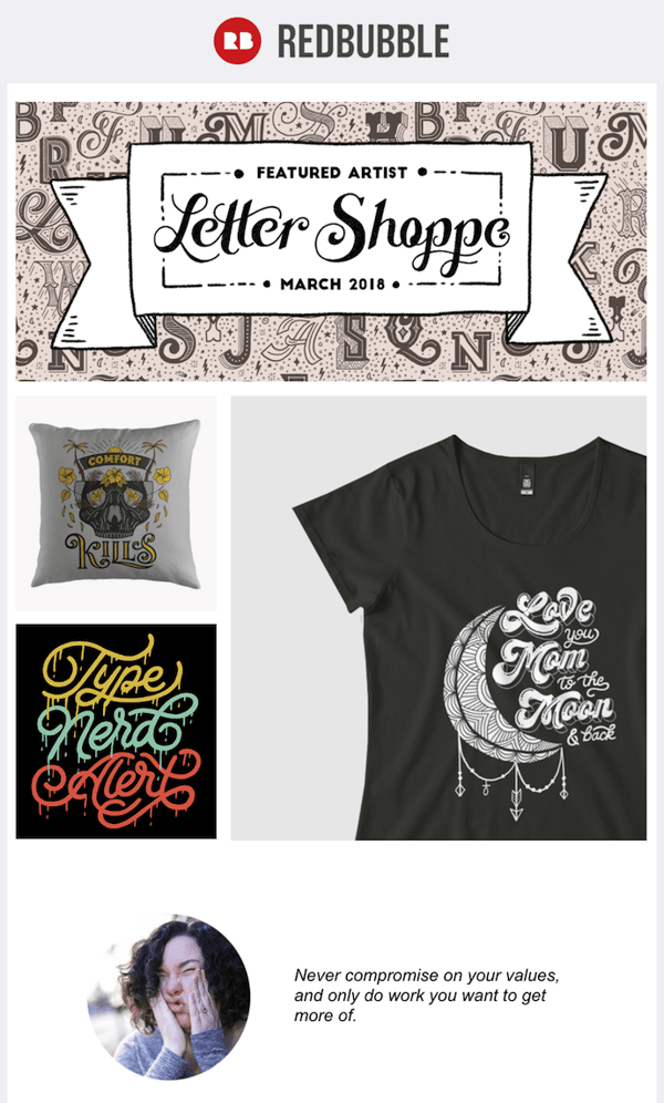


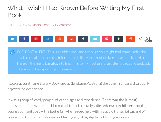
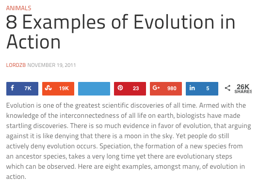
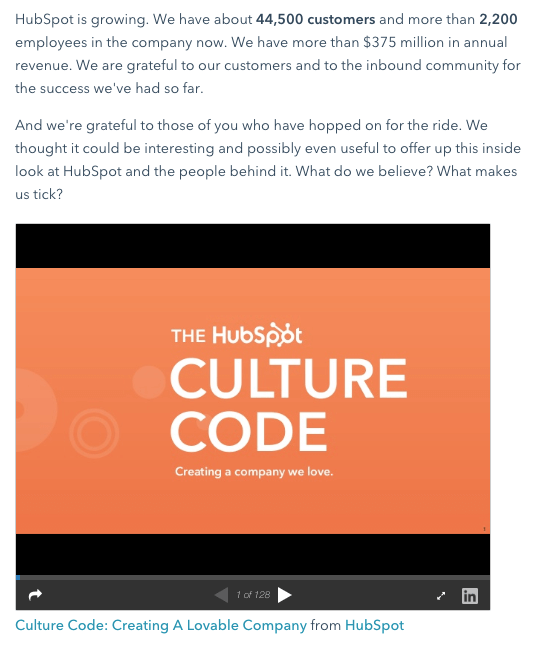


 RSS Feed
