|
Every once in a while, I'll come across a website that really draws me in. So, I found 32 of them to show you. These sites push the boundaries of what is known to be possible on the web. Whether it's the design aesthetic, usability, interactivity, sound design, or value that the site provides, each one is a masterpiece in its respective industry, and something to be inspired by. Not surprisingly, many organizations exist to highlight these sites and the contributions they make to the web. To help surface some of the most inspirational designs, I gathered 32 award-winners that have made their way through several key awards organizations — including Awwwards, UX Awards, The Webby Awards, SiteInspire, Best Website Gallery, and FWA. Click the links below to jump to a group of website designs that crushed it in the last several years:
Below this list, I also found six more websites whose homepage designs are just plain cool and worth learning from. As you browse through the list, know that each site excels in its own way and seeks to serve a unique purpose. While one site may be an excellent example of visual design, another may be an excellent example of interactivity. This means that not all of these sites may be "conversion machines" or blueprint ideas that you can easily copy over to your site. Rather, they're great ways to gain some website design inspiration and see the cutting-edge marketing that's happening in the different corners of the web. Best Website Designs
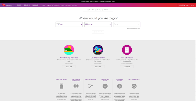
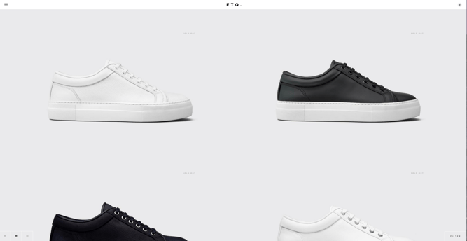
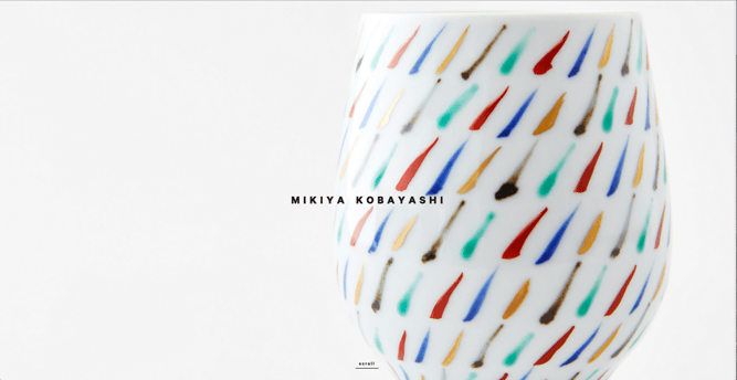
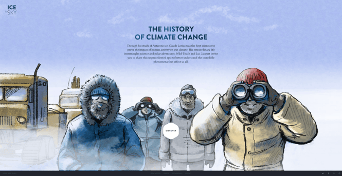
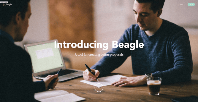
Beautiful Award-Winning WebsitesAnd the awards go to ... Best Website Designs from 2014 – 20151. Virgin AmericaAward: Most Significant Industry Evolution, 2014 UX AwardsIn a world where airline websites are known to be riddled with major usability issues, Virgin America has one of the best websites that pushes usability, accessibility, and responsive design forward. In fact, it's been named as the first truly responsive airline website, a new precedent in the industry. 2. FeedAward: Site of the Day (6/6/2015), AwwwardsNot only is Feed an interesting concept, but it also has a stunning execution that challenges our understanding of what is possible on the web. Through a creative blend of animation and video, the site immerses the user into a very engaging experience. As an atypical site, it contains several unique usability elements as well, including a navigation that doubles as a scroll progress bar. 3. ETQAward: Site of the Day (5/19/2015), AwwwardsETQ takes a very minimalistic approach to ecommerce with their stripped-down site with big, compelling visuals of their product. Simple, flat, color-based backgrounds accompanied by strong typography help to keep the focus on exactly what the user came there to see: shoes. 4. Mikiya KobayashiAward: Site of the Day (7/4/2015), AwwwardsMikiya is a Product Designer with a minimalistic portfolio that showcases his work through strong photography and subtle animations. His full site was originally created in Japanese and then translated into English, helping demonstrate the international scalability of his design. 5. The History of Climate ChangeAward: Site of the Day (6/23/2015), AwwwardsFollow the footsteps of Luc Jacquet as Wild-Touch takes you along this visual and educational journey about the history of global climate change. A mixture of historical media and unique animations help tell the story. 6. BeagleAward: Site of the Day (4/19/2015), Best Website GalleryBeagle does an exceptional job of visually and progressively telling the story of their product in a simple and easy-to-digest way. This is a major challenge for many startups, especially when they're introducing new concepts to existing markets. People want to know, "What is your product? How does it work? Why do I care?" Beagle answers all those questions while simultaneously showing off their product and compelling the user to purchase. Plus, they're one of few sites that actually implemented "scroll hijacking" correctly.
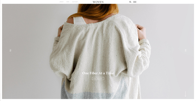
7. Woven MagazineAward: Site of the Day (4/4/2015), Best Website GalleryWoven is an online publication that celebrates artists, craftsmen, and makers alike. To me, they represent a confirmation that publications can (and should) have beautiful, engaging sites with easy-to-read content. Free of distractions like pop-ups and obtrusive ads, this site all about the experience of the content itself.
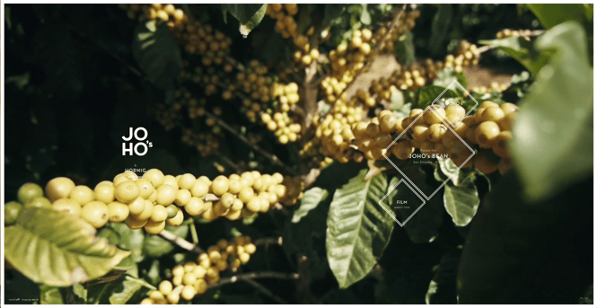
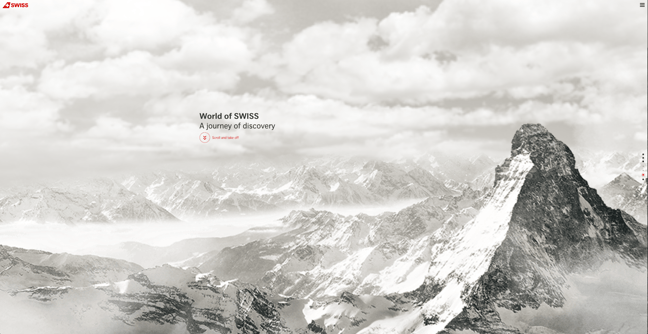
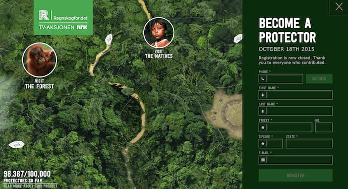
8. JOHO's BeanAward: FWA of the Day (8/7/2015), Favorite Website AwardsThe website for JOHO's Bean has incredible imagery, interactivity, story telling, visual design, and most of all, sound engineering. These all come together to create a compelling, emotional, and engaging site that tells the story of a coffee bean's journey. 9. World of SWISSAward: Best User Interface, 2015 Webby AwardsAnother airline?! What is happening?! Yep, SWISS airlines built an incredibly immersive site that tells their story and describes what it's like to fly with them -- and they simply did too great of a job to be ignored. Strong visuals and animations introduce the user to different sections of the site that are packed with information beyond the usual sales and marketing pitch that is so common today. Best Website Designs from 201610. Rainforest GuardiansAward: Best Activism Website, 2016 Webby AwardsRainforest Guardians became one of the most immersive nonprofit websites of 2016. Seeking to build awareness around deforestation, the site allows users to "visit" the various villages, natives, and waterways that make up the Amazon Rainforest. The site puts interactivity at the center of its user experience -- a wise choice if your goal is to get people to connect with your cause and convert into volunteers.
11. Protest SportswearAward: Site of the Year (2016), AwwwardsThe Awwwards calls Protest Sportswear a "shoppable look book," and that's exactly what this site is. As a clothing outfitter, this website has reinvented the way they market their product: Rather than promoting garments of clothing, Protest Sportswear promotes "looks." This makes the company's product the most appealing part of the website itself, using a collage of styles to design a homepage that changes as often as its customer's styles do.
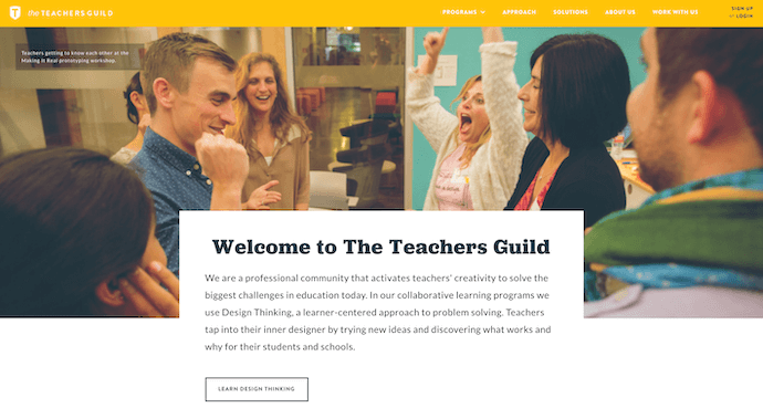
12. The Teacher's GuildAward: Best Association Website, 2016 Webby AwardsThe Teacher's Guild is a professional community of educators whose website publishes content that addresses today's most critical challenges in education. What makes this website award-winning is how it balances diverse content types -- programs, solutions, approaches, and collaborations -- without overwhelming its visitors. Not only are its background visuals prominently placed, but they also use white space to emphasize the written calls to action at the center, as shown in the screenshot below.
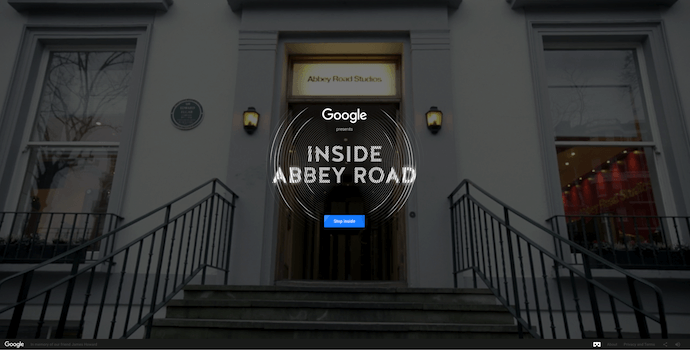
13. Inside Abbey Road
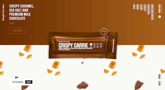
Award: Best Music Website, 2016 Webby AwardsGoogle knocked it out of the park with this highly interactive site, which allows users to step into the Abbey Road Studios. Brilliant sound design, navigation mechanics, and visuals mixed with the usual "Google flair" all help draw visitors in to this well-made web property. Best Website Designs from 201714. Simply ChocolateAward: Site of the Year (2017), AwwwardsYou'll get a craving for chocolate just looking at this website -- and in a way, that's Simply Chocolate's website working as designed. This appetizing website is that of a Denmark chocolate maker named Simply Chocolate. Its website uses a variety of colors (and creative product names) to promote each chocolate bar. And as you scroll from one product to the next, they all seem to remain consistent in brand. The three-dimensional appearance of each chocolate bar makes you feel like you can grab it off of your computer screen, while the "Add to Box" CTA to the top-left is ideally placed for users to select the products they want while browsing.
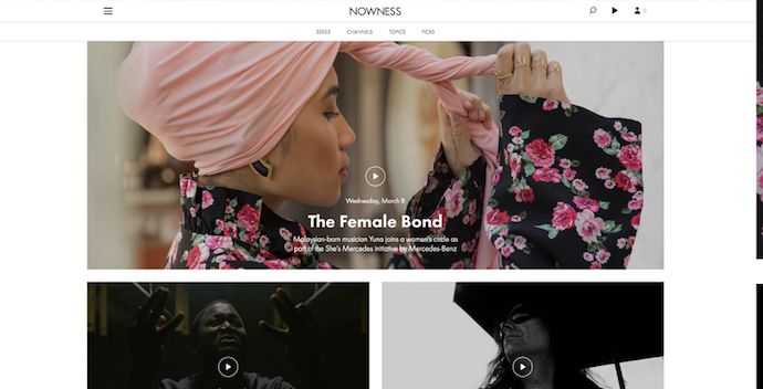
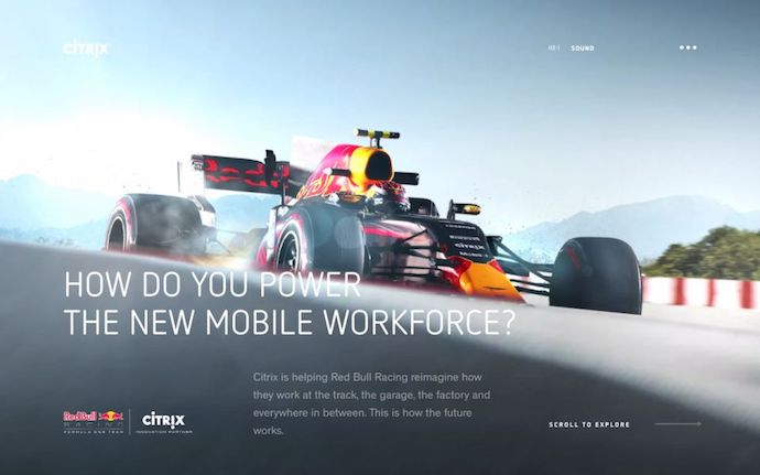
15. NOWNESSAward: Best Cultural Blog/Website, 2017 Webby AwardsNowness is perhaps the coolest crowdsourced video blog on the internet today. That was a mouthful ... what does all that mean? NOWNESS's "crowdsourced" nature is part of what makes it an award-winner. This means most of its content comes from independent creatives -- an increasingly popular way for businesses to publish content. NOWNESS is also a video blog, meaning all of its blog content is in video format. Together, these qualities help make Nowness a captivating hub for the stories that brands everywhere strive to tell. 16. Citrix: The New Mobile WorkforceAward: Site of the Day (11/23/2017), Best Website GalleryThis website -- dedicated to Red Bull's partnership with Citrix, a cloud-based software company -- is amazing. The New Mobile Workforce, a site owned by Citrix, uses panoramic photography to show visitors how Citrix is supporting Red Bull Racing's new race car. Even if you're not a car-racing enthusiast, the website's clever animations to explain a complicated automotive technology are hard to ignore.
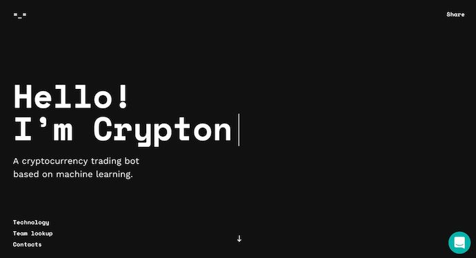
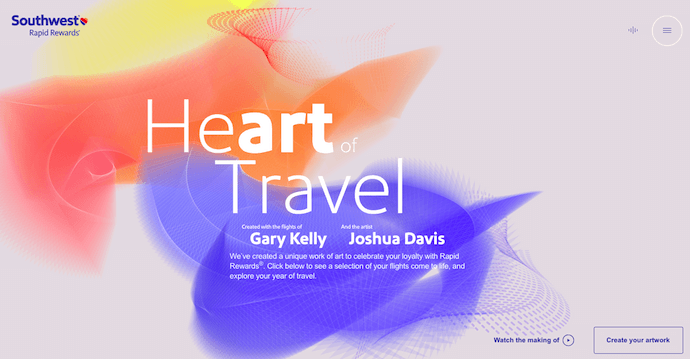
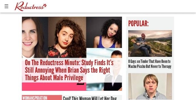
Best Website Designs from 201817. crypton.tradingAward: Site of the Day (4/3/2018), AwwwardsMeet crypton.trading, your robot accountant. Crypton.trading is a trading hub for cryptocurrencies such as Bitcoin, using artificial intelligence to predict changes in a currency's value and identify key buying and selling opportunities. The website was rated high for its development and design, as it gradually explains more of the developer's methods the further down visitors scroll. This award-winning website makes tech-savvy visitors feel right at home the moment Crypton's greeting appears across the homepage, one letter at a time. 18. Southwest: Heart of TravelAward: Best Visual Design - Aesthetic, 2018 Webby AwardsWhen Southwest Airlines wanted to prove its customers were "more than just a dollar sign," the company created a website whose design was assembled using the shapes of their customers' flightpaths. The website, called Heart of Travel, even allows visitors to create their own artwork out of a trip they might plan on taking. In this way, Southwest's website is a product of their most loyal passengers. 19. ReductressAward: Best Humor Website, 2018 Webby AwardsIt's not that hard to make someone laugh on the internet; so much of what we read and consume online is meant to be entertaining. But it is hard to do it consistently for a large audience. Reductress is a satirical magazine whose headlines and general reading experience are top-tier in the humor department -- making the website itself a quality property. 20. OverflowAward: Site of the Day (3/20/2018), Best Website GalleryOverflow is a design tool that allows people and businesses to create story-like flow diagrams of their ideas so they're easier for others to understand. Aside from this being just a good service, the Overflow website practices what it preaches: Along with vibrant red call-to-action buttons for downloading the tool, this website promotes its product the best way it knows how -- using a flow diagram. The website delivers this flow diagram in the form of a video. And while embedded videos can look rather clunky sitting in the middle of a website's other design elements, Overflow's is perfectly placed and exactly what you'd want to see when landing on the site for the first time.
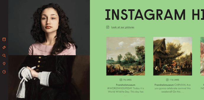
Featured by Best Website Gallery 21. Frans Hals MuseumAward: Site of the Year (2018), AwwwardsIt can be tough for a museum, whose brand is predicated on a variety of incredible artwork, to bring it all together on a cohesive website. That's what makes the website of the Frans Hals Museum so impressive. Located in the Netherlands, this museum has created a website that uses a combination of digital design elements and its own exhibits. This mixture helps visitors understand what they'll see, when they can see it, and where else they can get a taste of what this museum has to offer. Speaking of the latter, the museum promotes its Instagram account directly on its homepage -- a brilliant move for a museum looking to expand its audience across its online channels.
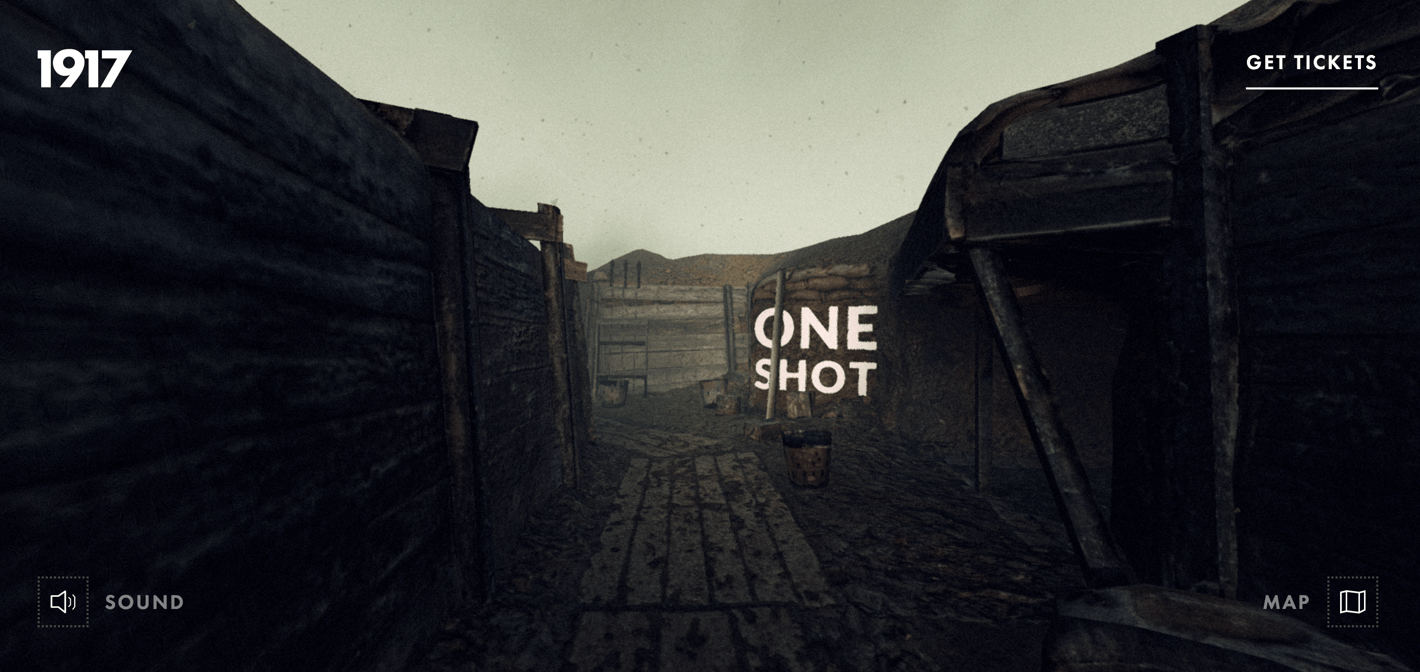
Award-Winning Designs of 201922. 1917: In the TrenchesAward: Awwwards' Best Website of the DayThis website, made to promote the film 1917, allows you to walk around the trenches and perform the same mission that the characters did in the film. You can also see their maps or access other tools. This is a great example of a site that. went above and beyond with interactivity as well as a site that leverages its own content and prewritten storyline to market its film. This website won Site of the Day by Awwwards which allows designers to vote and nominate great website's they see daily.
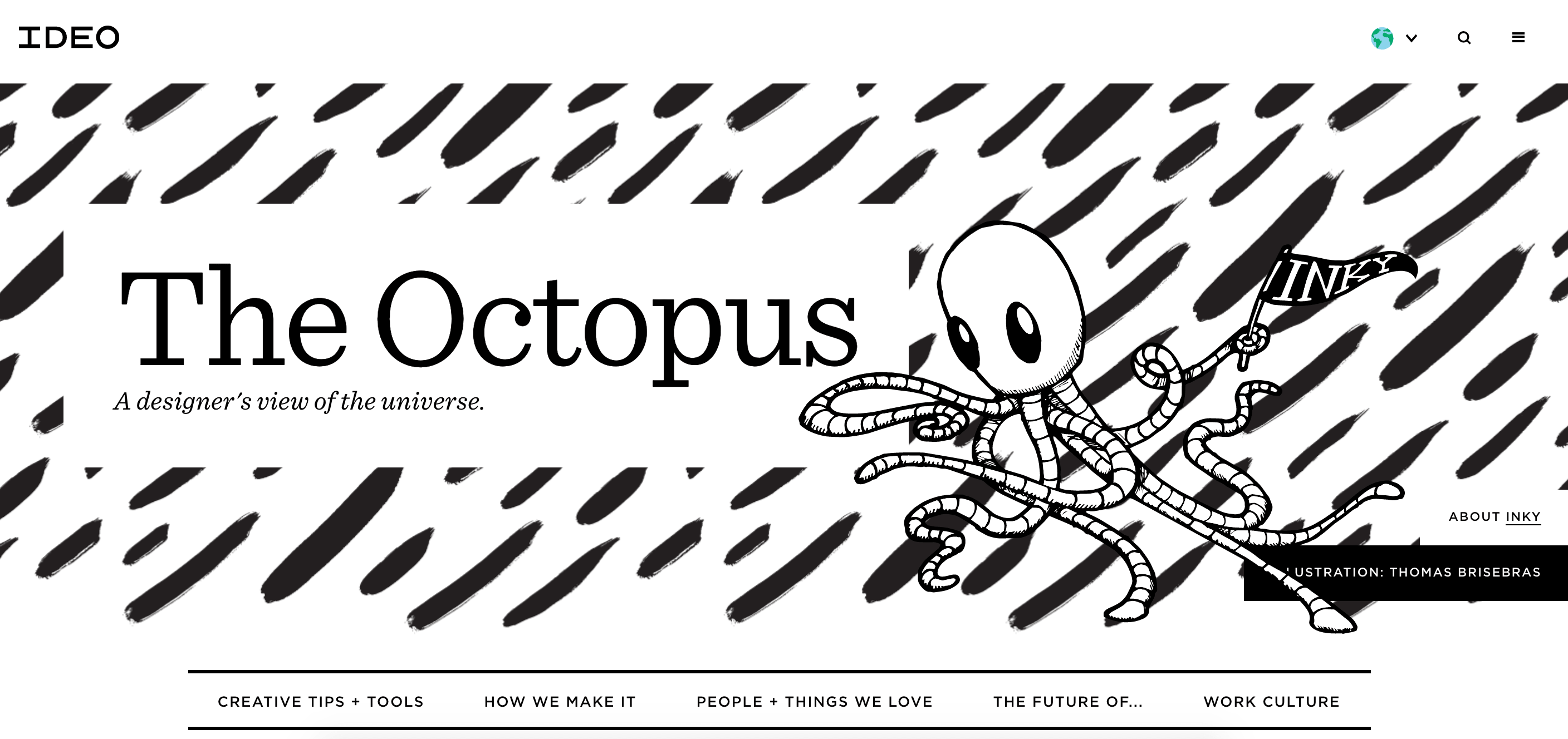
23. The Octopus: A design blog by IDEOAward: Business Blog/Website 2019 Webby awardIDEO, a global design company, won the Business Blog/Website 2019 Webby award for its Octopus blog, and for good reason. The blog features a sleek, black-and-white Octopus drawing as its homepage design, and uses yellow, black, and white to create a cohesive theme as you scroll. If you hover over a blog post, the title is highlighted in yellow, and if you hover over an image, the image is pulled towards you — two small features that make a big difference in terms of creating a unique and engaging user experience.
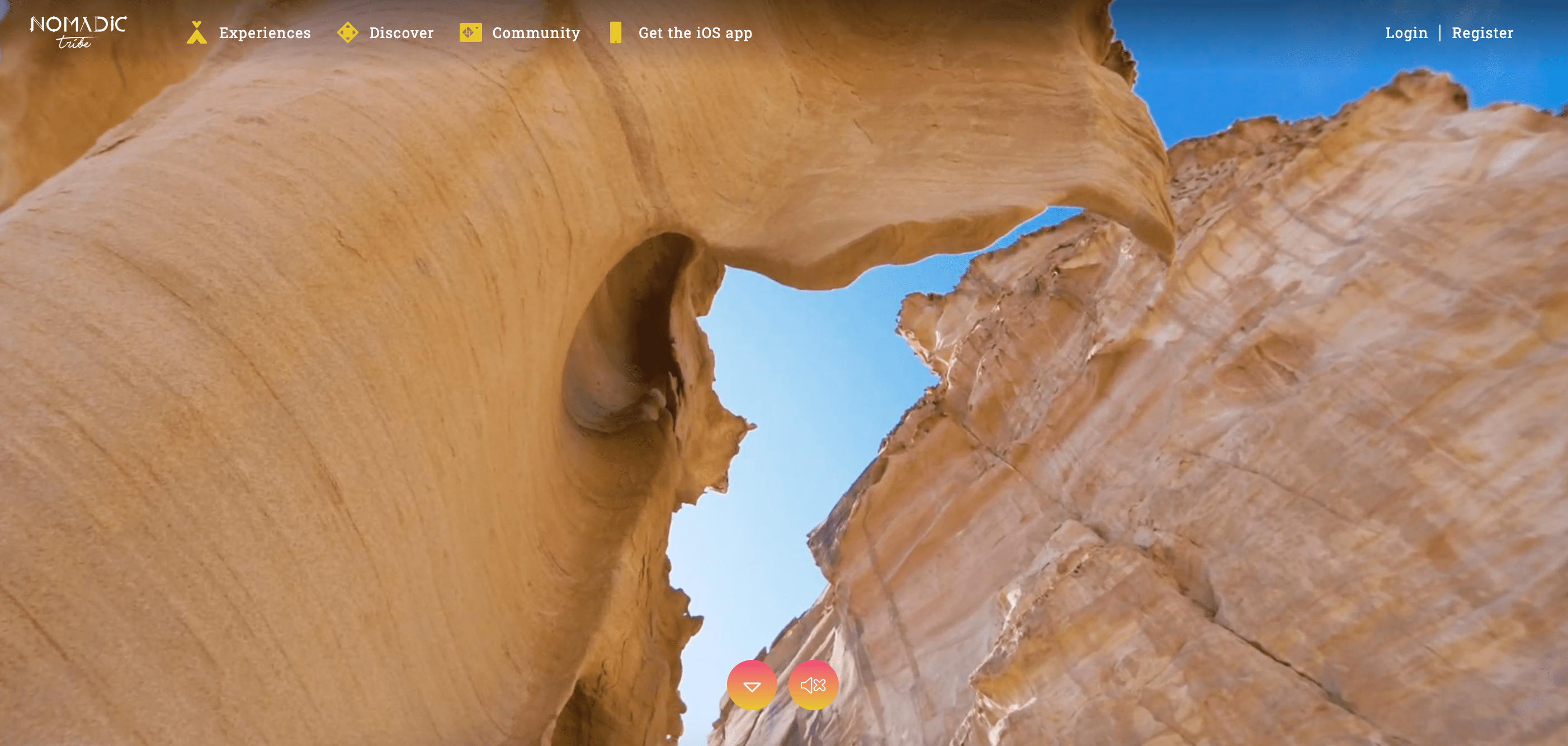
24. Nomadic TribeAward: Awwwards' Site of the Year nominationThis site, which was nominated for Awwards' Site of the Year, is one of the more engaging sites I've seen. The homepage immediately begins playing a stunning video featuring a man walking across a desert, followed by gorgeous landscape scenes and text like, "Are you lucky enough to call yourself an adventurer?". The text throughout the website is playful, with colorful pinks and oranges and yellows, and the homepage is logically designed, with CTAs placed throughout that range in commitment-level from "Read More" to "Watch Now" and, finally, "Download the App". Ultimately, the website is beautifully designed with a strong attention to detail, and tells a compelling story throughout.
25. Diana DanieliAward: Webby 2019This 2019 Webby winning site shows off imagery of art and architecture with either high contrast or heavy exposure. As a website visitor, you can click and drag your mouse to change the photos and variations. Each image shows a piece of work that highlights the artist who owns the website.
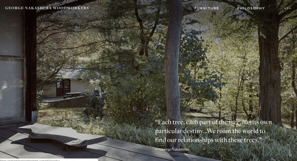
26.George Nakashima WoodworkersAward: Webby 2019This woodworking website emphasizes nature and care for the woodworking trade. It's essentially a slide show of beautiful forestry and farming images. As a new image comes on to the screen, a new quote related to wood or trees also comes up. This is incredibly relaxing to the visitor and shows that the woodworkers recognize the beauty of trees and the environment. This website also won a Webbie in 2019.
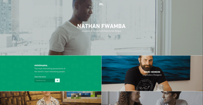
Other Cool Website Designs27. MinimumsMinimums takes a very bold approach to the way that they display their content, leveraging a grid-based website design, big typography, and full-width, high-quality images. Their site serves as a really nice example for how to properly execute a grid structure while still maintaining a nice visual hierarchy in the design.
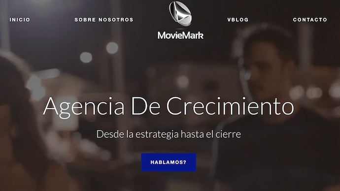
28. MovieMarkMovieMark is a growth marketing agency and HubSpot Partner, whose website is covered head to toe in the service it offers: digital storytelling. Located in Colombia, the agency makes video a core focus of its brand, so it's only fitting that MovieMark's website follows this theme. And oh, how visually pleasing the videos on its website are ...
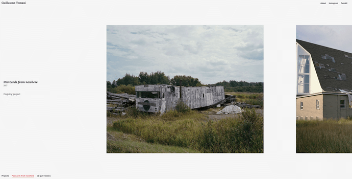
29. Guillaume TomasiAs a Photographer in Montreal, Guillaume Tomasi has built a portfolio that's truly fit to house his unique and awe-inspiring photography. His surreal photo style is juxtaposed by his simple, flat, empty, and minimalistic portfolio design that places all of the focus on the work itself. His unique series navigation coupled with art-gallery-inspired work introductions and perfect scrolling interactions yield an experience reminiscent of that of a real gallery.
|

Joseph Ashley
Juice is a drink made from the extraction or pressing of the natural liquid contained in fruit and vegetables. It can also refer to liquids that are flavored with concentrate or other biological food sources, such as meat or seafood, such as clam juice. Archives
February 2021
Categories |
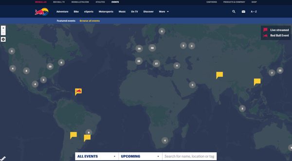
 Featured by The Webby Awards
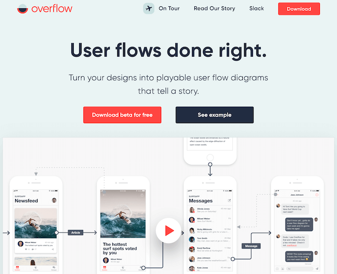
 30
30

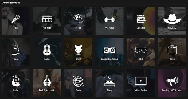 It's one thing to select a genre of music to listen to -- it's another thing to select a "mood" to listen to. The screenshot above is part of Spotify's "Browse" page, where you can listen not just to "country" and "hip-hop," but also music that caters to your "workout" or "sleep" preferences.


 RSS Feed
