|
In 2019, Google began rolling out what is arguably one of the most significant changes to its search engine since the introduction of dedicated video carousels in June 2018, or the introduction of featured snippets in October 2017: Google has begun to ad podcasts to search results. Every minor tweak to the search algorithm can have marketers scrambling to understand how they can take advantage of this shift — or, for the more pessimistic, how to avoid getting pushed to the dreaded page two of search results. Adding the podcast to search results is going to affect content creators, SEO specialists, marketers, and perhaps most importantly, it will also likely have a major impact on podcasts. In this post, we'll explore how to take advantage of the advent of audio SEO. Then we'll dive into how you can create high-quality audio from home, if you're creating a podcast remotely. But before we dive into how marketers can create SEO-friendly audio content, let's look at the primary problem Google is solving by indexing all podcast content. The History of Podcasts Discoverability ProblemIf you do any reading on the podcast industry, you will find endless articles lamenting "the discoverability problem" of podcasts. When people talk about the discoverability problem they're not referring to being able to find a podcast they've already heard of — instead, they're talking about how difficult it is to discover new, unheard-of shows. For the majority of podcasting, there has been one primary mechanism for discovering new shows: the iTunes Charts. The vast majority of podcast downloads occurs on iTunes. Despite Android commanding ~75% of smartphone ownership, iTunes commands the vast majority of podcast downloads. As Google's PM for Podcast Zach Reneau-Wedeen notes: "It's actually so egregious that on a device-by-device basis, the average iPhone listens to over ten times more podcasting than the average Android." Due to Apple's outsized command of podcast downloads, their charts have played a critical role in helping new shows gain traction. As a quick overview, the iTunes podcast section has Top 100 charts based on regions. There are charts for the top shows, charts for the top episodes, and then a whole collection of categories and sub-category charts such as Top 100 Business Shows. These charts are algorithmically generated. iTunes also has a hand-curated list such as "New & Noteworthy" where they can promote interesting new shows that have yet to gain a massive following. Beyond these charts, many podcasts are discovered through word-of-mouth or social media. The problem with Apple's system for discovering new podcasts is the shows that tend to get traction on the charts are the ones that already have built-in audiences. This is why you tend to see New & Noteworthy being filled with shows from reputable publishers. The one area that has never been particularly effective for finding a new podcast has been search. In 2018, Google set out to change that. Google's Quest to Fix Podcast DiscoverabilityWith over 700,000 podcasts out there, millions of episodes and even more hours of content, podcast are a set of data that Google can help people sift through. However, Google is not only trying to make it easier to find podcasts — they’re also trying to rapidly grow the number of people listening to podcasts. As Google Podcasts Product Manager Zack Reneau-Wedeen notes, "Our team's mission is to help double the amount of podcast listening in the world over the next couple years." Google’s approach to solving discoverability is two-fold: 1) make podcast discoverable via search, and 2) enable new content creators who have traditionally been excluded from the podcast world to develop new shows and attract new audiences. Here's what Google has done to help fix podcast discoverability:
Looking at Google's new smartphone, the Pixel 4's recorder app, you can see how incredibly good big G has gotten at transcribing voices. It makes sense, considering they have tons of data from YouTube videos, Google Home products, and all Android phones. There is no company better positioned to digest massive amounts of audio data than Google. So now that they have all of this data on podcasts, let's explore how they've begun to integrate it into search results. Google Adds Podcast to Search ResultsAs of writing this, the majority of search results that involve podcasts require the word 'podcast' to be in the search query. We are seeing podcast appear in two ways. Broad Category Search aka Popular on the Web: When you search a broad topic like "business podcast", shows will show up in a carousel at the top. Clicking on these results will simply open a new search for the name of the show. 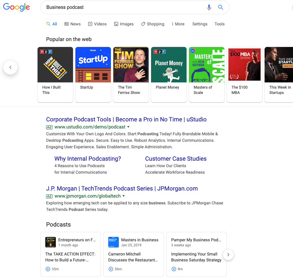 Searching for an Answer: When you're looking for a more specific answer and include the word "podcast" you will find a Podcast Carousel. The carousel appears to give weight to the title of the show, then the episode title, show description, and finally the actual content of the episode. In the example below, you can see a mix of shows that either including something about home building in the show, or in the episode title. 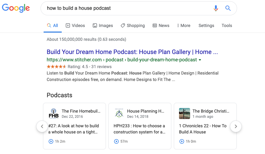 The "Popular from the Web" and podcast carousels are the two mechanisms for how Google is surfacing podcasts into search results. In terms of real estate, both these carousels occupy top positions in the SERPs. HubSpot's SEO strategist Aja Frost explains what the addition of podcasts will mean: "This will definitely have an impact on SEO." Frost says, "Search is a zero-sum game — there's a set amount of space on the SERP, so every new search feature, like a podcast carousel, means there's less space for the traditional blue links." Every marketer who cares about their position on Google should be interested in how to get their content into these coveted carousels. What types of shows will do well?In this new world of audio SEO who will be the winners? Here are some characteristics of shows we feel will do well:
Looking forward in time, we also expect shows with segments to do particularly well. We're in the early stages of audio SEO, but we know that Google has already transcribed the content of the episode. Shows that take one topic and then have particular segments that align to the overarching search term will likely perform well. For example, let's say our episode is about digital advertising. We might have a segment for each show called "Overview", where the host uses a search-friendly phrase like "Now we’re going to provide an overview of digital advertising on LinkedIn." Then, another episode might have the same "Overview" segment, and the host might say something like "Now, we’re going to provide an overview of digital advertising on Facebook." We believe show segments will help surface podcasts to page one of Google. Optimizing HubSpot's Podcast for SEOWe have officially relaunched our educational podcast Skill Up. The first season of Skill Up focused on SEO and had in-depth conversations with our SEO expert, Matt Barby. There were eight episodes averaging over 40 minutes long. For the new run of Skill Up, we intend to take a different approach. We're creating seasons based on specific topics which we identify as relevant to our core business and have high search volume. Episodes will be much shorter, averaging ~10 minutes per episode. Additionally, individual episodes will include segments where the host mentions key phrases. Finally, we are moving away from an interview format — instead, we want our Skill Up host to act as more of a narrator to the content. By focusing the content of each season around a specific topic, we're doing right by the listener by providing interesting bite-sized content that is easy to consume. We're also doing right by the search engines by making titles simple, descriptions keyword-rich, and integrating segments within the episode that makes it easier for search engines to identify parts of the episode. A Word of CautionPodcasts have evolved alongside but independent of search, social media, YouTube, and blogging. The success of podcasting today is built upon the backs of hard-working creators that have strived to make amazing shows that develop loyal followings. Podcasts have not become successful through growth hacking, newsjacking, or search engine optimization. Keyword stuffing a low-quality show that does not inspire listeners to subscribe is a recipe for failure. No matter what changes Google makes to their algorithm, better content will ultimately rise to the top. Above all else, remember you make shows for the listener, not Google's web-crawler. Next, let's dive into how you might create a high-quality podcast from your living room. How to Create a Podcast From Home2020 hasn't exactly gone as planned, which likely means your company has pivoted to remote work for the foreseeable future. If your company has a podcast, your team is likely recording podcast episodes from home. For most producers, that means calling guests via Zoom to interview them. But that's probably not the best way to do it. That’s not to say a Zoom recording won’t work out well in a pinch. But to put it into baking terms, a Zoom recording is the panko crust. Great for texture, not worth a meal.
Traditionally, high-quality recordings were done through tape syncs — booking local audio producers to record your guests in-person. Once you had your host and guest's respective tracks, you'd sync the two together to make it sound like they were in the same room all along. Magic. In this time of social distancing, however, it’s not safe to tape sync. What you need is to have your guests self-sync. Here, let's dive into the best practices you can use to create high-quality audio from home. How to Self-Sync AudioFortunately, it's easy enough to record high-quality audio within your own home. Whether your team is working from home temporarily or you're an entrepreneur aiming to create your own podcast from home permanently, you can follow these instructions to ensure your podcast is top-notch. Note: To ensure you have backup audio, you'll want to call your guest on Zoom and record through Zoom's software. To self-sync, your guest will need three basics: a laptop, headphones, and a cell phone. They can always swap the laptop for an iPad or a second phone. With those in hand, here’s the walkthrough list I send to every guest ahead of appearing on our The Growth Show podcast: 1. Use your laptop for the Zoom call 2. Plug in headphones to your laptop 3. Take one headphone out of your ear, leaving the other in 4. Turn down the volume of your headphones/laptop 5. Put your phone on Airplane Mode — or cell data turned off 6. Open the Voice Memo app on your phone (or Google Keep if you have Android) 7. Hit record in voice memo app & turn off screen 8. Put the phone to your non-headphone ear — like talking on a normal phone call After the interview, you’ll need your guest to email you the audio file they recorded on their phone. This will act as your clean copy, and your Zoom will work as the backup. All that’s left is to sync the phone recording with your host’s track. Go ahead and dub yourself a wizard, because you just made magic. One More OptionAnother option is to record your guests through Zencastr — a cloud-based software that records guests locally through their computer's built-in microphone. All it takes is a simple share of a link and you're all set up. Your guests will still need an external microphone to get the highest-quality. Otherwise, welcome to the wide world of room noise. There’s only so much you can do to fix it in post. Ultimately, no set-up is perfect. And sound quality aside, the last thing you want is to re-record an entire interview. That's the stuff of nightmares. What's most important is that you do your best to record a clean track, making sure to always have a backup in place. That way, when chaos inevitably reigns, there's always a second option. To learn more about successful podcast creation, check out The Anatomy of a Perfect Podcast Episode, According to HubSpot's Podcast Expert. [Read More ...] from https://blog.hubspot.com/marketing/designing-a-podcast-for-audio-seo
0 Comments
Email marketing is an undeniably powerful strategy for lead acquisition and customer retention — in fact, 59% of marketers say email is their biggest source of ROI, and 93% use email as a major channel for content distribution. Of course, creating an email marketing campaign isn't easy, and it might require you to build a template using HTML so you're not designing and altering every new email from scratch. Thankfully, there are dozens of email template builders available, all of which can help you intuitively and quickly create new email templates for your upcoming campaigns. Then again, the fact that there are dozens of tools available can pose a challenge — how are you supposed to know which template builder will best suit your needs? Fortunately, you're in luck. We've done the homework for you, compiling a list of our 13 favorite email template builders, complete with pricing, screenshots, and a general overview of each app's unique features. Keep reading to choose the best email template builder for your company. But first — why do you need an email template builder, anyway? Why You Need an Email Template BuilderEmail marketing remains one of the highest-ROI marketing strategies, in part because of how easy and inexpensive it is to create a campaign, but if you're designing and sending emails on a frequent basis, you'll need additional support to work efficiently—and maximize your results. An email template builder grants you several advantages:
Additionally, depending on the email template builder you're using, you may have access to even more features. Let's dive into some of the best builders, next. The Best Email Template Builders1. HubSpotHubSpot offers a comprehensive, start-to-finish solution for all your marketing needs. You can create a sleek, on-brand email campaign using HubSpot's drag-and-drop editor, and customize the template to match your brand and align with your goals. Additionally, you can customize each email depending on your recipient's lifecycle stage, list membership, or any information in their contact records to ensure each email is designed for optimal conversions. Best of all, the email tool provides top-notch analytics and A/B testing tools so you can continue to refine your marketing strategy over time.  Unique Features
PricingYou can get started with HubSpot's email tool for free. Alternatively, if you're already a HubSpot customer (professional or enterprise), the email tool is already included. 2. MailChimpMailChimp is one of the top names in email marketing, in part because of its accessibility. It's super easy to learn and build your first few email templates, and you can get started right now with a free plan. As you scale your business, you'll find additional options, features, and tools for your needs.
Unique Features
PricingMailChimp offers a free plan that provides basic templates, marketing CRM, surveys, and even website creation. At $9.99 per month, you'll get additional support, custom branding, A/B testing, and all email templates. To get access to custom templates, retargeting ads, and better audience insights, you'll need the Standard plan at $14.99 per month. Advanced plans, including a Premium tier at $299.00 per month, are also available, and offer features like advanced segmentation, multivariate testing, and more. 3. BEE FreeBEE Free is a free online email editor that has been used by more than a million people. In just a few clicks, you can get started designing your first email template — or use one of the 150 templates currently available by default. It also offers free design ideas on its own blog.
Unique Features
PricingBEE Free, as you might have guessed, is free. You can drag-and-drop to create emails without even needing to sign up. However, you may eventually want to upgrade to one of three BEE Pro packages, which are targeted to freelancers, marketing teams, and agencies. Pro plans start at $15 per month. 4. MosaicoMosaico.io is an open source email template builder, which is something of a rarity. You won't find any predesigned templates, as you would with other email template builders, but you will be able to alter the tool however you see fit.  Unique Features
PricingMosaico is currently completely open source, so you can use it for free. In fact, the entire code base is available on GitHub. 5. Email MonsterEmail Monster is another free email template builder, with a simple, easy-to-grasp approach. You can choose any of its 100+ base kit templates and edit the template as you see fit. You can also install the free Chrome extension if you want to integrate directly into Gmail.
Unique Features
PricingEmail Monster is free, with no upgrades or paid plan options available at this time. 6. AWeberAWeber is specifically designed for small businesses eager to get started with email marketing, but who might have trouble knowing where to begin. Predesigned templates, custom designs, and email automation are all available. 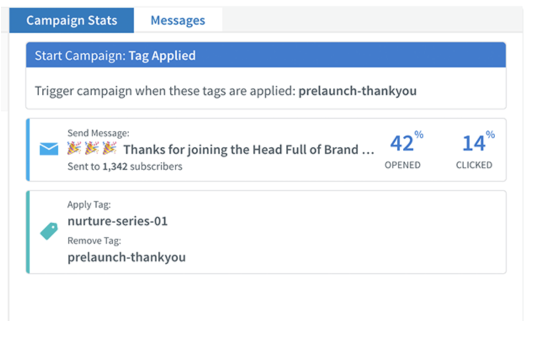 Unique Features
PricingPricing scales based on the number of subscribers you're emailing. Plans start at $19 per month, which covers you up to 500 subscribers. The top tier, for 10,000 to 25,000 subscribers, is $149 per month. Pricing options for businesses with more than 25,000 subscribers are available upon request. You can also choose to be billed quarterly or annually to reduce your per-month costs. 7. UnlayerUnlayer allows you to build email templates from scratch, but also utilize merge tags and embed customizable, dynamic content into the body of your messages. It's designed for SaaS companies, but could feasibly be used by any industry.  Unique Features
PricingThe basic plan option is free. Premium packages are available at $99 for startups, $199 for businesses, and $399 for growing businesses. 8. Campaign MonitorCampaign Monitor is primarily focused on email marketing, but has other features you can use for a variety of other marketing and ecommerce purposes. Because it's designed to work for teams, it's ideal if you have many people working together on your campaigns.  Unique Features
PricingPricing varies based on how many subscribers you have. You can get started for free, but if you want access for more features, or if you need more support, you'll need the Basic plan for $9 per month, the Unlimited plan for $29 per month, or the Premier plan for $149. 9. Chamaileon.ioChamaileon.io is a cleverly-named email template builder that allows your team to design emails collaboratively, complete with drag-and-drop mechanics so you never have to worry about coding. You can also design and follow a set email campaign workflow, simplifying your efforts in the future.  Unique Features
PricingThe free plan gives you much of what you need as an individual, but as you start adding seats and getting access to more features, the cost goes up. Premium plans start at $20 per month, with the Pro plan at $40 per month, and the Pro Team plan at $200 per month. 10. DesignmodoDesignmodo's email builder is designed to bring teams together for the email template building process. You can use it to design emails however you like, then export as HTML, or to a full email service provider like Mailchimp. 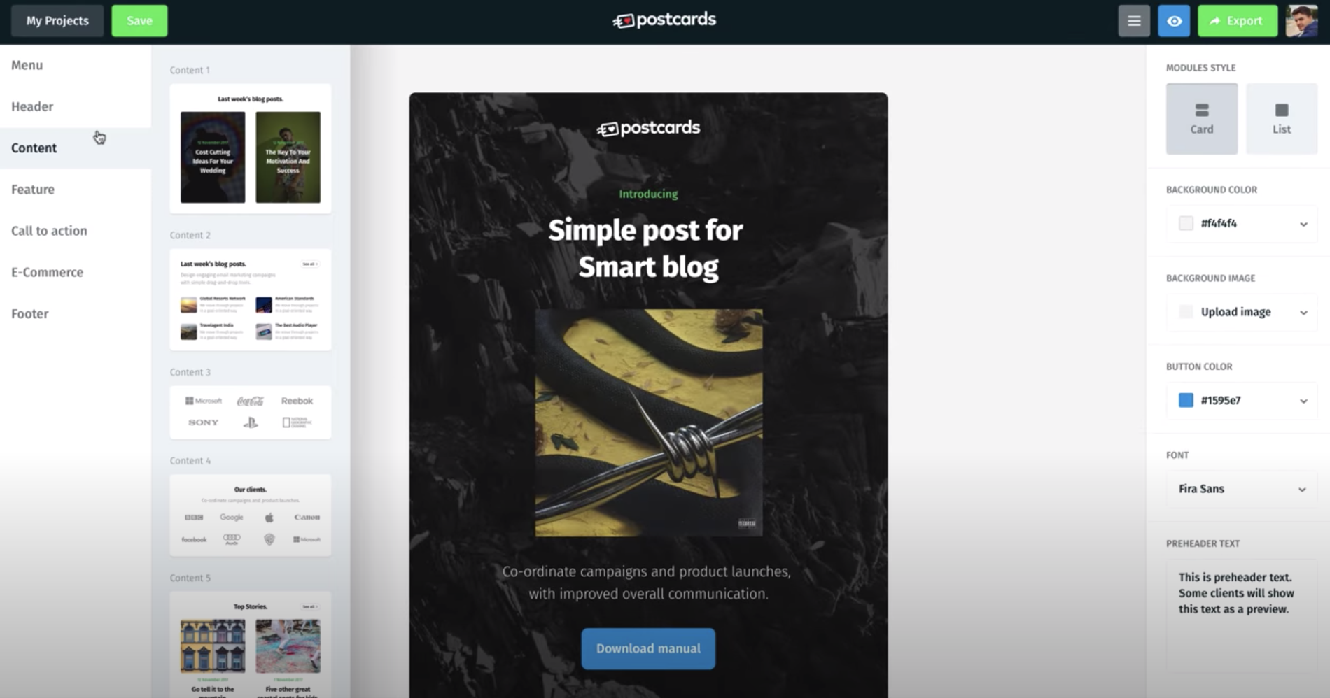 Unique Features
PricingFor a single user and 10 modules, you can use Postcards for free. Business plans start at $15 per month, and an agency plan starts at $25 per month. 11. Stripo.emailStripo.email helps you create responsive email templates without any HTML coding skills necessary. It also features innate dynamic AMP support, and a robust testing tool to help you preview your email in more than 90 popular environments, including variants for devices and browsers.  Unique Features
PricingThe free plan is all you'll need to get started. Billed yearly, the Business plan is $125 (or $10.42 per month), and the Agency plan is $400 (or $33.33 per month). 12. Taxi for EmailTaxi for Email provides scalable email template creation, as well as the ability to create email workflows. It also allows you to assign various tasks and permissions to your team, so each of your marketers can play a role in perfecting your email campaign. 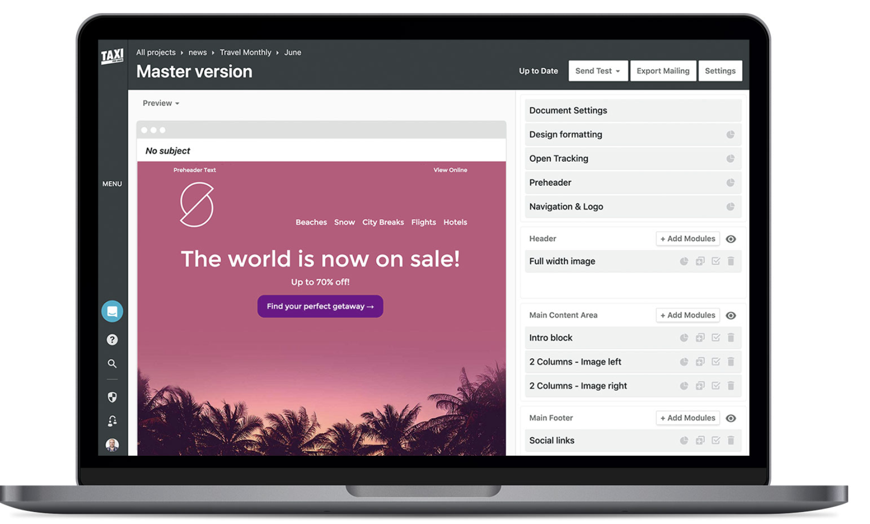 Unique Features
PricingTaxi for Email doesn't publish their pricing, but you can submit a short contact form on their website to get a free quote. 13. SendGridSendGrid is an email service that provides support for email template designs — additionally, it offers email functions like automatic shipping notifications and password resets. It also boasts an open API, which you can use to integrate with just about anything.  Unique Features
PricingThe basic version of the tool is free, and paid plans start at $14.95 per month for the essentials, or $89.95 per month for the Pro plan. Rates increase as you send more emails per month. Choose the Best Email Template Builder for Your NeedsWhile it's arguable that some of these email template builders are superior to some of the others, all of them have strengths and weaknesses. The best email template builder will be the one that most closely aligns with your organization's goals — giving you all the tools you need, at a price within your budget. When you narrow the list down to a few options, give each one a try (since most of these tools either offer a free trial, or a free version altogether), and get a hands-on feel for which tool might serve your organization best. [Read More ...] from https://blog.hubspot.com/marketing/email-template-builder When I try to think of marketing campaigns that were emotional and memorable, one of the first ones that comes to mind is the Dove Real Beauty campaign. The reason? Dove uses grassroots marketing strategies to create targeted content that their audience wants to share with everyone they know. As a marketer, that might seem like a daunting task. However, grassroots marketing can actually be cost-effective and achievable for any brand. Below, let's review grassroots marketing from the best strategies to examples that'll inspire your own campaigns. Grassroots marketing is similar to viral marketing because the goal is to create content that your audience wants to share. However, this might be more cost-effective since you're building a campaign that's targeted at a smaller, specific audience. These campaigns will be different from your everyday marketing campaigns because your goal is to inspire a small audience to take action. With other marketing campaigns, you're probably hoping to reach a large number of people. However, with grassroots marketing, you're creating highly specific content with the hope that your audience will share your message for you. 1. Know your target audience.It's true, it's going to be important for you to know your audience for any marketing campaign. However, with grassroots marketing it's a necessity. The entire concept of grassroots marketing is that your audience will share your content for you. Yet, they won't do that if your content doesn't inspire them to. Before you get started with grassroots marketing, you need to know what motivates and inspires your audience. Figure out what they care about and create content surrounding that. 2. Get creative and inspire action.Again, your grassroots marketing content should inspire your audience to take action. But you might be wondering, "How do I do that?" One way is be creative and start a movement. Your content doesn't have to be political, but it has to be inspiring and relatable. 3. Focus on storytelling.While I might be biased because I'm a writer, the best grassroots marketing campaigns are focused on storytelling. Ideally, your content will explore your audience's emotions. For example, if your target audience is parents, you can create a video that's focused on the parent/child relationship. This will tug at their heartstrings and make them want to share with their friends. In fact, think about grassroots marketing as a way to tell your audience's stories. If they feel represented by your content, they're going to share it wildly. 4. Start hyperlocal.It might seem like grassroots marketing is about creating viral content, however, no grassroots campaign started that way. With grassroots marketing, your content should be laser focused on your target audience. The goal is to attain national attention by sheer shareability and word of mouth. 5. Use reviews to your advantage.One strategy for your grassroots campaign should be to focus on getting reviews. You should spend time building your reputation on Yelp or Google reviews so you can gain organic attention online. For example, a year ago, I started to hear all about this thing called a Hydro Flask. I saw the reviews and heard people talking about it for months. I finally decided to buy one even though I had literally never used a water bottle in my day-to-day life before. That's the result of a great grassroots marketing campaign. With reviews from happy customers amplifying your message, you can reach people you weren't even targeting originally. 6. Create YouTube content.YouTube is one of the best channels to disseminate your grassroots marketing content. On this social media platform, you can share highly targeted content that's educational, helpful, and emotional. If your video continues to get shared by your audience, you can begin to reach even more people organically because your video might rank better. Grassroots Marketing Ideas1. Text your customer.With grassroots marketing, it's important to get creative with how you reach your audience. One way to do this is to use text marketing. With SMS messages, you can have a real conversation with your customers. You can learn about them, send them one-touch surveys, or offer targeted marketing based on their feedback. The trick with text marketing is to only send messages to customers who have signed up to receive your texts. No one wants to get a random text from an unidentified number. 2. Include visuals.Almost every grassroots marketing campaign should be focused around the visuals. In fact, in a 2018 HubSpot survey, 54% of consumers wanted to see more video content from a brand or business they support. Visual content is what your audience wants to see. Plus, the main idea is that grassroots marketing is shareable and visual content is easier to share. 3. Don't forget a call-to-action.Not to beat a dead horse, but your grassroots marketing campaign should inspire action. To do this, you have to include a call-to-action in your campaign. With successful grassroots marketing, your target audience has shared your content with their friends. Now that you have people's attention, you need to decide what to do with it. For example, you can ask people to donate to a cause or purchase a product. 4. Support a cause.A quick and easy way to implement grassroots marketing in your strategy is to support a cause that your audience cares about. When people see that your company is charitable, they're more likely to trust you and have positive associations with your brand. You can support a cause by donating, encouraging your audience to donate, amplifying and representing the message of a cause, or listing the causes you support on your website. When your content is focused around philanthropic efforts, your audience is more likely to share it. 5. Use influencers.Influencer marketing is a modern day version of grassroots marketing. The theory is that when influential people promote your brand, your audience is more likely to share that message and be inspired to take action. To get started, you could send influencers in your niche free products, or discounts. Hopefully, that will inspire them to talk about your brand and spread the word. Grassroots Marketing Examples1. Extra Gum Commercial.I don't typically cry when I see commercials on TV. However, Extra Gum has made me emotional with several of their grassroots marketing campaigns. This first commercial tells the story of a father and daughter who bonded over making origami birds from Extra gum wrappers. This hasn't aired since 2015, but it was one of the first campaigns I thought of when I thought of grassroots marketing. In this second commercial, we get to watch the love story of a couple who meets in high school, falls in love, and captures their love story by drawing on Extra gum wrappers. Again, this last aired over a year ago, but I remembered it because of the emotional storytelling. Both these commercials are meant to tug at your heart strings and inspire you to share them with your family and friends. 2. ALS Ice Bucket Challenge.In 2014, the ALS ice bucket challenge went viral. The concept was that you would take a video pouring a bucket of ice water on yourself and then challenge someone else to do the same. If you participated, you were supposed to donate money to the ALS Association. Before this campaign went viral, people weren't exactly talking about ALS. In fact, many people might not have even heard of the disease. That's how you know this was a successful grassroots marketing campaign. It started with a small idea, and grew to a national campaign. For this challenge to be shareable, everyone who participated had to nominate a friend to do it. This grassroots campaign started a movement, inspired action, and supported a cause. Plus, celebrities and influential people got involved. Below are a couple of images of the celebrities that participated in sharing the grassroots campaign.   3. Dove Real Beauty Campaign.This is one of my favorite grassroots marketing campaigns. That's why it bears mentioning twice. In the Dove Real Beauty campaign, Dove had a forensic artist draw women as they saw themselves and then as strangers saw them. This is an excellent example of what grassroots content will look like when you know your audience intimately. By knowing its audience of real women, Dove was able to start a movement. In fact, this video has over 68 million views on YouTube. The powerful video barely mentioned the product, but inspired women around the world. Grassroots marketing is a great way to focus on reaching your audience, with the hope that they'll share your campaign with people they know. Essentially, it's word of mouth marketing at its best. [Read More ...] from https://blog.hubspot.com/marketing/grassroots-marketing 90% of all web searches happen on Google, which means, if you're a marketer, you should probably know the ins and outs of Google Ads I've opened Google to search for something at least five times today. And every one of those times, I've seen at least two ads on every results page. No matter the wide range of my searches — from vegan snickerdoodles to makeup brands and HTML codes — I was met with Google advertisements. From a business perspective, Google Ads is amazing for lead generation. It's a pay-per-click platform that helps you boost visits to your website. With Google Ads, you can create targeted ads that will be shown to a segmented audience. Google Ads allows you to track the traffic, metrics, and conversions of your ads without switching to Google Analytics. Let's begin by talking about GCLID more in depth. What is GCLID, and how do you use it?If you are unsure of the number of conversions you're earning from your ad campaigns or want more insight into how to improve the performance of your ads, you may want to look into Google Click Identifier. A GCLID is generated every time an ad is clicked and the user is redirected to a landing page. GCLID communicates data to Google that will be sent to Ads and Analytics, like the pages per visit and the amount of time spent on the website as a whole. When you track ads, you can monitor their real-time performance. You can optimize ads for better performance. Ads can be tracked by adding tags, like GCLID. GCLID which helps you streamline tracking ad performance and gives you end-to-end conversion performance. This post will teach you all about GCLID and how it can fit into your Google Ads strategy. When you have GCLID turned on, you'll be able to track extensive details of the end-to-end conversions you're earning with specific campaigns. If you use auto-tagging, (also known as GCLID), you'll be able to track more dimensions than with manual tagging, including how your keyword is being matched to search queries, the ad group associated with the keyword, the URL ID, the ad format, and the distribution network. Below is an example of the amount of features available to you with auto-tagging: 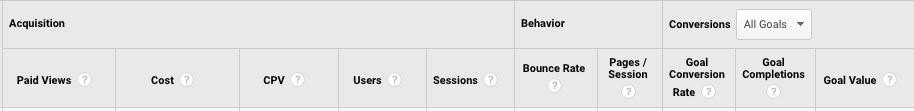 Ultimately, these metrics, available to view as a full report in Analytics, will help you improve the quality of your ads. Let's talk a little more about how tagging works. Manual tagging vs. auto-tagging in Google AdsYou can tag ads manually or have Google track for you using auto-tagging. Manual tagging is completed by adding a unique UTM code into your tracking data in Google Ads. While both GCLID and manual tagging allow you to obtain unique analytics about ad performance, there are differences. Keep in mind this important note from one of HubSpot's paid ads managers, Nicole Ondracek, about manual tagging: "Manual tagging overrides GCLID auto-tagging when used, but it's good to have auto-tagging turned on so you can see all the data and dimensions possible when looking in Google Analytics." If you use manual tagging in Google Ads, you'll be able to access data for these dimensions, including Source, Content, Medium, Campaign, and Keyword. Ondracek notes, "We look at all of the interactions, like clicks and impressions, in the Google Ads interface, and if we want to see further conversions, we look in Analytics using the manual UTM tracking." GCLID helps to keep all of those reporting features in one channel which means less back and forth for you. Now that you have a deeper understanding of the differences between tagging, let's talk about how to enable GCLID. How do you enable GCLID tracking?Setting up GCLID is pretty easy. First, access Google Ads, click "Settings," > "Account settings," > "Auto-tagging." From there, select "Tag the URL that people click through from my ad," and save your changes. Then, make sure your Google Ads and Analytics accounts are linked. Learn how to do that in this ultimate guide. Want the abbreviated version? In Google Ads, click "Linked Accounts" under Setup, which is located in the Tools icon. You'll also have to activate Google signals, which will import those conversions across the two channels. From there, check your reports in Ads by creating reporting columns based on the metrics you want to follow. To access your GCLID data in Analytics, go to the left sidebar and click "Acquisition," > "Google Ads," > and the type of campaign you're checking. In this case, I chose "Video." 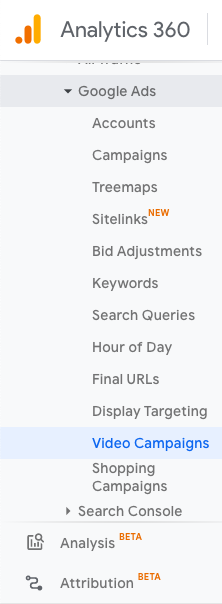 From this screen, keep track of the ROI you're earning from each GCLID you have. Additionally, sort your GCLIDs by campaign goal, or click on a specific GCLID to learn more details about how it's performing by the hour as well as specific web behavior concerning that URL. GCLID is meant to help you organize and keep track of your ad performance. It's a tool to help you optimize your campaigns so you can improve them as they're running. When you use GCLID, you are personalizing your Google Suite dashboard to benefit your company. How do you plan to fit GCLID into your Ads strategy? [Read More ...] from https://blog.hubspot.com/marketing/gclid So... you want to redesign your website. Maybe you just finished a brand overhaul or your product was recently updated. Whatever your reason, a redesign can be a huge success — or a total flop. It can also be a long and tedious undertaking, which is why every redesign needs to start with a clear vision and/or problem to solve. The better you are at defining that vision at the very beginning, the more successful your redesign will be — and the smoother the entire process will be as well. Whether you’re working with an agency, redesigning your site in-house, or proposing a redesign to company stakeholders, this guide will help you strategize your website redesign and ensure it turns out to be a huge success — not a total flop. Many organizations opt to redesign their website to welcome more traffic as their business grows and scales; others invest in a website redesign as part of a larger rebranding initiative. Regardless of why your company is interested in a website redesign, the project itself is a massive undertaking. Not to mention an important one to get right considering the critical role your website plays in your marketing and brand image. In fact, 80% of consumers say the experience your company provides is as important as the products or services you sell — including the experience they have with your website. How Often Should You Redesign Your Website?According to Business 2 Community, the average lifespan for a website is 1.5 to 2.5 years. Because design trends change and technology advances, this is the average amount of time that a redesign will feel "fresh" and competitive. However, that time frame is only a benchmark, so you will need to determine what works best for your organization. The following factors will determine how often you should redesign your website:
Your website is where visitors and customers go when they want to ask questions, read content, or purchase products or services. For that reason, it’s best to be extra prepared when committing to a website redesign. You may spend more time building your website redesign strategy than you will on the redesign itself. If you’re wondering what should go into your website redesign strategy, start with the steps below. Let’s unpack eight critical steps to take when redesigning your website. 1. Benchmark your current performance metrics.Before you begin planning your website redesign, document your current performance metrics. This will give you a good idea of where your current website stands and what metrics you can improve upon through your redesign. Analyze your existing website’s monthly performance in the following areas. The importance and relevance of each may vary depending on your website redesign goals, but it’s helpful to pull each metric before you dive into your redesign.
If you don’t have access to this information, I recommend adding tools like Google Analytics and HubSpot’s Marketing Analytics for better tracking and visibility into your website's performance. Furthermore, make note of which tools you used to measure each of these benchmarks in the past. Ideally, you’ll want to use those same tools when collecting your post-redesign metrics. Otherwise, you’ll be comparing apples to oranges. 2. Determine your website redesign goals.What’s the “why” behind your website redesign? When considering a redesign, there should always be a good reason behind it. If you’re answering with “well, it’s been a while since we’ve done one” or “my competitor just did a redesign,” those reasons aren’t good enough on their own. Remember: It’s not just about how your site looks, but rather how it works. Be crystal clear about why you’re doing a website redesign, and tie those goals to measurable results. Then communicate your goals with your team, designer, and/or agency. Consider the following data-driven objectives for your own website:
Many of these goals are dependent on one another. For example, in order to generate more conversions, you may also need to increase traffic while decreasing your site's bounce rate. Also, take a look at the metrics you pulled out in step one. Are there any metrics you can improve upon with your new website? Perhaps you use your old website metrics to inspire new goals, too. 3. Define your branding and messaging.Before crafting your new website design and content, be crystal clear about your desired branding, messaging, and unique value proposition. Doing so will ensure consistency across your entire website. Anyone who visits your website for the first time should immediately understand what you do, how it may benefit them, and why they should stay on your site and not flee to your competitors'. Think about whether you plan to change your branding and/or messaging, or if it will stay the same. If you plan to change it, what about it needs to change? Keep these changes top-of-mind as you redesign your website. As you develop your messaging, use clear, concise language. Avoid using industry jargon that may alienate parts of your audience and make you sound more like a business-babbling robot than a human. Consider the following example of how we could describe HubSpot in a “gobbledygook” way: HubSpot helps companies across multiple countries reduce churn by backfilling the sales pipeline with highly qualified traffic that generates leads that convert into customers with high lifetime value. We achieve this by providing leading-edge software that integrates all marketing channels for a synergistic view of the data that determines and prioritizes high-value marketing activities. Say what? Let’s translate that into the way people actually speak: HubSpot’s all-in-one marketing software helps more than 6,000 businesses in 45 countries attract leads and convert them into customers. A pioneer in inbound marketing, HubSpot aims to help its customers make marketing that people actually love. Much clearer! I think visitors and potential customers would prefer the second description — don’t you? Additionally, as you develop your branding, consider what visual aspects of your website need to be redesigned and what can stay the same. Have you created a new logo, style guide, or color palette? Make sure these are applied to your new website so it remains consistent with other parts of your brand. 4. Define your buyer persona(s).Your website is not just about you. Actually, it’s hardly about you. When your visitors land on your website, they're asking themselves, “What’s in it for me? How could this help me?” Speak to your visitors in their language by crafting your website design and content around your buyer personas. For instance, if you're a marketing manager at a hotel looking to bring in new business, you might target five different buyer personas: an independent business traveler, a corporate travel manager, an event planner, a vacationing family, and a couple planning their wedding reception. Make sure you clearly identify your buyer personas so you can shape your website redesign strategy around the website visitors that matter most to you. Check out our handy buyer personas template to help you research and create detailed buyer personas. Is your target audience changing as part of your website redesign? Do your branding and content align with this audience? Answer these questions as you're strategizing your website redesign. 5. Protect your search engine optimized pages.Getting discovered online is also essential to improving your website's metrics. If no one is able to find and visit your site, how can you increase new leads, reconversions, or sales? Here are some tips for designing your new website with search engine optimization (SEO) in mind: Document your most search-valued pages.Use your marketing analytics to figure out which pages receive the most traffic and inbound links, convert the most leads, and ultimately cover the most influential topics in your industry. If you plan to move any of these highly valuable pages, make sure you create the proper 301 redirects. Create a 301 redirect strategy.Speaking of 301 redirects, these are extremely important in terms of retaining the traffic and link value associated with a given page. Create a spreadsheet to record and map out your 301 redirects (old URLs vs. new URLs). Then hand this document over to someone technical for proper implementation. Do your keyword research.For every page on your newly designed website, pick one keyword/topic each page will focus on. Once you determine the keyword(s), use on-page SEO best practices to optimize your website pages. Furthermore, consider adding new content and pages to your website that address those particular keywords and topics that may be neglected on your current site. Save time and rank higher on Google with our free on-page SEO template. 6. Analyze the competition.While we don’t recommend obsessing over your competitors, it can help to know how you compare. First, run your website through HubSpot's free Website Grader tool to generate a report card of how well your website is performing. You can also use this diagnostic tool to evaluate your competitors' websites, so you're aware of their strengths and weaknesses. Next, take a look at your competitors' websites, and take note of what you like — and what you don’t. This process is to help you realize what you can do better on your website. Once you conduct your competitive analysis, put together a list of action items highlighting some areas for improvement and how you can set yourself apart from your competitors. 7. Take inventory of your high-performing content.While a redesign is a great way to improve the performance of your website, there are unfortunately countless ways in which it can hurt you. Your existing website likely contains many high-performing content assets that you've already built up, and losing their effectiveness because of a redesign can severely damage your marketing results. For instance, such assets might include your:
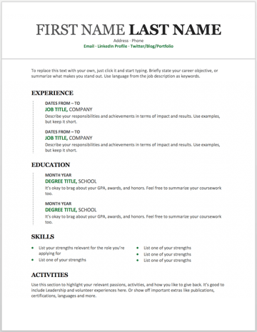
For example, if you end up removing a page from your site that has accumulated a high number of inbound links, you could potentially lose a lot of SEO credit, which would make it increasingly difficult for you to get found on search engine results pages (SERPs). Keep in mind that many web designers don’t consider this step because they are neither marketers nor SEO specialists. Don’t hesitate to remind them about this, and help them along by auditing your site and providing them with a list for maintaining or updating critical pages on your site. 8. Choose the right software.The final (but arguably most important) step of the website redesign process is choosing the right software with which to create and host your website. This software is typically called a content management system (CMS), and it’s used to develop, design, and publish your website for the world to see. CMS software is beneficial for a few reasons. Whether you’re a novice digital marketer or a master web developer, a CMS can easily help you create a gorgeous, functional website. Choosing the right CMS depends on your business, such as what CMSs you’re already familiar with and what features your website redesign requires. There are hundreds of CMSs to choose from, including CMS Hub — the only combined CMS and CRM. Or you can review some of the best CMS platforms to learn about your options. Get Started on Your Website Redesign TodayWhew! Now you're ready to plan, design, build, optimize, launch, and analyze your new website. Apply these seven steps to redesign a website that attracts more consumers, wows more visitors, and converts more customers. Editor's note: This post was originally published in January 2013 and has been updated for comprehensiveness. [Read More ...] from https://blog.hubspot.com/blog/tabid/6307/bid/33924/how-to-develop-a-website-redesign-strategy-that-guarantees-results-free-template.aspx No matter what industry you work in (or your experience level in that industry), a plain, black-and-white resume written in Times New Roman font can actually weaken a job application. But just because resumes have gotten more creative doesn’t mean you need special design software to make your application stand out. On the contrary, writing your resume in good old Microsoft Word is still the perfect way to develop your personal brand, while also communicating your experience and career goals. Read on to find out how to make your resume in word, then download one of these amazing resume templates that open directly in Microsoft Word. How to Make a Resume in Word
1. Open Microsoft Word on your computer.If you have Microsoft Word installed on your computer, open the program and let it load for a moment. There will be a couple of helpful options waiting for you on the first screen, specifically for resume creation. 2. Select either "Basic Resume" or "Bold Resume" from the template menu.Once you've launched MS Word, a window of templates will appear. Scroll down until you see the template options designed for resumes -- there will be at least two of them. Double-click the one that suits your style and personal brand, but don't be too particular about design just yet ... you can customize these templates quite a bit.
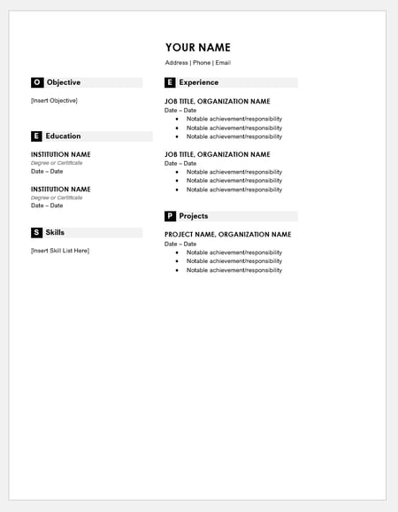
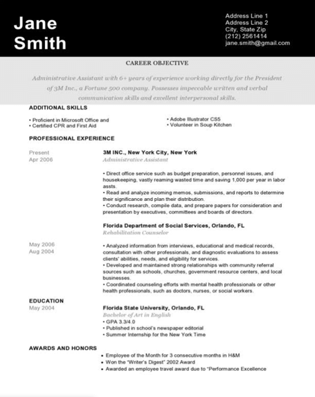
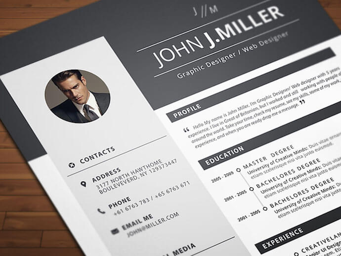
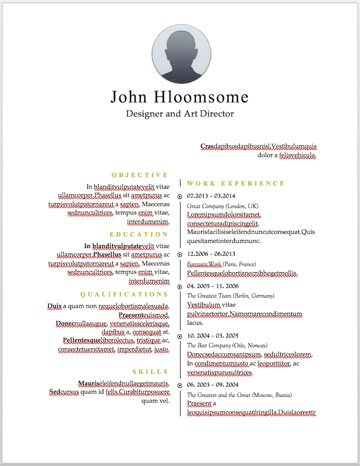
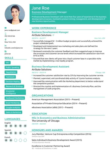
3. Fill in your name and contact information at the top.When your resume template opens, you'll see placeholder text for each line of your resume, starting with your first and last name at the top. Delete this header text and enter your name, as well as any contact information by which you want the recruiter to contact you. 4. Draft a brief summary of your experience and goals.Use the first line below your name and contact info to describe who you are, what you do, and what you're looking for in your career. 5. Enter your school and latest education.List any relevant degrees or certificates you received through schooling. You can safely exclude secondary education if you've graduated from an accredited college. 6. Describe each job you've held using the lines prompted on the template.Your professional experience is frequently the most important section of your resume, so feel free to rank this section above your skills and education, depending on how many jobs you previously held. 7. List all relevant skills.If you have experience in certain software, exercises, problem-solving, or management techniques, use them to populate your skills. Your resume's "Skills" section helps reveal what all of your previous jobs or related experiences have in common, based on what they taught you and what you provided them. 8. Describe any relevant accolades and accomplishments.Finish out your resume with any personal accomplishments or accolades you think a hiring manager in your industry would appreciate. Although this section shouldn't include a Most Improved recognition from little league, for example, it should definitely include your Marketer of the Month award from your last position. Free Resume Templates That Download in WordOf course, if you’re already employed full-time, it’s hard to find the time to apply to a new job opportunity, let alone update your resume to reflect your qualifications. Luckily, there are numerous publishers out there who've created incredible resume templates for quick editing and formatting in Word. To keep you from hunting the internet for the resume templates that are both free and compatible with MS Word, we’ve listed 19 more options below for you to customize with your own information right now. Some of them come with variations so you can pick your favorite design. Four of them cater specifically to marketers. They’re so nice, you won’t believe they open up in Microsoft Word once you download them. 1. Monogram Header Resume TemplateWe'll start with a simple one. This is a HubSpot exclusive resume template that is simple and clean with attractive monogrammed headers to call out each section of the resume. The rest of the design relies on a simple serif font for easy reading, which is a good thing considering that hiring managers only take 7.4 seconds to evaluate a resume. You want your experience section to be easily scannable. Download this template here.
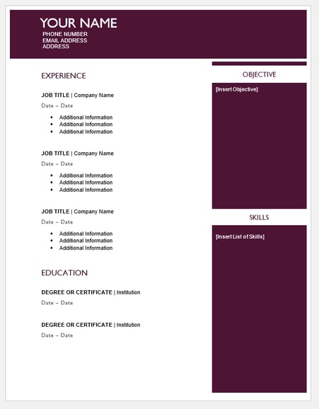
2. Maroon Sidebar Resume TemplatePulling your more text-heavy information off to the side in an attractive color-blocked sidebar, this resume lets your experience stand for itself in white space at the top. It's also easily customizable with no difficult-to-manipulate tables or formatting. The sidebars are in movable text boxes that can even be removed if you wish. Download this template here.
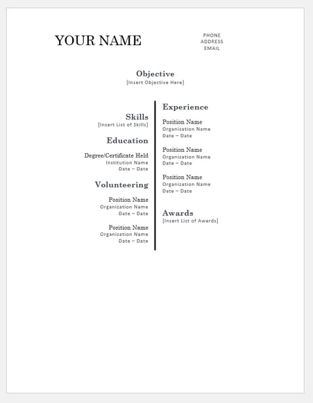
3. Centered Bar Resume TemplateThis resume takes on a different look than most resumes, centered around a single bar. This makes the resume more visually striking, which could draw attention as hiring managers are evaluating candidates. It also puts emphasis on the objective with your chronological experience supporting it underneath. All of this is in an attractive serif font that is elegant and classy. Download this template here.
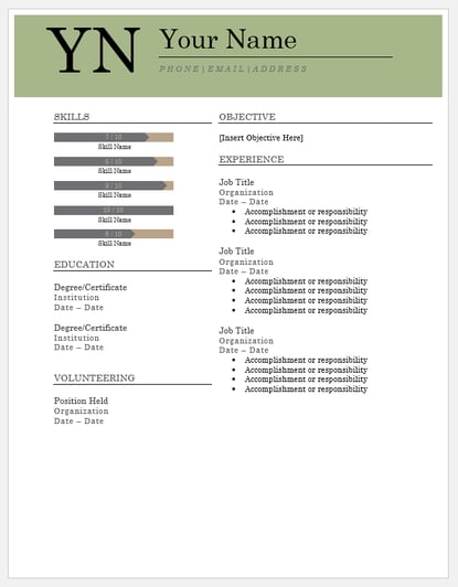
4. Bold Serif Resume TemplateSpeaking of serif font, this resume puts forward an element of grace and formality with its font choices. It's perfect for individuals who are looking for more organic color than the ones more typically found in resumes, and the colors are also easily changed in Microsoft Word's theme settings. It also includes a skill-level bar, adding a nice visual touch to the template. Download this template here.
5. Modern Chronological Resume TemplateThis resume template is available from Microsoft itself, and it’s one of many free templates the company has prepared for those who depend on Microsoft Office tools to create content. Yes, it is written in Times New Roman — don’t freak out. Designs like this can borrow an old-school typeface and still impress recruiters with a clean layout and subtle use of color. You can also change the font if you wish (and the same goes for every template in our list). Download this template here.
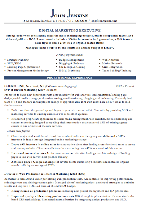
6. Digital Marketing Resume TemplateThe digital marketing resume below comes from our own collection of resume templates, all of which open directly in MS Word. Coming with two pages total, this sheet holds a wealth of information and offers the perfect amount of style while maintaining professionalism. Mid-level marketers all the way up to CMOs can find this template valuable. Download this template here.
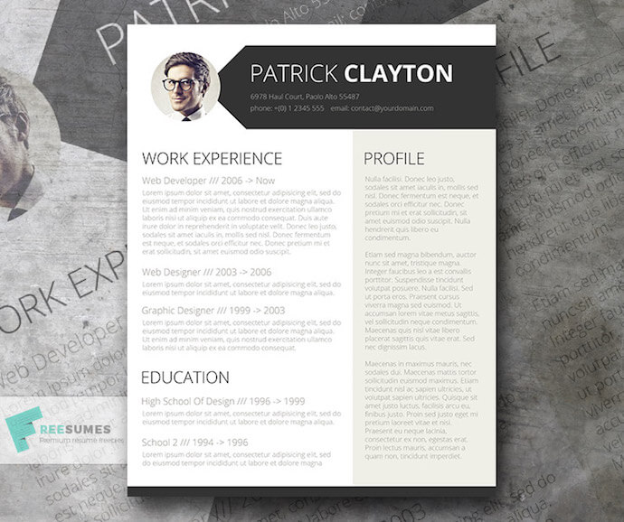
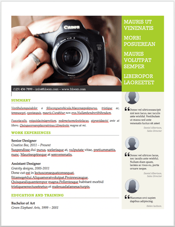
7. Simple and Clean Resume TemplateThis template is the perfect balance of creative and modest -- best for the professional who wants to seem casual, thoughtful, but not over the top. Not only does it feature a space for a headshot on the top-left, but you can customize the color of that entire panel. Created by Zoki Design, the resume template also comes with a matching cover letter template. Download this template here.
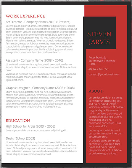
8. Black and White Resume TemplateThe Black and White resume template below suits professionals who prefer using color and shading to add structure to their resume. The black banner at the top contrasts the applicant's name nicely to help make him/her more memorable to recruiters. The gray banner just below the header is perfect for a summary or career objective — it makes one's goals known but doesn't overpower the experience listed below it. Download this template here.
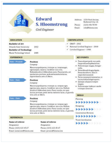
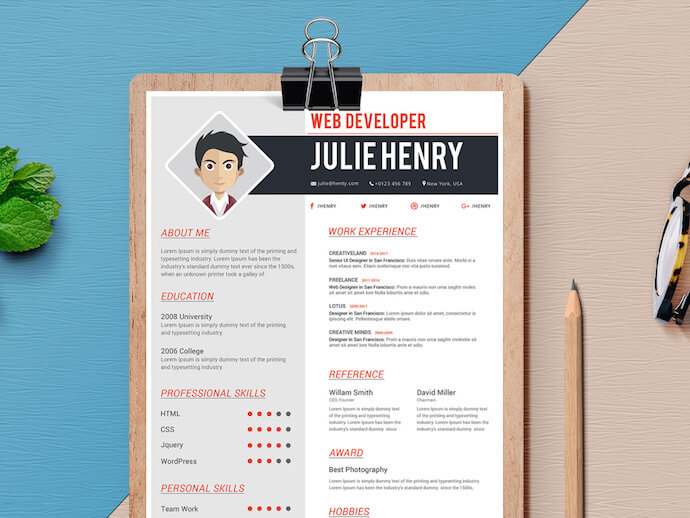
9. Urban Development Resume TemplateThe illustration on the top-left of this template shows who the designers at Hloom had in mind for this resume: civil engineers. But because it’s a Word document, that graphic is easy to edit and replace with an image that represents your line of work. Are you an analytics buff? Design a clever bar or line graph icon and place it next to your name in blue (or whatever color you’d like!). Download this template here.
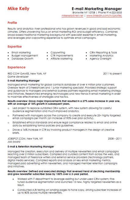
10. Email Marketing Resume TemplateRed color never fails to stick out on a sheet of paper, especially if it's included in small amounts. The resume template for email marketers, below, captures that balance. In addition to the professional title in the top-righthand corner, this template also stands out with a thin sans-serif font, helping make a lot of text easier for a recruiter to digest and read through. Download this template here.
11. Info Pop Resume TemplateThis one, also from Hloom, gives you exactly what the name suggests: ample space for the info you need, with headers that pop just enough to get your employer’s attention. Although the template fits a ton of text, its soft color palate prevents the document from seeming overwhelming. Download this template here.
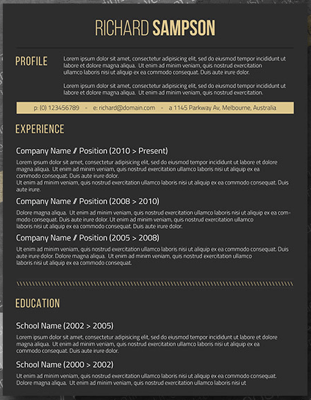
12. Dark Resume TemplateIronically, a dark background could be just the thing to ensure your resume doesn't fall into the black hole of resumes piled on the hiring manager's desk. Using soft, yellow font, the resume template below inverts the usual color scheme of a resume without trying too hard to be creative. Download this template here.
13. Neat and Confident Resume TemplateSimilar to the Simple and Clean template mentioned earlier, this resume design by Nowpixelse communicates a truly professional tone. The template’s muted colors work very well with the side panel layered over the top header. Download this template here.
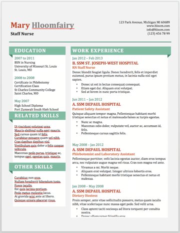
14. Inbound Marketing Resume TemplateHere's another resume template dedicated to the digital marketer. This sheet offers all the inbound marketing language you need to express your values as a passionate, brand-loyal professional. Similar to a few other templates on this list, it also uses just a dash of vibrant color in the applicant's name at the top (where it matters most). Download this template here.
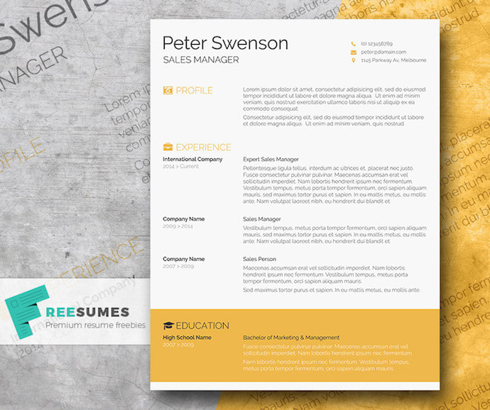
15. Smart and Professional Resume TemplateThis is another sharp template that offers a basic but confident design for any professional. The warm-colored panel on the right-hand side is pre-formatted for a written profile, where you can write a summary of your background or a form letter to each employer. Just be sure to personalize this messaging to each new recipient so it works for the job you’re applying to. This template is available on Freesumes, and is free to users once they share the page to Facebook or Twitter. Download this template here.
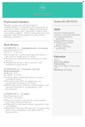
16. Spick and Span Resume TemplateThere isn't a better name for the template below. The Spick and Span resume might be the cleanest-looking sheet on this list. It uses boldface, all-caps, and gray typeface to structure various headers of the document differently and maximize the hiring manager's reading experience. And all that minimalism makes the professional headshot at the top pop off the page. Download this template here.
17. Timeline-Style Resume TemplateSimilar to the Centered Bar resume earlier in the post, Hloom’s Timeline template is a super simple but creative way to tell your story. You can convey your progression through various jobs you’ve held on one side of the vertical line, and more static elements of your background — such as skills and education — on the other. Download this template here.
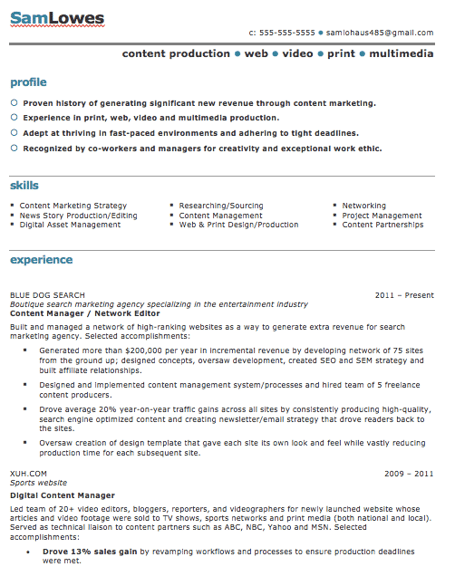
18. Content Production Resume TemplateThis basic resume template is suited for content producers at all stages in their career. By spreading out the header and "Skills" text horizontally, the resume below fits a lot of crucial information comfortably on one page (of course, it also comes with a second page if you need it). Download this template here.
19. Fresh Resume TemplateThis is perhaps the most imaginative of all the Word-based resume templates on this list — with both a skills meter and a comic headshot. The template was designed by Venkata Naresh and comes with 12 different versions of the design you see below. Have you created a Bitmoji of yourself? Do you think your employer would find it creative? Match the template and add it as your photo. Download this template here.
20. CV Resume TemplateThe curriculum vitae-style resume below flips the typical two-column resume so the basic applicant information is listed across the right side, rather than the left. Feel free to change the color of this sidebar in Microsoft Word if dark-red isn't your thing — the template can pull off any color you wish. Download this template here.
21. Goldenrod Resume TemplateThis template, also offered on Freesumes, dares to use yellow as the dominant color — but doesn’t sacrifice professionalism in the process. The document anchors the education section to a thick, bright banner across the bottom, but you can likely change this to a skills section with some simple editing in Microsoft Word. Download this template here.
22. Resume Template With Personal EndorsementsThis resume template has quite a flashy header — no photography pun intended — but it’s not just for photographers. What makes this resume unique is the space for references on the lower right-hand side. Does your field need others to vouch for your experience? This resume gives you room for three solid recommendations. Download this template here.
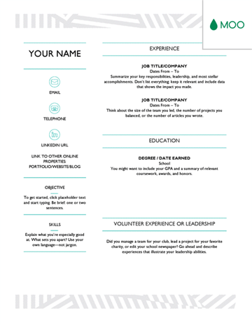
23. Creative Resume TemplateThis one was designed by the stationery experts at MOO and is offered for download by Microsoft. Simple but vibrant, this template hugs the text with an artistic header and footer — great for recent graduates who need to fill empty space on the page. Download this template here.
24. Modern Resume TemplateThis resume embraces simplicity with a slight touch of color to make things a bit more interesting. It also nicely sections off Skills and Education notes from the Work History list. With LiveCareer.com, you can generate a template with your basic information and then download it to add small details. Download this template here.
25. Functional Resume TemplateThis NovoResume.com template is colorful and includes a place for your headshot which could make you look both interesting and confident to an employer. A colorful format like this might be great for someone in the media or advertising industry that wants to keep their job application visually memorable to prospective employers. Download this template here.
|

Joseph Ashley
Juice is a drink made from the extraction or pressing of the natural liquid contained in fruit and vegetables. It can also refer to liquids that are flavored with concentrate or other biological food sources, such as meat or seafood, such as clam juice. Archives
February 2021
Categories |

 26. Elegant Resume Template
 27. Blue Corporate HR Resume Template
.jpg?width=389&name=canva-blue-corporate-hr-professional-resume-MADftnj-Tj4%20(1).jpg) 28. Concept Resume
28. Concept Resume


 RSS Feed
