|
Despite its reputation for dry content delivery across virtual and in-person meetings alike, PowerPoint remains the go-to choice for many professionals, even as other options emerge that offer greater usability and flexibility outside of the Microsoft ecosystem. Part of the presentation platform’s popularity stems from its familiarity — many organizations still run Microsoft-first IT software environments, making PowerPoint the obvious choice for straightforward presentation design. Simplicity provides the second part of this popularity permutation since creating a basic PowerPoint presentation on a single topic requires minimal time and effort. The problem? “Simple” doesn’t always mean “effective”. Staff across markets, industries, and verticals worldwide have stories about unbearably long and boring PowerPoint presentations that were long on details but short on value. The 7x7 rule offers a framework to help boost PowerPoint form and function by reducing text volume and improving information impact. In this piece, we’ll break down the 7x7 rule in PowerPoint, best practices, and offer some actionable examples of seven-by-seven solutions in-situ. The PowerPoint ProblemTo put it simply, most viewers don’t like PowerPoint. While the format has the benefit of speed and convenience — and can conceivably be used to communicate information quickly and concisely — many presentations are overlong and overwrought with bonanzas of bullet points that seem relevant but are really just digital hot air. In most cases, the disconnect between appearance and action is boring at best and irritating at worst. As noted by the BBC, however, in extreme cases — such as NASA’s Challenger shuttle disaster — overlooked information in an overstuffed presentation can have significant real-world consequences. Best bet? To avoid PowerPoint frustration and fatigue, it’s time for a new framework: The 7x7 rule. What is the 7x7 rule in PowerPoint?The 7x7 rule is simple: For every slide, use no more than seven lines of text — or seven bullet points — and no more than seven words per line. Slide titles aren’t included in the count. There’s no specific data supporting the 7x7 model as the ideal; some PointPower proselytizers consider 8x8 good enough while others say 6x6 is more streamlined. The point here isn’t the hard-and-fast number but the underlying idea: Cut out extraneous information to improve presentation uptake. Slides can still contain images — and should, wherever possible — but sticking to the 7x7 rule helps cut down on excess data that might be better-shared in follow-up emails or one-on-one discussions. In effect, the 7x7 rule is a way to reduce the amount of time staff spend pretending to care about PowerPoints and instead help them focus on slide information that’s relevant, contextual, and actionable. Best Practices for the 7x7 Rule in PowerPointBuilding a typical PowerPoint slide is straightforward. Like any business practice, however, it can be improved with a standardized set of rules designed to limit waste and improve efficiency. And when it comes to most PowerPoint presentations, almost any change makes a positive impact. Let’s break down some of the best practices for building PowerPoint slides with the 7x7 rule. 1. Single slide, single concept.Each slide should address a single concept rather than trying to connect the dots across multiple data points, trends or ideas. While it’s fine to build on previous slide data as your presentation progresses the single slide, single concept approach helps focus presentation efforts from the word go. 2. Images increase impact.As noted above images are a welcome addition to slides, so long as they’re relevant. If you find yourself adding unrelated stock photos just to add some color — don’t. Keep slides, text, and images on-track. 4. Forget the funny.Almost everyone has a story about a “funny” PowerPoint joke that was nothing of the sort. In most cases, these heavy-handed humor efforts are shoehorned in ostensibly to help viewers better remember slide data. In fact, they shift the focus away from your primary objective. 5. Plan it out.Before creating your presentation, create a basic outline that highlights your primary concept, how you plan to get it across, and how many slides in total it should take. Then, draft your slides. Take a break, review them, and cut back wherever possible. 6. Consider the 7x7x7.If you really want to go all-in on the 7x7 rule, consider adding another 7 and aiming for no more than 7 words in each line, no more than 7 lines on each slide, and no more than 7 slides in total. It’s not easy — but offers a much better chance of getting your point across. 7x7 Rule in Powerpoint ExamplesSo what does the 7x7 rule look like in practice? It’s one thing to talk about building a better slide, but it’s easy to fall back into bad habits when it’s time to put together a presentation. It makes sense; content creators are often trying to convey a significant amount of information in a short period of time, and it’s easy to get sidetracked by the notion that every piece of data must be included to make the meeting a success. Let’s start with a slide that’s substantially removed from the 7x7 rule: 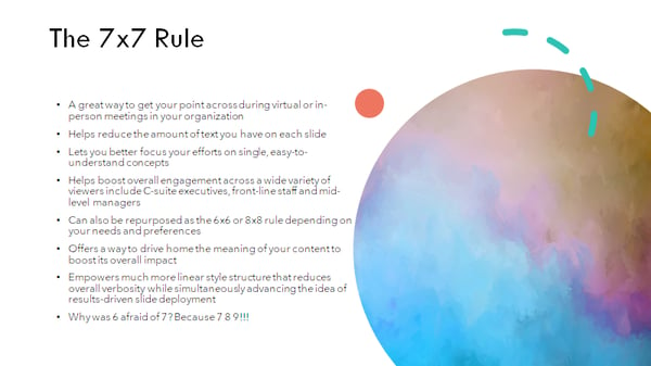 There’s a lot to unpack here. We’re using too many lines and too many words per line. Lines are complex without saying much, and the attempt at humor doesn’t add anything. Let’s try again: 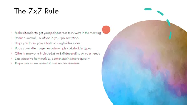 This one is better — we’ve reduced the number of lines to 7 and lost the joke, but most of the lines still have more than 7 words and the text is overly convoluted. Let’s try one more time: 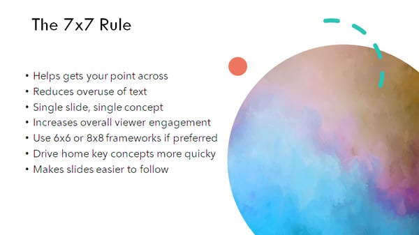 This slide is clear and concise, and most lines have less than 7 characters. It offers the same information as the first two versions — it’s just more effective and efficient. The 7x7 SolutionWhile using 7 lines of text with 7 words or less isn’t a silver bullet for all PowerPoint-related problems, it’s a good place to begin if you’re looking to boost viewer engagement and limit fatigue. Bottom line? PowerPoint isn’t always the ideal format for getting your point across, but if you need to create a quick-hitter presentation that lands well with your audience, start with the 7x7 solution. [Read More ...] from https://blog.hubspot.com/marketing/7x7-rule-powerpoint
0 Comments
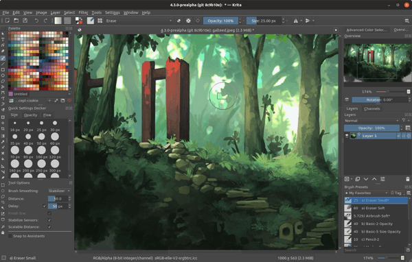
Digital transformation is more than just a buzzword — as noted by Forbes, 70% of companies have already deployed a strategy to improve digital service and solution uptake or are actively working on one. And, in 2019 alone, enterprises spent more than 2 trillion dollars worldwide to help drive digital adoption and improve overall organizational performance. For product and service providers in the technology industry, this presents an opportunity: If B2B sales teams can determine where enterprises are struggling with digital transformation initiatives, they can improve targeted marketing efforts and boost total sales. But how do they bridge the gap between potential conversions and practical insight? Technographic data. In this piece, we'll break down what technographic is (and isn't), how companies can collect this data at scale, and why this data is important to help enhance B2B sales efforts. Let's get started. What is Technographic Data?Technographics is a portmanteau of the words “technology” and “demographics”, and refers to information that describes the use of technology solutions, their adoption rates, and the potential challenges they present for organizations. The challenge? This technographics definition isn't terribly useful without context. First, let's talk about what technographics isn't: Demographic data Demographic data focuses on information about people — how many people are employed by a specific organization? What points of contact exist? How have companies' sizes and staff configurations changed over time, and what's on the horizon. This information is critical to help identify potential leads and develop initial marketing efforts but offers no insight about technology use. Firmographic data Firmographic data refers to information such as company size, product offerings, industries served, total revenues and even physical locations. This data is useful to help create targeted campaigns that drive B2B sales interest but doesn't include technology metrics or measurements. So what exactly is technographic data? Put simply, it's the practical application of information about the technology stack used by a prospective customer — everything from the infrastructure and network tools they're using to the applications they prefer and the adoption rate of these applications at scale. Effectively used, technographic data can help companies align their product offerings with digital transformation needs and capture client interest. Worth mentioning? There's a distinction between pure technographic data and social technographic data. While technographic data speaks to the use of software, hardware, and networking technologies within an organization, social technographic data focuses on the consumption and use of social media technologies within an enterprise. While this is useful for social marketing efforts, it doesn't serve the same function as technographic data for B2B marketing efforts. How to Collect Technographic DataWhen it comes to collecting technographic data, three broad methods exist: 1. SurveysThe most direct method of collecting technographic data starts at the source: Staff at target companies. Using phone or email surveys, companies attempt to collect information about how technology is adopted, deployed and used to boost B2B efforts. The challenge? Most companies won't respond to cold-call surveys, and many aren't willing to provide specific usage data even via email response templates. While this method may provide some generalized use data, it's often more trouble than it's worth. 2. Website ScrapingWebsite scraping tools extract specific information from corporate websites about the apps and services used by enterprises. Although this may produce more accurate results than survey data and without the need to cold call companies, it requires technical expertise to ensure tools are collecting and reporting relevant data. In addition, security controls on websites may limit the type and amount of data that can be collected, and available information may be out-of-date. 3. Third-party PurchasingThe most straightforward way to obtain technographic data is by purchasing it from a reputable data collection provider. Thanks to the rapid uptake of cloud-based SaaS, PaaS, and IaaS solutions, both service providers and data analytics firms now have access to much more robust and reliable technographic data sets than can be purchased by interested parties. While there are some limitations on this data collection — for example, personal data must be anonymized to ensure compliance with both local and global privacy legislation — enterprises can access massive amounts of usable technographic data with the right third-party provider. It's worth keeping in mind, however, that not every provider is created equal. Some promise massive datasets but can't deliver, while others can't offer real-time insight. Best bet? Do your research before contracting any technographic data supplier. Why Technographic Data is ImportantOn its own, technographic data offers a window into company technology use. Combined with targeted marketing and sales efforts, meanwhile, this information provides a way to significantly improve conversion outcomes. Four actionable benefits of technographic data include: 1. Improved SegmentationWith accurate data about the use and deployment of technologies within potential customer organizations, companies can better define granular customer segments based on current needs and ongoing priorities to ensure sales resources are used effectively. 2. Enhanced SpecificitySales leads are often inundated with pitches for new technologies and services. Technographic data lets sales teams speak to specific problems faced by potential clients and quickly capture their interest. 3. Increased PrioritizationNot all leads have the same potential value to companies. But distinguishing lead priority is difficult, especially in an increasingly competitive technology market. Technographic data can help businesses quickly assess which leads are more likely to spend on new solutions and which need more time. 4. Reduced Lead TimeSpeaking of time, news announcements about new technology solutions, mergers and acquisitions or product launches offer jumping-off points for successful sales discussions — but only if teams are equipped with relevant technographic data to help connect the dots between news releases and customer needs. Tactical Technical TargetingTechnographic data makes it possible for marketing and sales teams to create tactical, targeted campaigns that speak to the real-life issues faced by organizations undergoing digital transformation. By prioritizing in-situ issues and providing comprehensive solutions for emerging challenges using technographic data, B2B efforts can stand out from the crowd and help drive sustainable client conversion. [Read More ...] from https://blog.hubspot.com/marketing/technographics When it comes to website success, what you see is what you get. While compelling text, blog, and social media content can help set your brand apart from the competition, the visual appeal of your site is the first thing users see when they follow backlinks or click through on search engine results. Recent research found that it takes just 2.6 seconds for users’ eyes to focus on a specific area of your website. What’s more, it takes just 0.05 seconds for visitors to form a general first impression of your site — meaning you’ve got just one opportunity to change their minds or reinforce this impression, and it happens in the first three seconds of arrival. As a result, it’s critical to create webpages that are both aesthetically appealing and contextually relevant. For larger businesses, this often means hiring dedicated graphic designers to develop eye-catching designs and deploy them consistently across web pages, but SMB budgets may not support this type of spending. What it Takes to Have a Great DesignAdvanced graphic design skills require practice, practice, practice. Great designers can take one look at your webpage and see where current visual elements aren’t performing, then create visual content options that capture both your brand position and aesthetic style. But what about website and business owners who can’t afford the skills of a master graphic designer? How can they jumpstart the process of improving their site’s visual appeal? The first step is taking a step back. Open your own webpage in multiple browsers and see what stands out. What’s the first thing you notice? Is it a specific image — or lack thereof? Is the image clear and concise, and does it drive action? What about the text formatting, color, and font? Here, the goal isn’t to drill down and analyze the nitty-gritty details of website design but instead put yourself in the digital shoes of a site visitor. It’s also a good idea to ask for feedback from other staff members along with friends and family. While this comes with natural bias — they want your site to succeed, after all — it can help identify persistent or problematic visual elements and suggest an initial course of action. In this piece, we’ll examine some of the best free graphic design software tools, where this software fits into your website strategy, and how they can help capture user interest from the moment they arrive. What is the Best Free Graphic Design Software?If your research turns up a problem — your images aren’t compelling, your text is hard to read and your color scheme hurts the eyes — you need a simple solution. Free graphic design software offers the ability to customize the look and feel of your site without breaking the bank. But with a host of options on the market, which is the best fit for your business? Two broad factors impact this outcome: Your current graphical ability and your potential use case. For example, if you have no experience with graphic tools of any kind, look for a solution that’s simple, streamlined, and does most of the work behind-the-scenes. If you have a graphic design background or natural inclination, tools with more robust customization and control may be a better fit. If you’re planning to revamp your entire site with new colors, images, logos, and menus, meanwhile, you’ll need an in-depth solution that provides this level of control. If you’re starting small with minor changes to your color scheme or image quality, this kind of granular adjustment isn’t necessary. So which software tool is the best fit for your business? Here’s a look at five free graphic design tools and some pros and cons for each. The Best Free Graphic Design Software for Beginners and Mac OwnersThe Best Free Graphic Design Software for Beginners1. DesignWizard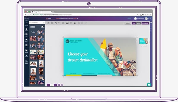 DesignWizard ranks among the best free graphic design software for beginners. The tool offers a large database of images along with a host of free templates (over 10,000) plus a simple, easy-to-use interface. You can also quickly create custom templates, but where DesignWizard excels is as a front-line, free graphic design tool for beginners. Despite an easy-to-use interface and no upfront costs, it’s worth noting that most of the more powerful options in DesignWizard are only available in its for-pay version. 2. Setka Editor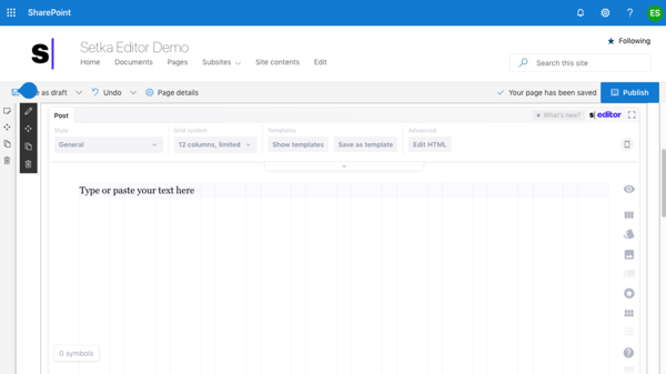 Setka bills itself as “everything you need to create content that converts”. This graphic design software is primarily focused on delivering enhanced content branding across your website, ad campaigns and social media posts — and works from within your current CMS or in the cloud. The caveat? Although the Setka Editor is free to try for two weeks, companies will need to select a plan — Starter, Pro, or Enterprise — to unlock the full feature set and keep using Setka. 3. CanvaWhether you're looking to create an ebook, infographic, business card, or email header, Canva has a template to simplify your process. The free web design tool, developed by non-designers, offers professional, easy-to-customize templates for just about any design need you can think of. The drawback? You might need to invest in the paid version or try one of the more advanced free graphic design softwares as you skill up. While Canva's free version is great for new designers working with templates, you can access more complex tools and features -- such as team sharing -- in the paid version. 4. Adobe Spark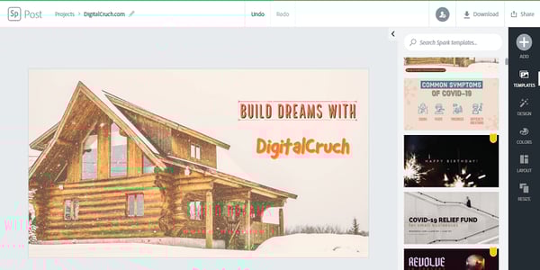 Adobe Spark is a free alternative to the company’s popular, for-pay Adobe Illustrator. While it’s not nearly as full-featured it does support integration with other Adobe products, is easy to use and comes with a host of free templates. If you’re looking to quickly create posters or videos for ad campaigns, Spark is a great choice. The potential drawback? A limited feature set makes this a great starting point for beginners but less useful for more in-depth projects or experienced designers. Spark is available for both web and mobile, however, meaning you design anywhere, anytime. Best Free Graphic Design Software for Mac5. KritaKrita is a free, open-source painting program made by artists, for artists. Ongoing development of this tool depends on donations and is driven by the needs of the designer community at large. It’s no surprise, then, that Krita includes a customizable user interface, feature-rich toolset, and a comprehensive resource manager. For businesses looking to boost their graphic design impact, Krita is a great tool — if they have the help of an experienced designer. For companies in need of simple, streamlined solutions, meanwhile, other software on this list offers a better fit for beginners. 6. GravitGravit is a vector design application created by the makers of Corel Draw. With a host of tools for creating vector art and a self-adjusting interface, Gravit earns its place among the best free graphic design software for Mac and Windows — the tool is also available for ChromeOS and Linux.
Worth noting? When you sign up for a free trial of Gravit you automatically get access to “Pro” features including the ability to work offline and see version history. However, you lose these features when your trial is up unless you’re willing to pay for a subscription. Creating a Great First ImpressionThe first thing users see when they land on your website significantly impacts their perception of your brand — and their likelihood to become paying customers. The right free graphic design software can help ensure your site delivers visual value from first impressions to eventual purchases and streamlines the process of ongoing aesthetic adjustment. [Read More ...] from https://blog.hubspot.com/marketing/best-free-graphic-design-software The other day, I was on a run and listening to my trusty Spotify playlist. Lo and behold, in between two of my favorite pump-up jams, I hear a HubSpot audio advertisement trickle through my headphones. It’s not uncommon for me to see HubSpot ads on social media or Google, but Spotify was a new one. This experience made me curious about what other kinds of advertisements our team at HubSpot had tested out this year. So I sat down with a few folks on our advertising and editorial teams. Below, they share some interesting lessons and takeaways regarding the different platforms and audiences they tested in 2020. Advertising Experiments HubSpot Tried in 2020“While HubSpot has traditionally been relatively direct response-focused (with software signups being the main acquisition goal), one of the biggest takeaways from our advertising in 2020 actually revolves around driving awareness through brand advertising,” shared Rex Gelb, Director, Acquisition Analytics & Paid Advertising at HubSpot. In early 2020, the team realized they were reaching diminishing returns on many of their existing ad channels, namely search and social ads, and saw it as an opportunity to branch out. They spearheaded this effort based on the guiding principle that the HubSpot audience is comprised of people with different media habits. “What works for one person might not work for everyone, so we were likely only reaching a small segment of them through [direct response ads],” said Jillian Hope, Senior Marketing Manager, Brand Advertising at HubSpot. “But in reality, our audience is listening to podcasts, they're reading articles in the New York Times or The Wall Street Journal,they’re watching Hulu, they're doing all these different activities throughout the day.” So, by expanding where they showed HubSpot ads, the team hypothesized they could reach a much larger segment of their audience and make new consumers aware of HubSpot. As I chatted with these experts, a few key platforms stood out. 1. Audio Advertising“In 2020, we started doubling down on [podcasts]. It started as more of an awareness play, but we’ve invested in this really neat tool called Podsights,” said Jillian. Podsights is a podcast attribution tool through which the team measures when someone hears a podcast ad and returns to the site, and becomes a lead. (Can I plug an audio file in COS? https://wiki.hubspotcentral.net/display/marketing/2020+Year+in+Review%3A+HubSpot%27s+First+Brand+Advertising+Push) The team has tested a few direct buys with specific podcasts, like NPR’s How I Built This and Masters of Scale. They’ve also done some national radio buys on NPR and a few Spotify Audio Everywhere ads (for those Spotify users who don’t pay for premium). 2. Hulu Advertising“[In addition to podcast advertising,] we're diversifying into new channels and also looking for opportunities to really measure and hone in on what's working even from a direct response standpoint, including Hulu,” Jillian shared. That’s right — this year, consumers turned on their TV to see some of HubSpot’s first advertisements on streaming channels. The team found that Hulu has high completion rates (about 99%) because the network’s ads are unskippable. “This made it a great tactic for testing out more creative messaging and executions because our audience was tuning into the full ad,” shared Alicia Collins, Copywriting & Brand Strategy at HubSpot. Alicia worked on much of HubSpot’s 2020 brand advertising campaigns, including the Hulu push. 3. YouTube AdvertisingVideo as a whole gave the team more room to deliver value through education, entertainment, and inspiration, especially compared to a display or static social advertisement. “Because YouTube is a Google-owned property,” Jillian said, “we had the ability to target people who are actively searching for content related to our products, so our ads are relevant to their work.” In fact, Rex shared one of the most successful tests they ran: YouTube’s “affinity audiences,” Affinity audiences are audiences that Google’s algorithm identifies as likely to be interested in your product(s). “While the algorithm is a bit of a black box, trusting their data ultimately paid off for us, generating some of the most cost-efficient, high-quality impressions and video views, which in turn yielded a great brand lift (as reported by surveys), and a measurable increase in incremental Google searches,” reported Rex. So, what does developing this brand advertising campaign creative look like?According to Alicia: “When you're thinking about brand awareness advertising, you have to think about who you're coming in contact with.” Most people who interact with HubSpot’s brand awareness advertisements have never heard of HubSpot — versus those who see the typical direct response advertising. “There's a reason why people are getting targeted with [direct response] ads; they've seen our content, they've been on our website, and they've interacted with our posts.” The same can’t be said for this new brand advertising push. Alicia and her team are trying to reach a completely new audience, meaning they have to create clear, direct ads that communicate what HubSpot is and who it's for. “[We’re aiming for] eye-catching and engaging, so people are either enticed to click-through to learn more or simply stop and take a second look,” Alicia shared.
Speaking of second looks, Alicia has learned just how different the brand advertising strategy can be. “[It’s a] bit different because, again, people don't see one social ad and immediately remember your brand. It takes like seven or eight impressions for someone to start recalling.” In her opinion, brand awareness work is unlike a lot of other bottom-of-the-funnel work. “It's not that there's only a science to it, but there's also a bit of an art,” she shared. “It's [all about] trying to find the right balance between solving for the data and the short-term results, and thinking about where you want to be in the long-term.” She encourages those who want to invest in brand awareness plays to be patient. “It can take a long time to move [brand awareness] metrics; raising brand awareness can take years and millions of dollars,” said Alicia. In her experience, people who want to invest in new channels and audiences tend to put their money in one place. But Alicia and her teammates have found that no one spends all their time on one channel.
For example, you might prefer to start your day listening to a podcast, read a few articles during lunch, and watch your favorite Hulu show to unwind after work. However, your coworker might like to start their day watching cable news, scroll through social media during lunch, and travel to the gym (passing multiple billboards) after work. “You're just getting multiple touch points throughout the day and sharing your stories in new, unique ways,” said Alicia. Jillian agreed: “What works for some won’t work for all. If we limit channels, we risk not reaching a large segment of our audience.” And the more channels on which consumers can see HubSpot, the more likely they are to remember and return. Read more about developing your own cross-channel or omnichannel advertising strategy on the HubSpot Blog. [Read More ...] from https://blog.hubspot.com/marketing/hubspot-advertising-experiments How do prospective consumers spend their money? What matters to them when they make decisions about how much to spend, where to spend it, and which company earns their business? This is the role of sales and marketing teams in your organization: Designing and deploying consumer campaigns to showcase the unique value proposition of your product or service so you stand out from the competition. The challenge? It’s not easy. Customer preferences are constantly evolving in response to both external market forces and internal financial constraints. As a result, the reasons around how, when, and why consumers spend money are never static — companies must find ways to understand and articulate the value of service or product offerings in a way that both captures consumer interest and convinces them to convert. Here, the concept of utility-based marketing is markedly useful. In this piece, we’ll explore the basics of utility in marketing, why it matters, and then dive into five common types of utility in marketing. What is utility in marketing?Put simply? Value. While in a non-economic context the term “utility” typically means “usefulness”, the marketing-driven definition speaks to the specific value realized by consumers when they spend on products or services. Understanding utility in marketing can help companies both better-predict spending habits and design campaigns to capture consumer interest. Why Marketing Utility MattersHistorically, marketing efforts have focused on making an impression. It makes sense — if consumers notice and remember your print, email, or television ad campaign, you’re better positioned to capture their spending when they see your brand again in-store or while shopping online. The problem? With so many companies now competing for consumer interest both online and in-person, market saturation is a significant concern. Even more worrisome? As noted by a New York Times article, “people hate ads.” Oversaturated and overwhelmed by ads across desktops, mobile devices, and in-person, prospective buyers are now tuning out enterprise efforts to impress. Instead, they’re looking for utility. This is the goal of utility-driven marketing: To offer consumers functional and useful products or services that provide a specific benefit or can be repurposed to serve multiple functions. When done well, utility marketing can create stronger bonds between customers and companies, and drive increased brand loyalty over time. It’s a slow-burn process rather than a quick-spend process and one that serves a different purpose — connecting customers with brands based on value, not volume. The Five Types of Utility in MarketingDespite our definition, the notion of “utility” in marketing remains fairly nebulous. That’s because trying to identify the exact value offered by your products or services to a specific customer segment, and how best to communicate this value effectively, is no easy task. As a result, utility in marketing is often broken down into different types, each of which can help inform better ad building and effective sales outcomes. Depending on how specific — or how generalized — your marketing approach, however, it’s possible to identify anything from one massive utility model to hundreds of smaller utility types for each consumer segment. To streamline your audience targeting and campaign creation process, we’ll dig into five common types of utility in marketing. 1. Utility of TimeThis is the “when” component of utility: Is your product available when customers want it? Will it arrive quickly and without complication? Consumers want to spend as little time as possible waiting for products to arrive in-stock or at their homes — as a result, utility of time is critical to capture consumer conversion on-demand. Time utility also accounts for seasonal changes in purchasing habits; for example, sales of boots and gloves spike in the winter, while ice cream sees greater demand during the summer. Some products are staples and are therefore time-resistant — such as groceries — but still need to be in-stock and delivered on-time. As a result, time-based marketing efforts are inherently tied to inventory and delivery systems to ensure outcomes meet consumer expectations. 2. Utility of PlacePlace utility refers to the ability of consumers to get what they want, where they want it. Often applied to brick-and-mortar stores, utility of place is paramount for customers looking for familiar items that are easy to obtain. In a world now driven by digital marketing efforts, place offers a competitive edge if companies can showcase their capacity to keep specific items in-stock at all times. And as improved logistics chains shorten the time between order and delivery, it’s possible for ecommerce operators to leverage place utility as a market differentiator. 3. Utility of PossessionPossession utility speaks to the actual act of product possession — such as consumers driving a new car off the lot or having furniture delivered to their home. It also highlights the connection between possession and purpose. Consider plastic storage bins. While they might be sold in the “kitchen” section of an online or brick-and-mortar store, consumers are free to repurpose the items as they see fit once they take possession, increasing their overall utility. 4. Utility of FormWhile some companies offer lower prices by shifting the responsibility of assembly to the consumer (e.g. that new dresser that you bought and had delivered, but still need to assemble on your own time), finished forms are often more valuable to customers. Consider complex products such as vehicles or electronic devices — by highlighting the finished form of these items, companies can reduce potentially purchasing barriers by making it clear that consumers will receive feature-complete products that don’t add the complexity of self-assembly. 5. Utility of InformationInformation utility is a new addition to this list, but in a world where competition for even basic goods now happens on a global scale, information can make the difference between successful sales and failed conversion efforts. Information utility speaks to any data that helps consumers make buying decisions. This includes product details on ecommerce pages, targeted marketing campaigns, and well-trained call center and in-store agents capable of answering customer questions. Simply, the right information at the right time improves market utility and increases the chance of sales conversion. Creating Customer ValueThe ultimate goal of any marketing strategy is to create customer value. While not every campaign requires the complete implementation of all five utility types to improve conversion and customer satisfaction, general knowledge paves the way for implementation to deliver value at scale. [Read More ...] from https://blog.hubspot.com/marketing/utility-marketing Developing and delivering a five-minute presentation seems an easy enough task at first -- until you realize the condensed format actually requires significantly more efficiency, focus, and attention to detail than longer presentation types. When there's less time to get your point across, every second counts more. While short presentations can be unexpectedly challenging to create, when done correctly they can be more impactful than longer presentations. Five minutes is just enough time for you to present a compelling narrative about one topic, without any filler or fluff. The time limit forces you to pack as much valuable information as possible into your presentation while maintaining a coherent structure. The shorter format also encourages audiences to pay more attention. But how can you ensure your short presentation accomplishes everything it needs to within just five short minutes? We've put together an (appropriately condensed) guide on five-minute presentations to help you get started. How Many Words Are in a 5-Minute Presentation?A person speaks on average 120 to 160 words a minute, which means the average five-minute presentation will be anywhere from 600 to 800 words. That means every word should be carefully chosen to support the central idea of your presentation. When constructing a longer presentation, you might be more concerned about transitions and keeping the audience engaged with more extensive narrative elements. In a short presentation, everything you say should directly tie back to your central premise and further advance your main point. By keeping a tight scope and using your words carefully, you'll ensure your time isn't wasted and the audience leaves with a clear, singular takeaway. How many slides are in a 5-minute presentation?Generally speaking, you'll want to stick to just five or six slides for a five-minute presentation, but there's no set limit on how many yours will require. You may choose to have twenty slides and to spend about 10 or 15 seconds on each depending on your subject matter. More important than your slide count is what each slide contains. While it's a good rule to keep your slides simple and focused on visuals (instead of text) for a presentation of any length, this becomes especially important when you're dealing with a condensed presentation window. It can be tempting with a small time window to try to cram in as much information as possible -- resist the urge. Instead, focus on simple, clean visuals that (once again) all tie back to your central premise. If you're concerned that scaling back the scope of your presentation will leave things out, add a slide at the end of the deck with additional resources and information that your audience can access after the presentation is over. 5-Minute Presentation Example FormatIf you're looking for a starting point for your own five-minute presentation, we've created a basic outline below you can use to organize your initial thoughts in the planning stage. You can choose to devote one slide to each section or multiple slides if you want to break them down further. Feel free to make departures from the structure depending on the content or format of your presentation. Just remember not to give your audience too much to chew on -- the key here is -- you guessed it -- tying every slide back to one central idea. An Extremely Short IntroductionYour first slide should serve as an introduction to the topic of your presentation. Try to limit your title to around six words or even less. If your title is too long, it can become unwieldy and your presentation may confuse your audience by covering too much. Remember: your audience (hopefully!) already has an idea of what you're presenting on, so you don't need to spend too much precious time or slide real-estate explaining what you're going to cover -- just jump right in. A Problem SlideMost presentations can be boiled down to a problem you've identified, solved, or are in the process of solving. Lead with that familiar narrative. It will give your presentation a clear starting point and prime your audience for the rest of your slides. A Solution/Analysis Slide(s)Now that your problem has been introduced, tell your audience what they need to know about what you're doing about it. In shorter presentation formats, you'll want to focus less on the details and more on the big-picture items. Ask yourself: what does your audience need to know when they leave the room? Anything that falls into the "nice to know" category can be cut and delivered to stakeholders after the meeting in a follow-up email. A Conclusion SlideThe conclusion side allows you to bring a coherent end to your presentation and summarize the important takeaway points for your audience. Don't skimp on your conclusion just because it's a short presentation -- it's the last thing your audience will hear from you. A good conclusion will reinforce the other information you presented and ultimately makes your presentation as a whole more memorable. 5-Minute Presentation ExamplesWhile we (unfortunately) weren't in the room when these presentations were originally given -- and therefore can't confirm with 100% certainty that they ran for only five minutes -- these decks all clock in at under 15 slides and use a simple format to convey a problem and solution. 1. AirBnB Pitch Deck2. Buffer Pitch Deck3. Mixpanel Pitch DeckHow Do I Create a Killer 5-Minute Presentation?Here are some best practices to follow when crafting a short presentation. 1. Focus on the most important part.The greatest challenge you'll have when designing your presentation is choosing what to focus on -- but from the format we discussed above, you can see how important it is to have a single premise to design your presentation around. It's easy to become overambitious in your presentation or to be overwhelmed by the information you want to present. Choosing a single idea to focus on gives you clarity when designing your speech and allows you to cut extraneous information. It also provides a narrative structure that your audience can more easily grasp. 2. Research, fact-check, and do it twice.Your presentation is your chance to shine -- but the shorter format also means that each point you make is going to be more visible, memorable, and consequentially more vulnerable to scrutiny. Take the time to thoroughly research the subject of your presentation and ensure every point you make is both technically accurate and easy to understand. This will put you in a better position to field questions and discuss your subject in-depth. With a strong command of your subject matter, your delivery will also be more confident and convincing. 3. Appeal to how people learn best: stories.A story can give meaning to your presentation and elevate it to more than just facts, figures, and some flashy slides. Building your presentation around a simple, easy-to-understand narrative (like the problem/solution narrative we showed you in the template avoid) can make your content more digestible. Your presentation will only last for a few minutes, but the story you tell needs to stick around in your audiences' brains for longer -- and stories naturally help humans understand and retain information more easily. 4. Don't skip that practice session.Just because your presentation is only five minutes doesn't mean you should try to wing it. Your audience's time is valuable, and practicing your presentation before you deliver it to them will help you make the most of it. From CEOs to interns, everyone can benefit from practicing their presentations in advance, no matter how confident they are. If you're able to deliver much (or all) of it by heart, your delivery will be much more natural, allowing you to develop a stronger connection with your audience. And once nerves hit, you'll have the muscle memory to fall back on and carry you through the rough patches! 5. Relax and don't rush.You only have five minutes to present, so it's only natural to feel pressure to go a little too fast. Stay relaxed throughout your presentation and avoid distractions, such as someone informing you that you only have a minute left. Staying focused on your presentation itself will improve your delivery and give you more confidence, even if you're normally terrified of public speaking. If you find yourself needing to speed through your presentation to squeeze it into a five-minute window, that's a good sign you're trying to do too much and need to consider cutting your slides down. You Know Your Audience BestWhen creating your five-minute presentation, think about your audience and craft it to appeal to them. The information you decide to highlight and the way you frame it will be vastly different depending on who your presentation is meant for. It's natural to be nervous going into your presentation, especially if you don't like public speaking or have a fear of it, but with enough consideration and practice, you'll be a master of whatever subject you hope to present. [Read More ...] from https://blog.hubspot.com/marketing/5-minute-presentation A presentation aimed at persuading an audience to take a specific action can be the most difficult type to deliver, even if you’re not shy of public speaking. Creating a presentation that effectively achieves your objective requires time, lots of practice, and most importantly, a focused message. With the right approach, you can create a presentation that leaves a skeptical audience enthusiastic to get on board with your project. In this post, we'll cover the basics of building a persuasive presentation. Let's dive in. What is a persuasive presentation?In its most basic form, a persuasive presentation features a speaker who tries to influence an audience to accept certain positions and engage in actions in support of them. A good persuasive presentation uses a mixture of facts, logic, and empathy to help an audience see an issue from a perspective they previously discounted or hadn’t considered. How to Plan a Persuasive PresentationWant to make a persuasive presentation that connects with your audience? Follow these steps to win friends and influence people within your audience. 1. Decide on a single ask.The key to convincing your audience is to first identify the singular point you want to make. A good persuasive presentation will focus on one specific and easy-to-understand proposition. Even if that point is part of a broader initiative, it ideally needs to be presented as something your audience can say "yes" or "no" to easily. A message that isn’t well-defined or which covers too much can cause the audience to lose interest or reject it outright. A more focused topic can also help your delivery sound more confident, which (for better or worse) is an important factor in convincing people. 2. Focus on fewer (but more relevant) facts.Remember: You are (in the vast majority of cases) not the target audience for your presentation. To make your presentation a success, you’ll need to know who your audience is so you can shape your message to resonate with them. When crafting your messaging, put yourself in your audience's headspace and attempt to deeply understand their position, needs, and concerns. Focus on arguments and facts that speak specifically to your audience's unique position. As we wrote in our post on How to Present a Compelling Argument When You're Not Naturally Persuasive, "just because a fact technically lends support to your claim doesn't mean it will sway your audience. The best evidence needs to not only support your claim but also have a connection to your audience." What are the target audience's pain points that you can use to make a connection between their needs and your goals? Focus on those aspects, and cut any excess information. Fewer relevant facts are always more impactful than an abundance of unfocused pieces of evidence. 3. Build a narrative around your evidence.If you want to persuade someone of something, it’s not enough to win their brain -- you need their heart in it, too. Try to make an emotional connection with your audience throughout your presentation to better sell them on the facts you’re presenting. Your audience is human, after all, so some emotional tug will go a long way to shaking up how they view the issue you’re talking about. A little bit of emotion could be just what your audience needs to make your facts “click.” The easiest way to incorporate an emotional pull into your presentation is through the use of narrative elements. As we wrote in our guide to crafting pitch decks, "When our brains are given a story instead of a list of information, things change -- big time. Stories engage more parts of our brains, including our sensory cortex, which is responsible for processing visual, auditory, and tactile stimuli. If you want to keep people engaged during a presentation, tell them a story." 4. Confidence matters.Practice makes perfect (it's a cliche because it's true, sorry!), and this is especially true for presentation delivery. Rehearse your presentation several times before you give it to your audience so you can develop a natural flow and move from each section without stopping. Remember, you're not giving a speech here, so you don't want your delivery to come across like you're reading fully off of cue cards. Use tools like notes and cue cards as ways to keep you on track, not as scripts. Finally, if you can, try to practice your presentation in front of another human. Getting a trusted co-worker to give you feedback in advance can help strengthen your delivery and identify areas you might need to change or bulk up. 5. Prepare for common objections.The last thing you want to say when someone in your audience expresses a concern or an outright objection during your presentation's question section is “umm, let me get back to you on that.” Carefully research the subject of your presentation to make the best case possible for it -- but also prepare in advance for common objections or questions you know your stakeholders are going to ask. The stronger your command of the facts -- and the more prepared you are to proactively address concerns -- the more convincing your presentation will be. When you appear confident fielding any rebuttals during a question and answer session after your presentation, it can go a long way towards making your case seem more convincing. Persuasive Presentation OutlineLike any writing project, you’ll want to create an outline for your presentation, which can act as both a prompt and a framework. With an outline, you’ll have an easier time organizing your thoughts and creating the actual content you will present. While you can adjust the outline to your needs, your presentation will most likely follow this basic framework. I. IntroductionEvery persuasive presentation needs an introduction that gets the listener’s attention, identifies a problem, and relates it to them.
II. The BodyThe body forms the bulk of your presentation and can be roughly divided into two parts. In the first half, you will build your case, and in the second you will address potential rebuttals.
III. ConclusionIn your conclusion, you will wrap up your argument, summarize your key points, and relate them back to the decisions your audience makes.
IV. CitationsInclude a section at the end of your presentation with citations for your sources. This will make independent fact-checking easier for your audience and will make your overall presentation more persuasive. Persuasive Presentation ExamplesCheck out some of these examples of persuasive presentations to get inspiration for your own. Seeing how someone else made their presentation could help you create one that strikes home with your audience. While the structure of your presentation is entirely up to you, here are some outlines that are typically used for different subjects. Introducing a ConceptOne common type of persuasive presentation is one that introduces a new concept to an audience and tries to get them to accept it. This presentation introduces audience members to the dangers of secondhand smoke and encourages them to take steps to avoid it. Persuasive presentations can also be a good format to introduce marco issues, such as this presentation on the benefits of renewable energy. Changing Personal HabitsWant to change the personal habits of your audience? Check out this presentation on how to adopt healthy eating habits. Or this presentation which encourages the audience to get more exercise in their daily lives. Making a Commitment to an ActionIs your goal to get your audience to commit to a specific action? This presentation encouraging audience memes to become organ donors could provide inspiration. Trying to make a big sale? Check out this presentation outline that can encourage someone to buy a home. Remember: You Can Do ThisAnyone can craft a persuasive presentation once they know the basic framework for creating one. Once you get the process down, you’ll be in a better position to bring in sales, attract donors or funding, and even advance your career. The skills you learn can also benefit you in other areas of your personal and professional life as you know how to make a case and influence people toward it. [Read More ...] from https://blog.hubspot.com/marketing/persuasive-presentation Remote work is incredible. Goodbye soul-draining commute, uncomfortable "business professional" outfits, and expensive takeout salads. Hello leisurely mornings, hoodies and slippers, and delicious home-cooked meals. But remote work is also tough. You're hundreds, if not thousands, of miles away from your colleagues; your home workspace probably lacks some of the bells and whistles of a traditional office; and your work-life boundaries can quickly become nonexistent. To learn how to conquer these challenges — plus many you haven't discovered yet — take a look at these books on remote work. 1. Working Remotely: Secrets to Success for Employees on Distributed TeamsBy Teresa Douglas, Holly Gordon, and Mike Webber Unlike many remote work books aimed at leaders and solopreneurs, Douglas, Gordon, and Webber focus on the front-line remote worker. This book is divided into seven chapters, each dedicated to a pillar of WFH success. You'll learn how to battle isolation and loneliness, work well with your peers, and manage your inbox. Along with concrete tips, the authors include examples and anecdotes to bring their points home (no pun intended). 2. Work-From-Home Hacks: 500+ Easy Ways to Get Organized, Stay Productive, and Maintain a Work-Life Balance While Working from Home!By Aja Frost On March 20th, I left HubSpot's Boston office with my monitor and keyboard. I thought I'd use them for a few weeks, a month at the most — then we'd all be back in the office. Of course, eight months later most of our team is still working from home … and that will be the case for years to come. Maybe forever! This book is packed with all the advice I wish I'd had when I transitioned to permanent remote work. It covers common scenarios like maintaining boundaries between work and the rest of your life (when your office is also your bedroom or kitchen), combating loneliness and isolation, and overcoming the "out of sight, out of mind" effect. Plus, if you're a parent, freelancer, or manager, there's special advice just for you. By the time you finish, you'll know everything you need to be successful and happy as a remote worker. 3. The Holloway Guide to Remote WorkBy Juan Pablo Buriticá and Katie Womersley, along with contributing authors This manual will help leaders through common remote work challenges and choices, including hiring, onboarding, and compensating remote employees; creating communication channels and setting expectations; implementing a healthy company culture across time zones; and more. Buriticá and Womersley draw on their experience as leaders of distributed engineering teams at Splice and Buffer, respectively. Employees from Angel List, Doist, Remote.com, and other remote organizations contributed, as well. As a result, every recommendation is practical, realistic, and often backed by case studies, examples, and/or data. 4. REMOTE: Office Not RequiredBy Jason Fried and David Heinemeier Hansson, the founders of Basecamp If you're looking for a manifesto on the benefits of remote work, this one's for you. Fried and Hansson spend most of REMOTE: Office Not Required refuting the arguments against allowing folks to work from wherever they'd like, such as:
Already believe in remote work? Looking for practical tips on how to do it well? I'd suggest other books, like Work-From-Home Hacks or the Holloway Guide. 5. Subtle Acts of Exclusion: How to Understand, Identify, and Stop MicroaggressionsBy Tiffany Jana and Michael Baran Microaggressions — or Subtle Acts of Exclusion (SAEs) as Jana and Baran call them — happen whether you're remote or co-located. But SAEs are harder to handle when you're not all in the same room: You can't drop by someone's desk to let them know what they said was hurtful, or stop a conversation in its tracks by asking the offender to leave. And if you're the one who committed the SAE? The relationship damage is harder to undo without the rapport-building effects of sharing an office. That makes Jana and Baran's book an essential read for distributed teams. Learn how to spot, deal with, and most importantly, prevent SAEs so that everyone feels safe and included. 6. Act Like a Leader, Think Like a LeaderBy Herminia Ibarra If you're like me — or any of the other managers I talked to — your professional self-confidence might suffer after going remote. Why? Because you lose a ton of positive feedback. You're no longer bumping into your coworkers in the hall, seeing their smiles and nods when you present, hearing their cheers when you win a big account, or getting celebratory drinks after a great quarter.
This book will help restore your confidence. According to Ibarra, the best way to feel like a leader is to act like one. In other words: Your thoughts follow your actions, not the other way around. She provides you with actionable recommendations to do just that. Whether you're an individual contributor, executive, or anyone in between, you'll discover how to step up at work — and boost your self-esteem in the process. 7. The Remote Facilitator's Pocket GuideBy Kirsten Clacey and Jay-Allen Morris Running remote meetings is both science and art. As Clacey and Morris point out in their introduction, virtual meetings are:
To combat these issues, the authors condensed research, personal anecdotes, and strategies into a short but powerful book. In just 153 pages, you'll get a veritable PhD in remote meeting facilitation. One GoodReads reviewer said, "Everyone who does online meetings should read this book." 8. The ultimate guide to remote workBy Wade Foster, with content from Danny Schreiber, Matthew Guay, Melanie Pinola, Bethany Hills, Alison Groves, Jeremey DuVall, and Belle Cooper Zapier has been a remote-first company since its 2011 founding. Safe to say, the team has spent a lot of time thinking about common remote work issues and coming up with scalable solutions. This guide (which is available online for free) is broken into fifteen chapters. First, you'll learn how to hire and manage remote employees. Next, you'll delve into building and maintaining a strong virtual culture, followed by tips on productivity, multi-time-zone collaboration, and avoiding burnout. And, finally, you'll discover how to get a remote job (likely easier now than when the e-book was first written) and work smarter, not harder with the remote work tool-kit. Hopefully, this remote work reading list helps you avoid many of the pitfalls of working from home … while maximizing its benefits. [Read More ...] from https://blog.hubspot.com/marketing/remote-work-books The easier it is for potential customers to find your site in search engine results, the more traffic (and sales) you’ll generate. As a result, there’s a kind of constant content competition underway as website owners and administrators look for ways to stand out from the crowd and improve search engine optimization (SEO). Gone are the wild, wild west days of the World Wide Web where keyword spamming and content stuffing were the norm to drive search engine interest. Now, brands need to focus on more tightly-controlled metrics — such as Google’s PageRank — to boost their online appeal and push their site listing closer to the first page, first result pinnacle. While part of this effort comes down to writing relevant, accurate, and interesting content, there’s another key component: Dofollow links. With the right approach, these links can help leverage great content into higher PageRank and better search results. Here’s how they work. What is a dofollow link?PageRank is effectively a weighted score that uses links to assign points — the more points, the better your site rank, and the better your SEO. Often referred to as “link juice” by online marketing professionals because of their ability to “flow” through websites with the right linking structure, getting these points is a priority for any site owner. The problem? Almost immediately after their introduction, getting points in any way possible became the strategy of many unscrupulous marketers. The easiest way to achieve this aim? Leaving comments on the posts of popular websites that contained links back to client sites, in turn boosting their profile. The more reputable the linking site — think well-respected retailers or news organizations — the bigger the link juice boost. By default, these links were “dofollow” — they instructed search engines to follow the link back to the originating site and boost its PageRank. To solve the growing problem of spam links the “nofollow” link was created: Site admins could add an HTML tag: … to any link on their site, which instructed search engines not to follow the link back to its destination and, in turn, not boost its PageRank. Today, dofollow links remain an important part of SEO strategy — getting a “backlink” from a reputable site can significantly boost PageRank values and help brands stand out. The introduction of nofollow links, meanwhile, offers more control for site admins. For example, most comment sections now include nofollow tags by default, and page creators can choose to add nofollow tags to blog posts and other articles. Changing these links from nofollow to dofollow is easy, but requires that destination site owners contact linking site admins and ask for the change. How to Make a Dofollow LinkIn most cases, no action is required to create a dofollow link. If your site is linked to by another site and they don’t choose to add the nofollow tag, search engines will naturally arrive at your page and increase your overall PageRank. The same is true if you’re including links on your own site. For example, you may choose to add links to other reputable sites within your own content and allow search engines to follow these links. If you’ve been asked by another brand to include their links on your page or are moderating blog comments, meanwhile, you may want to turn on automatic nofollow tags where possible or ensure that all links include the nofollow tag until you’re sure it makes sense to follow the link back. This is especially critical if other links lead to low-quality or keyword-stuffed content, since this can reflect poorly on your own site. Put simply? When it comes to external links from reputable sites that lead back to your page, dofollow is ideal. Links leading outside your site and linked from your own posts or attached to comments on your content should only be dofollow if the outgoing link site is reputable and relevant. What tools are available for dofollow links?Wondering if a link is dofollow or nofollow? If it’s on your own site, you can check the HTML code from your CMS admin page to determine if the nofollow tag is present, but what happens when the link comes from another, external site? Since you can’t see or edit their code, you can’t be certain if links are dofollow or nofollow. In this case, it’s worth using dofollow link checker tools to determine if links will boost your PageRank or not. Examples include: The first tool is a web-based tool that checks entire pages for nofollow and dofollow links. Moz MozBar is a Chrome extension, while SEOquake is offered for both Chrome and Firefox. Link Analyzer, meanwhile, is a standalone tool that doesn’t require a specific browser. Each of these tools is free and works by following any links to your site to determine if they’re nofollow or dofollow, then reports the results. Should I dofollow an external link?Here, the answer depends on two factors: Where does the link lead, and what are the benefits if you opt for dofollow? Ideally, any dofollow links point search engines to content that’s current, relevant and accurate, in turn providing “link juice” for both the external site and your own website. There may be cases where reciprocal dofollow links are a good idea, especially if you’re looking to expand site traffic and the external site has a similar ranking to your own page. Ideally, you want a mix of nofollow and dofollow links on your page to ensure search engines don’t view your content as simply a vehicle for PageRank points. How long will it take Google to recognize a dofollow link?While there’s no hard and fast answer here since search engine spiders crawl a significant volume of pages each day, dofollow links are generally recognized by Google within two to four days after being posted. If your site has low traffic volumes and the dofollow links you’re creating or receiving come from similarly small webpages, it could take more time for PageRank to recognize these links. If you’re fortunate enough to receive a backlink from a highly-ranked site, meanwhile, you may see the benefit in just a few days. Dofollow links remain a critical aspect of SEO and search ranking efforts, but must be used strategically to deliver substantive benefits. [Read More ...] from https://blog.hubspot.com/marketing/dofollow-link Connecting with potential customers is critical to boost interest in your website and drive sales conversions. But this is often easier said than done — while many site owners understand the value of compelling content, creating copy that resonates with visitors is more complicated than it appears. Here's why: Gone are the days of keyword-stuffed content designed only to drive up SEO values. When it comes to successful website marketing and sales campaigns, action is the driving force. But with the typical consumer now owning and using at least three digital devices on average, the amount of time content has to make an impact is diminishing quickly. To both boost up-front engagement and encourage immediate action, many businesses are leveraging a new approach: Direct response copywriting. In this piece, we'll dive into direct response copywriting details, offer some actionable examples and provide six tips to help boost the benefits of direct response copywriting. What is direct response copywriting?Direct response copywriting is all about right now. It's about inspiring consumers to action the moment they're done reading your copy. As a result, successful direct response content creators are highly valued (and well-paid) professionals since they're able to generate significant return on investment (ROI) for organizations. They accomplish this aim by combining a deep understanding of target markets with substantial writing skills to create copy that evokes emotional or logical responses from readers. From understanding key pain points to highlighting immediate needs or offering specific solutions, direct response copywriting done right delivers familiarity and personalization combined with market knowledge and authority to create a sense of trust. While your specific aim may vary, direct response copywriting typically focuses on actions such as:
Metrics are critical to ensure direct copywriting is having the desired effect. These may include total sales volumes, new email list sign-ups, the number of times resources are downloaded, or the uptick in total followers on social sites like Facebook, Instagram, or Twitter. When it comes to creating direct response copywriting, businesses have two options: in-house or outsourced. While in-house content creation may offer up-front cost savings, the highly targeted nature of direct deliverables comes with a steep learning curve — initial efforts may not have the intended effect if they're too generalized or fail to strike the right balance between authority and accessibility. Alternatively, while best-of-breed direct response copywriting services aren't cheap, they can often deliver ROI between 5X and 10X their initial cost. Direct Response Copywriting ExamplesSo what does direct response copywriting look like in practice? Let's break down a few examples. 1. Fizzle.png) This banner is from Fizzle, which provides resources for entrepreneurs. It speaks to the fundamental nature of these self-starter businesses: Earning a living that isn't tied to traditional corporate or retail frameworks and that brings a sense of personal satisfaction. The copy is short, targeted, and to-the-point and encourages immediate action to click-through and see what the company has to offer. 2. Dropbox-1.png?width=351&name=Six%20Direct%20Response%20Copywriting%20Tips%20(and%20Examples)-1.png) File service Dropbox has made significant enterprise in-roads by offering streamlined and secure collaboration. Here, their direct response copy makes their value proposition abundantly clear: Users can collaborate on anything, anytime, anywhere. It speaks to the pain points experienced by main companies trying to find collaborative common ground and offers Dropbox as the simplest solution. 3. MailChimp-2.png) This direct response copy is from automation platform MailChimp. It offers four key benefits laid out in an easy-to-read format, along with more in-depth details and links below. For companies looking to improve customer connections, boost brand impact, or get more from their data, MailChimp's copy makes it clear they can help — and makes it easy for companies to take the first step. Six Direct Response Copywriting TipsHere's the hard truth: With customers now inundated by online advertisements across multiple platforms and devices, it's hard for content to stand out. As a result, companies need direct response copywriting that is immediately engaging and compelling — and that's no easy task. Here are six direct response copywriting tips to boost your in-house efforts or help you evaluate the potential copy providers. 1. Know your market.Understanding your target audience is key for any copywriting, but it's fundamental for direct response efforts.
This is by far the most labor-intensive step of the process, but is well worth the effort. 2. Start strong.The first thing prospective customers see when they look at your copy? The headline. If it doesn't grab attention, chances are prospective purchasers won't read the rest of your content and you won't compel action. Headlines should reference the reader directly with "you" statements or questions — done well, headlines can stand on their own as effective actionable content. Worth noting? If a great headline doesn't present itself immediately, try writing the rest of the copy first, since this may help you find the best first-line fit. It's also a good idea to walk away from your content for a few days after you're done — if it doesn't have the same impact when you look again, consider making changes. 3. Apply AIDCA were possible.AIDCA stands for "attention, interest, conviction, desire and action." Ideally, you want all five in your copy. Start with an attention-grabbing headline, then drive interest with a compelling product or service hook. If you're creating longer-form copy, conviction can take the form of a customer testimonial or review, but this isn't necessary for quick-hitter content. Desire speaks to your value proposition — why would customers want your product or service? Action is your goal; make it clear what you're looking for and provide direct links. 4. Ask for action.While your direct response copywriting content should always end with a call-to-action (CTA), it's also a good idea to reinforce this idea two or three times throughout your content. Best bet? Always start and end with a call-to-action and include another actionable mention in the middle of longer copy. 5. Prioritize the second person.Effective direct response copywriting centers on the consumer, not the company. As a result, businesses are best-served by prioritizing the second person with "you" statements and questions that speak to readers directly. While "I" and "we" statements might offer great insight about your company, its processes or its current accolades, these first-person pronouns won't encourage action. Simply put? "You" is the fastest way to "yes". 6. Write fast, edit hard.Overthinking direct response copywriting can slow the process and hamper overall effectiveness. Why? Because this action-driven framework demands a unique combination of instinct and information to create compelling content. Instead, companies should take a write fast, edit hard approach: Draft content quickly to establish key themes and pinpoint critical outcomes, then edit ruthlessly to eliminate extraneous words. Direct response copywriting isn't about literary loquaciousness — it's about crisp, clear, compelling content that connects with your target audience. And … Action!The ultimate goal of direct response copywriting? Connecting with your audience to drive immediate action. It's no easy task — but by knowing your market, starting strong, applying AIDCA, asking for action, prioritizing the second person, and editing with intention it's possible to create content that delivers reliable consumer response on-demand. [Read More ...] from https://blog.hubspot.com/marketing/direct-response-copywriting |

Joseph Ashley
Juice is a drink made from the extraction or pressing of the natural liquid contained in fruit and vegetables. It can also refer to liquids that are flavored with concentrate or other biological food sources, such as meat or seafood, such as clam juice. Archives
February 2021
Categories |


 RSS Feed
